
大家好,又见面了,我是你们的朋友全栈君。
- 线性布局LinearLayout
- 相对布局RelativeLayout
- 帧布局FrameLayout
- 表格布局TableLayout
- 绝对布局AbsoluteLayout
- 网格布局GridLayout
| key | Value |
|---|---|
| android:gravity | 控件布局方式 |
| android:layout_gravity | 布局方式 |
| android:persistentDrawingCachehua | 定义绘图的高速缓存的持久性 |
| android:descendantFocusability | 控制子布局焦点获取方式 常用于listView的item中包含多个控件 点击无效 |
| android:scrollbars | 设置滚动条的状态 |
| android:scrollbarStyle | 设置滚动条的样式 |
| android:fitsSystemWindows | 设置布局调整时是否考虑系统窗口(如状态栏) |
| android:scrollbarFadeDuration | 设置滚动条淡入淡出时间 |
| android:scrollbarDefaultDelayBeforeFade | 设置滚动条N毫秒后开始淡化,以毫秒为单位。 |
| android:scrollbarSize | 设置滚动调大小 |
| android:fadingEdge | 设置拉滚动条时 ,边框渐变的放向 |
| android:drawingCacheQuality | 设置绘图时半透明质量 |
| android:OverScrollMode | 滑动到边界时样式 |
| android:alpha | 设置透明度 |
| android:rotation | 旋转度数 |
| android:rotationX | 水平旋转度数 |
| android:rotationY | 垂直旋转度数 |
| android:scaleX | 设置X轴缩放 |
| android:scaleY | 设置Y轴缩放 |
| android:verticalScrollbarPosition | 设置垂直滚动条的位置 |
| android:layerType | 设定支持 |
| android:layoutDirection | 定义布局图纸的方向 |
| android:textDirection | 定义文字方向 |
| android:textAlignment | 文字对齐方式 |
| android:importantForAccessibility | 设置可达性的重要行 |
| android:labelFor | 添加标签 |
| key | Value |
|---|---|
| android:layout_centerHrizontal | 水平居中 |
| android:layout_centerVertical | 垂直居中 |
| android:layout_centerInparent | 相对于父元素完全居中 |
| android:layout_alignParentBottom | 贴紧父元素的下边缘 |
| android:layout_alignParentLeft | 贴紧父元素的左边缘 |
| android:layout_alignParentRight | 贴紧父元素的右边缘 |
| android:layout_alignParentTop | 贴紧父元素的上边缘 |
| android:layout_alignWithParentIfMissing | 如果对应的兄弟元素找不到的话就以父元素做参照物 |
| android:layout_alignParentStart | 紧贴父元素结束位置开始 |
| android:layout_alignParentEnd | 紧贴父元素结束位置结束 |
| android:animateLayoutChanges | 布局改变时是否有动画效果 |
| android:clipChildren | 定义子布局是否一定要在限定的区域内 |
| android:clipToPadding | 定义布局间是否有间距 |
| android:animationCache | 定义子布局也有动画效果 |
| android:alwaysDrawnWithCache | 定义子布局是否应用绘图的高速缓存 |
| android:addStatesFromChildren | 定义布局是否应用子布局的背景 |
| android:splitMotionEvents | 定义布局是否传递touch事件到子布局 |
| android:focusableInTouchMode | 定义是否可以通过touch获取到焦点 |
| android:isScrollContainer | 定义布局是否作为一个滚动容器 可以调整整个窗体 |
| android:fadeScrollbars | 滚动条自动隐藏 |
| android:fitsSystemWindows | 设置布局调整时是否考虑系统窗口(如状态栏) |
| android:visibility | 定义布局是否可见 |
| android:requiresFadingEdge | 定义滚动时边缘是否褪色 |
| android:clickable | 定义是否可点击 |
| android:longClickable | 定义是否可长点击 |
| android:saveEnabled | 设置是否在窗口冻结时(如旋转屏幕)保存View的数据 |
| android:filterTouchesWhenObscured | 所在窗口被其它可见窗口遮住时,是否过滤触摸事件 |
| android:keepScreenOn | 设置屏幕常亮 |
| android:duplicateParentState | 是否从父容器中获取绘图状态(光标,按下等) |
| android:soundEffectsEnabled | 点击或触摸是否有声音效果 |
| android:hapticFeedbackEnabled | 设置触感反馈 |
| key | Value |
|---|---|
| android:layout_alignBaseline | 本元素的文本与父元素文本对齐 |
| android:layout_below | 在某元素的下方 |
| android:layout_above | 在某元素的的上方 |
| android:layout_toLeftOf | 在某元素的左边 |
| android:layout_toRightOf | 在某元素的右边 |
| android:layout_toStartOf | 本元素从某个元素开始 |
| android:layout_toEndOf | 本元素在某个元素结束 |
| android:layout_alignTop | 本元素的上边缘和某元素的的上边缘对齐 |
| android:layout_alignLeft | 本元素的左边缘和某元素的的左边缘对齐 |
| android:layout_alignBottom | 本元素的下边缘和某元素的的下边缘对齐 |
| android:layout_alignRight | 本元素的右边缘和某元素的的右边缘对齐 |
| android:layout_alignStart | 本元素与开始的父元素对齐 |
| android:layout_alignEnd | 本元素与结束的父元素对齐 |
| android:ignoreGravity | 指定元素不受重力的影响 |
| android:layoutAnimation | 定义布局显示时候的动画 |
| android:id | 为布局添加ID方便查找 |
| android:tag | 为布局添加tag方便查找与类似 |
| android:scrollbarThumbHorizontal | 设置水平滚动条的drawable。 |
| android:scrollbarThumbVertical | 设置垂直滚动条的drawable |
| android:scrollbarTrackHorizontal | 设置水平滚动条背景(轨迹)的色drawable |
| android:scrollbarTrackVertical | 设置垂直滚动条背景(轨迹)的色drawable |
| android:scrollbarAlwaysDrawHorizontalTrack | 设置水平滚动条是否含有轨道 |
| android:scrollbarAlwaysDrawVerticalTrack | 设置垂直滚动条是否含有轨道 |
| android:nextFocusLeft | 设置左边指定视图获得下一个焦点 |
| android:nextFocusRight | 设置右边指定视图获得下一个焦点 |
| android:nextFocusUp | 设置上边指定视图获得下一个焦点 |
| android:nextFocusDown | 设置下边指定视图获得下一个焦点 |
| android:nextFocusForward | 设置指定视图获得下一个焦点 |
| android:contentDescription | 说明 |
| android:OnClick | 点击时从上下文中调用指定的方法 |
| key | Value |
|---|---|
| android:layout_width | 定义本元素的宽度 |
| android:layout_height | 定义本元素的高度 |
| android:layout_margin | 本元素离上下左右间的距离 |
| android:layout_marginBottom | 离某元素底边缘的距离 |
| android:layout_marginLeft | 离某元素左边缘的距离 |
| android:layout_marginRight | 离某元素右边缘的距离 |
| android:layout_marginTop | 离某元素上边缘的距离 |
| android:layout_marginStart | 本元素里开始的位置的距离 |
| android:layout_marginEnd | 本元素里结束位置的距离 |
| android:scrollX | 水平初始滚动偏移 |
| android:scrollY | 垂直初始滚动偏移 |
| android:background | 本元素的背景 |
| android:padding | 指定布局与子布局的间距 |
| android:paddingLeft | 指定布局左边与子布局的间距 |
| android:paddingTop | 指定布局上边与子布局的间距 |
| android:paddingRight | 指定布局右边与子布局的间距 |
| android:paddingBottom | 指定布局下边与子布局的间距 |
| android:paddingStart | 指定布局左边与子布局的间距与android:paddingLeft相同 |
| android:paddingEnd | 指定布局右边与子布局的间距与android:paddingRight相同 |
| android:fadingEdgeLength | 设置边框渐变的长度 |
| android:minHeight | 最小高度 |
| android:minWidth | 最小宽度 |
| android:translationX | 水平方向的移动距离 |
| android:translationY | 垂直方向的移动距离 |
| android:transformPivotX | 相对于一点的水平方向偏转量 |
| android:transformPivotY | 相对于一点的垂直方向偏转量 |
线性布局
LinearLayout又称作线性布局,是一种非常常用的布局。
这个布局会将它所包含的控件在线性方向上依次排列。
既然是线性排列,肯定就不仅只有一个方向,那为什么上一节中的控件都是在垂直方向排列的呢?这是由于我们通过android:orientation属性制定了排列方向是vertical。
如果指定的是horizontal ,控件就会在水平方向上排列了。
注意:如果LinearLayout的排列方向是horizontal,内部的控件就绝对不能将宽度指定为match_parent,因为如果这样的话,单独一个控件就会将整个水平方向占满,其他的控件就没有可放置的位置了。同样的道理,如果LinearLayout的排列方向是vertical,内部的控件就不能将高度指定为match_parent。
首先来看
android:layout_gravity属性
和android:gravity属性看起来有些相似,这两个属性有什么区别呢?
其实从名字就可以看出来
android:gravity用于指定文字在控件中的对齐方式,而android:layout_gravity用于指定控件在布局中的对齐方式。
android:layout_gravity的可选值和android:gravity差不多,但是需要注意,当LinearLayout的排列方向是horizontal时,只有垂直方向上的对齐方式才会生效,因为此时水平方向上的长度是不固定的,每次加一个控件,水平方向上的长度都会改变,因而无法指定该方向上的对齐方式。同样的道理,当LinearLayout的排列方向是vertical时,只有水平方向上的对齐方式才会生效。
LinearLayout中另一个重要的属性。
——android:layout_weight.这个属性允许我们使用比例的方式来指定控件的大小,它在手机屏幕的适配性方面可以起到非常重要的作用。
当时用android:layout_weight属性,此时控件的宽度就不应该再由android:layout_width来决定,这里指定成0dp是一种比较规范的写法。
另外dp是Android中用于指定控件大小、间距等属性的单位,后面我们还会经常用到它。
<LinearLayout xmlns:android="http://schemas.android.com/apk/res/android"
    android:orientation="horizontal"
    android:layout_width="match_parent"
    android:layout_height="match_parent">
    <EditText
        android:layout_width="0dp"
        android:layout_height="wrap_content"
        android:layout_weight="3"
        android:hint="Type something"
        />
    <Button
        android:id="@+id/send"
        android:layout_width="0dp"
        android:layout_height="wrap_content"
        android:layout_weight="2"
        android:text="Send"
        />
	</LinearLayout>
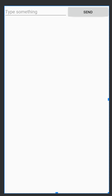

然后再EditText和Button里都将android:layout_weight属性的值指定为1,这表示EditText和Button将在水平方向平分宽度。
为什么将android:layout_weight属性的值同时指定为1就会平分屏幕宽度呢?
系统会先把LinearLayout下所有控件指定的layout_weight值相加,得到一个总值,然后每个控件所占大小的比例就是用该控件的layout_weight值除以刚才算出的总值。
我们还可以通过指定部分控件的layout_weight值来实现更好的效果。
相对布局
RalativeLayout又称作相对布局,也是一种非常常用的布局。和LinearLayout的排列规则不同,RelativeLayout显得更加随意一些。他可以通过相对定位的方式让控件出现在布局的任何位置,,也正因为如此,RelativeLayout中的属性非常多,不过这些属性都是有规律可循的,其实不难理解和记忆。
<RelativeLayout xmlns:android="http://schemas.android.com/apk/res/android"

    android:layout_width="match_parent"
    android:layout_height="match_parent">
    <Button
        android:id="@+id/button1"
        android:layout_width="wrap_content"
        android:layout_height="wrap_content"
        android:layout_above="@+id/button3"
        android:layout_toLeftOf="@+id/button3"
        android:text="Button1"
        />
    <Button
    android:id="@+id/button2"
    android:layout_width="wrap_content"
    android:layout_height="wrap_content"
        android:layout_above="@+id/button3"
        android:layout_toRightOf="@+id/button3"
    android:text="Button2"
    />
    <Button
        android:id="@+id/button3"
        android:layout_width="wrap_content"
        android:layout_height="wrap_content"
        android:layout_centerInParent="true"
        android:text="Button3"
        />
    <Button
        android:id="@+id/button4"
        android:layout_width="wrap_content"
        android:layout_height="wrap_content"
        android:layout_below="@+id/button3"
        android:layout_toLeftOf="@+id/button3"
        android:text="Button4"
        />
    <Button
        android:id="@+id/button5"
        android:layout_width="wrap_content"
        android:layout_height="wrap_content"
        android:layout_below="@+id/button3"
        android:layout_toRightOf="@+id/button3"
        android:text="Button5"
        />
</RelativeLayout>
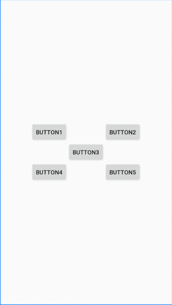
这次的代码复杂一点,但是仍然有规律可循。
android:layout_above属性可以让一个空间位于另一个控件的上方,需要为这个属性指定相对控件id的引用,这里我们填入了@id/button3,表示让该控件位于Button3的上方。其他的属性也都是相似的。android:layout_below表示让一个控件位于另一个控件的下方,android:layout_toLeftOf表示让一个控件位于另一个控件的左侧,android:layout
-toRightOf表示让一个控件位于另一个控件的右侧。
注意:当一个控件去引用另一个控件的id时,该控件一定要定义在引用控件的后面,不然会出现找不到id的情况。
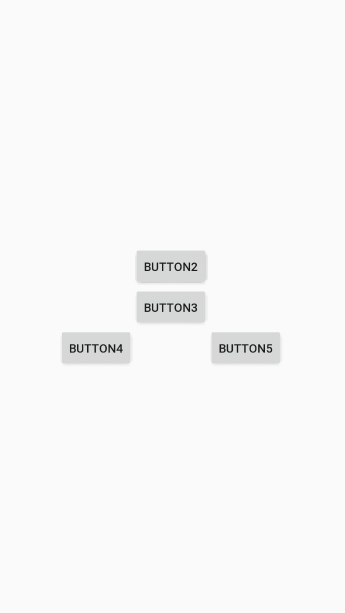
RelativeLayout中还有另外一组相对于控件进行定位的属性,android:layout_alignLeft表示让一个控件的左边缘和另一个控件的左边缘对齐。
此外,还有android:layout_alignTop和android:layout_alignBottom,道理都是一样的。
<RelativeLayout xmlns:android="http://schemas.android.com/apk/res/android"

    android:layout_width="match_parent"
    android:layout_height="match_parent">
    <Button
        android:id="@+id/button1"
        android:layout_width="wrap_content"
        android:layout_height="wrap_content"
        android:layout_above="@+id/button3"
        android:layout_alignLeft="@+id/button3"
        android:text="Button1"
        />
    <Button
    android:id="@+id/button2"
    android:layout_width="wrap_content"
    android:layout_height="wrap_content"
        android:layout_above="@+id/button3"
        android:layout_alignRight="@+id/button3"
    android:text="Button2"
    />
    <Button
        android:id="@+id/button3"
        android:layout_width="wrap_content"
        android:layout_height="wrap_content"
        android:layout_centerInParent="true"
        android:text="Button3"
        />
    <Button
        android:id="@+id/button4"
        android:layout_width="wrap_content"
        android:layout_height="wrap_content"
        android:layout_below="@+id/button3"
        android:layout_toLeftOf="@+id/button3"
        android:text="Button4"
        />
    <Button
        android:id="@+id/button5"
        android:layout_width="wrap_content"
        android:layout_height="wrap_content"
        android:layout_below="@+id/button3"
        android:layout_toRightOf="@+id/button3"
        android:text="Button5"
        />
</RelativeLayout>
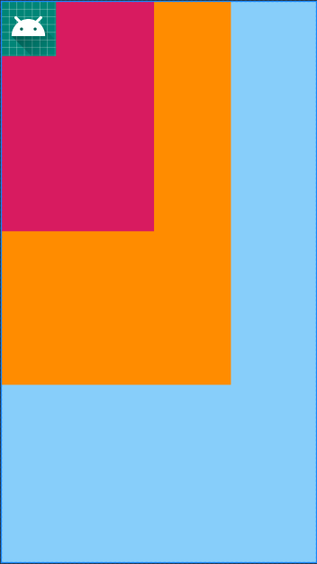
帧布局
FrameLayout又称作帧布局,他相比于前面两种布局就简单太多了。因此它的应用场景也少了很多。这种布局没有方便的定位方式,所有的控件都会默认摆放在布局的左上角。
<?xml version="1.0" encoding="utf-8"?>
<FrameLayout xmlns:android="http://schemas.android.com/apk/res/android"
    android:layout_width="match_parent"
    android:layout_height="match_parent"
    android:background="@color/blue"
    >

    <FrameLayout
        android:layout_width="300dp"
        android:layout_height="500dp"
        android:background="@color/dark_orange">

        <FrameLayout
            android:layout_width="200dp"
            android:layout_height="300dp"
            android:background="@color/colorAccent"
            >

        </FrameLayout>


    </FrameLayout>

    <ImageView
        android:id="@+id/image_view"
        android:layout_width="wrap_content"
        android:layout_height="wrap_content"
        android:src="@mipmap/ic_launcher"
        />

</FrameLayout>
TableLayout
相信学过HTML的朋友都知道,我们可以通过< table >< tr >< td >就可以生成一个HTML的表格, 而Android中也允许我们使用表格的方式来排列组件,就是行与列的方式,就说我们这节的TableLayout! 但却不像我们后面会讲到的Android 4.0后引入的GridLayout(网格)布局一样,直接就可以设置多少行与多少列!
如何确定行数与列数
①如果我们直接往TableLayout中添加组件的话,那么这个组件将占满一行!!!
②如果我们想一行上有多个组件的话,就要添加一个TableRow的容器,把组件都丢到里面!
③tablerow中的组件个数就决定了该行有多少列,而列的宽度由该列中最宽的单元格决定
④tablerow的layout_width属性,默认是fill_parent的,我们自己设置成其他的值也不会生效!!! 但是layout_height默认是wrapten——content的,我们却可以自己设置大小!
⑤整个表格布局的宽度取决于父容器的宽度(占满父容器本身)
⑥有多少行就要自己数啦,一个tablerow一行,一个单独的组件也一行!多少列则是看tableRow中 的组件个数,组件最多的就是TableLayout的列数
三个常用属性
android:collapseColumns:设置需要被隐藏的列的序号
android:shrinkColumns:设置允许被收缩的列的列序号
android:stretchColumns:设置运行被拉伸的列的列序号
以上这三个属性的列号都是从0开始算的,比如shrinkColunmns = “2”,对应的是第三列!
可以设置多个,用逗号隔开比如”0,2″,如果是所有列都生效,则用”*”号即可
除了这三个常用属性,还有两个属性,分别就是跳格子以及合并单元格,这和HTML中的Table类似:
android:layout_column=“2”:表示的就是跳过第二个,直接显示到第三个格子处,从1开始算的!
android:layout_span=“4”:表示合并4个单元格,也就说这个组件占4个单元格
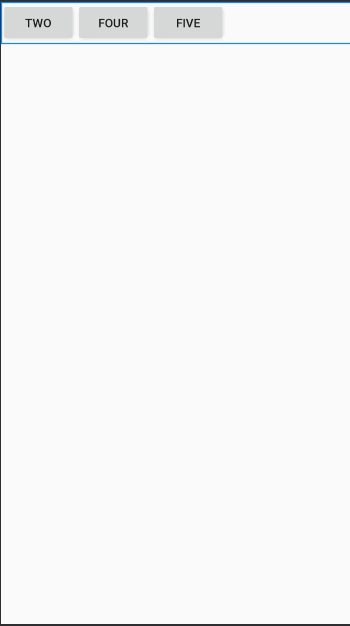
collapseColumns(隐藏列)
<?xml version="1.0" encoding="utf-8"?>
<TableLayout android:id="@+id/TableLayout2"
    android:layout_width="fill_parent"
    android:layout_height="wrap_content"
    android:collapseColumns="0,2"
    xmlns:android="http://schemas.android.com/apk/res/android">

<TableRow>

    <Button
        android:layout_width="wrap_content"
        android:layout_height="wrap_content"
        android:text="one" />

    <Button
        android:layout_width="wrap_content"
        android:layout_height="wrap_content"
        android:text="two" />

    <Button
        android:layout_width="wrap_content"
        android:layout_height="wrap_content"
        android:text="three" />

    <Button
        android:layout_width="wrap_content"
        android:layout_height="wrap_content"
        android:text="four" />

    <Button
        android:layout_width="wrap_content"
        android:layout_height="wrap_content"
        android:text="five" />
</TableRow>
    </TableLayout>
stretchColumns(拉伸列)
流程:在TableLayout中设置了四个按钮,接着在最外层的TableLayout中添加以下属性: android:stretchColumns = “1”
设置第二列为可拉伸列,让该列填满这一行所有的剩余空间,代码如下:
<TableLayout
    android:id="@+id/TableLayout2"
    android:layout_width="fill_parent"
    android:layout_height="wrap_content"
    android:shrinkColumns="1" >

    <TableRow>

        <Button
            android:layout_width="wrap_content"
            android:layout_height="wrap_content"
            android:text="one" />

        <Button
            android:layout_width="wrap_content"
            android:layout_height="wrap_content"
            android:text="two" />

        <Button
            android:layout_width="wrap_content"
            android:layout_height="wrap_content"
            android:text="three" />

        <Button
            android:layout_width="wrap_content"
            android:layout_height="wrap_content"
            android:text="four" />

        <Button
            android:layout_width="wrap_content"
            android:layout_height="wrap_content"
            android:text="five" />

        <TextView
            android:layout_width="wrap_content"
            android:layout_height="wrap_content"
            android:text="文本XX" />
    </TableRow>
</TableLayout>
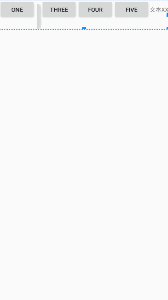
从图中我们可以看到two这个按钮被挤压成条条状,这个就是收缩,为了保证表格能适应 父容器的宽度!至于另外两个属性就不讲解了,用法和HTML相同!有兴趣的可以研究下!
绝对布局AbsoluteLayout(不常用想学的可以看这篇)
网格布局GridLayout
| 属性 | 作用 |
|---|---|
| android:columnCount | 最大列数 |
| android:rowCount | 最大行数 |
| android:orientation | GridLayout中子元素的布局方向 |
| android:alignmentMode | alignBounds:对齐子视图边界 alignMargins :对齐子视距内容,默认值 |
| android:columnOrderPreserved | 使列边界显示的顺序和列索引的顺序相同,默认是true |
| android:rowOrderPreserved | 使行边界显示的顺序和行索引的顺序相同,默认是true |
| android:useDefaultMargins | 没有指定视图的布局参数时使用默认的边距,默认值是false |
item属性
| 属性 | 作用 |
|---|---|
| android:layout_column | 指定该单元格在第几列显示 |
| android:layout_row | 指定该单元格在第几行显示 |
| android:layout_columnSpan | 指定该单元格占据的列数 |
| android:layout_rowSpan | 指定该单元格占据的行数 |
| android:layout_gravity | 指定该单元格在容器中的位置 |
| android:layout_columnWeight | (API21加入)列权重 |
| android:layout_rowWeight | (API21加入) 行权重 |
| android:layout_gravity | 作用 |
|---|---|
| center | 不改变元素的大小,仅居中 |
| center_horizontal | 不改变大小,水平居中 |
| center_vertical | 不改变大小,垂直居中 |
| top | 不改变大小,置于顶部 |
| left | 不改变大小,置于左边 |
| bottom | 不改变大小,置于底部 |
| right | 不改变大小,置于右边 |
| start | 不改变大小,根据系统语言,置于开始位置 |
| end | 不改变大小,置于结尾 |
| fill | 拉伸元素控件,填满其应该所占的格子 |
| fill_vertical | 仅垂直方向上拉伸填充 |
| fill_horizontal | 仅水平方向上拉伸填充 |
| clip_vertical | 垂直方向上裁剪元素,仅当元素大小超过格子的空间时 |
| clip_horizontal | 水平方向上裁剪元素,仅当元素大小超过格子的空间时 |
注意
使用layout_columnSpan 、layout_rowSpan时要加上layout_gravity属性,否则没有效果;另外item在边缘时宽高计算会出现错误,需要我们手动设置宽高,否则达不到想要的效果
实例:
<?xml version="1.0" encoding="utf-8"?>
<GridLayout xmlns:android="http://schemas.android.com/apk/res/android"

    android:id="@+id/GridLayout1"
    android:layout_width="wrap_content"
    android:layout_height="wrap_content"
    android:columnCount="4"
    android:orientation="horizontal"
    android:rowCount="6" >

    <TextView
        android:layout_columnSpan="4"
        android:layout_gravity="fill"
        android:layout_marginLeft="5dp"
        android:layout_marginRight="5dp"
        android:background="#FFCCCC"
        android:text="0"
        android:textSize="50sp" />

    <Button
        android:layout_columnSpan="2"
        android:layout_gravity="fill"
        android:text="回退" />

    <Button
        android:layout_columnSpan="2"
        android:layout_gravity="fill"
        android:text="清空" />

    <Button android:text="+" />

    <Button android:text="1" />

    <Button android:text="2" />

    <Button android:text="3" />

    <Button android:text="-" />

    <Button android:text="4" />

    <Button android:text="5" />

    <Button android:text="6" />

    <Button android:text="*" />

    <Button android:text="7" />

    <Button android:text="8" />

    <Button android:text="9" />

    <Button android:text="/" />

    <Button
        android:layout_width="wrap_content"
        android:text="." />

    <Button android:text="0" />

    <Button android:text="=" />

</GridLayout>
发布者:全栈程序员-站长,转载请注明出处:https://javaforall.net/137097.html原文链接:https://javaforall.net


