
首先要导入mayplotlib,是一个类似于matlab的工具包。
一.认识matplotlib
在任何绘图之前,我们需要一个Figure对象,可以理解成我们需要一张画板才能开始绘图。在拥有Figure对象之后,在作画前我们还需要轴,没有轴的话就没有绘图基准,所以需要添加Axes。
import matplotlib.pyplot as plt
fig = plt.figure()
ax = fig.add_subplot(111)
ax.set(xlim=[0.5, 4.5], ylim=[-2, 8], title=’An Example Axes’,
ylabel=’Y-Axis’, xlabel=’X-Axis’)
plt.show()
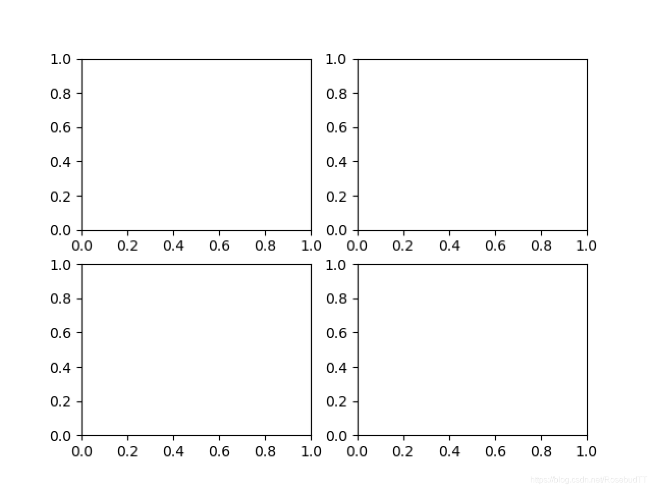
在处理复杂的绘图工作时,需要使用 Axes 来完成作画
fig = plt.figure()
ax1 = fig.add_subplot(221)
ax2 = fig.add_subplot(222)
ax3 = fig.add_subplot(223)
ax4 = fig.add_subplot(224)
fig, axes = plt.subplots(nrows=2, ncols=2)
axes[0,0].set(title=’Upper Left’)
axes[0,1].set(title=’Upper Right’)
axes[1,0].set(title=’Lower Left’)
axes[1,1].set(title=’Lower Right’)

二.多种绘图方式
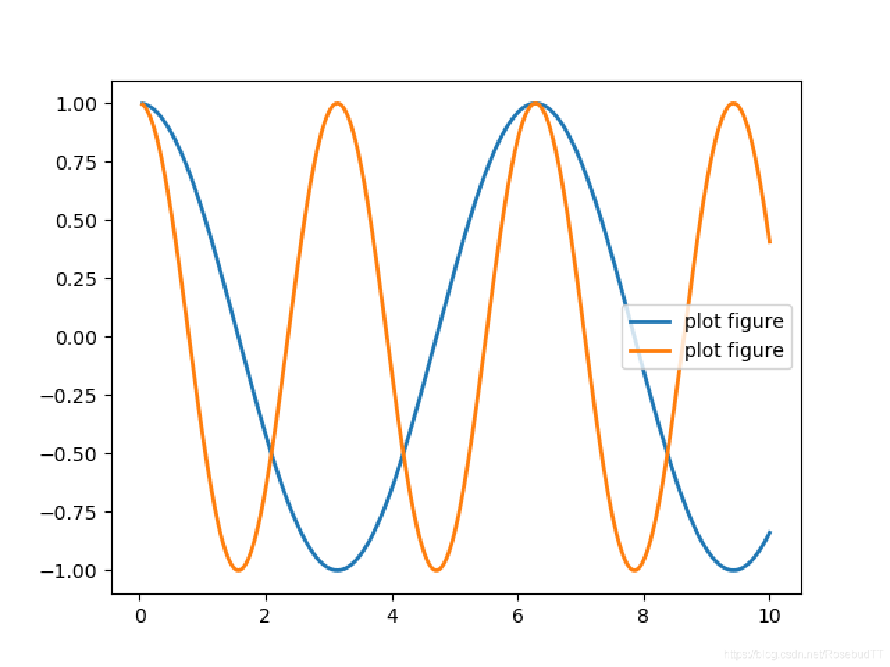
1.plot二维图
用linespace生成一组等间隔数据
import matplotlib.pyplot as plt
import numpy as np
x = np.linspace(0.05, 10, 1000)
y = np.cos(x)
z=np.cos(2*x)
plt.plot(x, y, x,z,ls=”-“, lw=2, label=”plot figure”)
plt.legend()
plt.show()
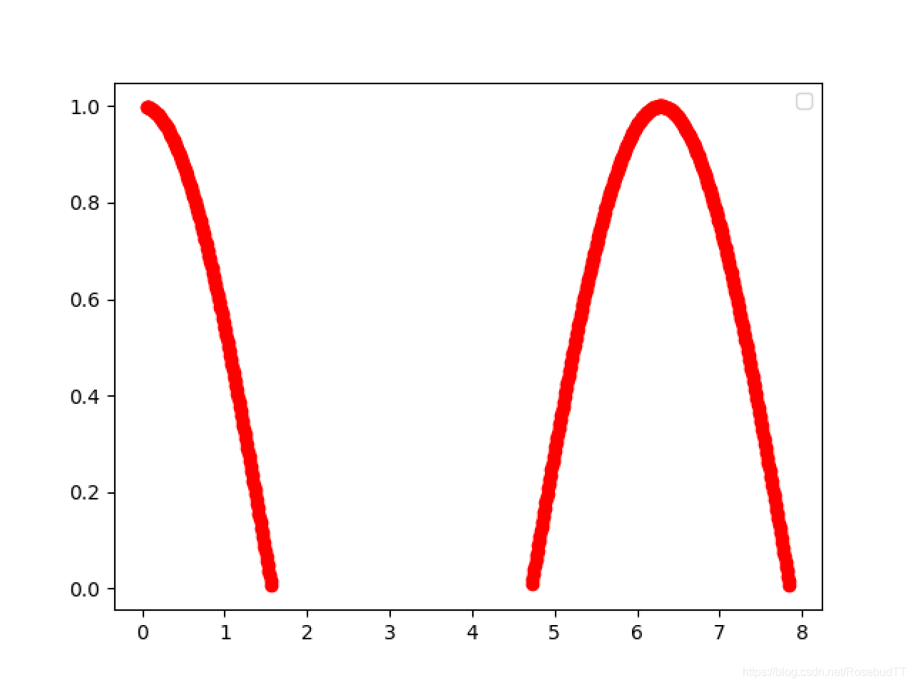
进一步从数组中选择元素
mask=y>=0 //产生一组bool值
plt.plot(x[mask],y[mask],’ro-‘) //参数例如颜色,线条等和matlab基本类似
plt.legend()
plt.show()
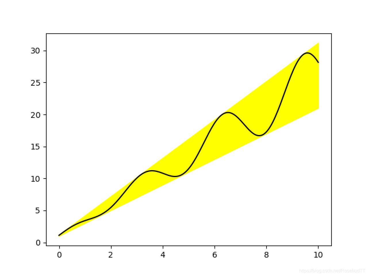
以通过关键字参数的方式绘图
x = np.linspace(0, 10, 200)
data_obj = {‘x’: x,
‘y1’: 2 * x + 1,
‘y2’: 3 * x + 1.2,
‘mean’: 0.5 * x * np.cos(2*x) + 2.5 * x + 1.1}
fig, ax = plt.subplots()
#填充两条线之间的颜色
ax.fill_between(‘x’, ‘y1’, ‘y2′, color=’yellow’, data=data_obj)
ax.plot(‘x’, ‘mean’, color=’black’, data=data_obj)
plt.show()
2.scatter散点图
只画点,但是不用线连接起来。
x = np.arange(10) //arange函数用于创建等差数组,返回array对象
y = np.random.randn(10)
plt.scatter(x, y, color=’black’, marker=’o’)
plt.show()

np.random.seed()
N = 50
x = np.random.rand(N)
y = np.random.rand(N)
colors = np.random.rand(N)
area = (30 * np.random.rand(N))2 # 0 to 15 point radii
plt.scatter(x, y, s=area, c=colors, alpha=0.5)
plt.show()

3.条形图
np.random.seed(1)
x = np.arange(5)
y = np.random.randn(5)
fig, axes = plt.subplots(ncols=2, figsize=plt.figaspect(1./2))
vert_bars = axes[0].bar(x, y, color=’black’, align=’center’)
horiz_bars = axes[1].barh(x, y, color=’blue’, align=’center’)
#在水平或者垂直方向上画线
#plt.axhline(y=0.0, c=”r”, ls=”–“, lw=2)
#y:水平参考线的出发点,c:参考线的线条颜色,ls:参考线的线条风格,lw:参考线的线条宽度
axes[0].axhline(0, color=’gray’, linewidth=2)
axes[1].axvline(0, color=’gray’, linewidth=2)
plt.show()

条形图还返回了一个Artists 数组,对应着每个条形,例如上图 Artists 数组的大小为5,我们可以通过这些 Artists 对条形图的样式进行更改,如下例:
ig, ax = plt.subplots()
vert_bars = ax.bar(x, y, color=’lightblue’, align=’center’)
# We could have also done this with two separate calls to `ax.bar` and numpy boolean indexing.
#zip() 函数用于将可迭代的对象作为参数,将对象中对应的元素打包成一个个元组,然后返回由这些元组组成的列表。
for bar, height in zip(vert_bars, y):
if height < 0:
bar.set(edgecolor=’darkred’, color=’salmon’, linewidth=3)
plt.show()

堆积图:
x=np.arange(5)#给出在y轴上的位置
y=np.array([5,4,7,2,9])#给出具体每个直方图的数值
y1=np.array([3,5,2,4,10])#给出第二组直方图信息
y2=np.array([3,4,6,2,5])#给出第三组数据
plt.bar(x,y,label=’workday’)
plt.bar(x,y1,bottom=y,label=’weekend’)
plt.bar(x,y2,bottom=y+y1,label=’Christmas’)
plt.legend()#列出图例
plt.show()

需要注意的是x,y1,y2即数据来源最好使用np.ndarray格式的数据,普通的python列表数据很可能失败报错。其中将python list数据转为np.ndarray的方式为
list_a=[1,2,3,4]
list_b=np.array(list_a)
4.直方图
用于统计数据出现的次数或者频率,有多种参数可以调整,主要用hist()函数
np.random.seed()
n_bins = 10
x = np.random.randn(1000, 3)
fig, axes = plt.subplots(nrows=2, ncols=2)
#flatten()用于将二维数组转化成一维,只用于array和mat
ax0, ax1, ax2, ax3 = axes.flatten()
colors = [‘red’, ‘tan’, ‘lime’]
#hist()函数参数设置,density控制Y轴是概率还是数量
ax0.hist(x, n_bins, density=True, histtype=’bar’, color=colors, label=colors)
ax0.legend(prop={‘size’: 10})
ax0.set_title(‘bars with legend’)
ax1.hist(x, n_bins, density=True, histtype=’barstacked’)
ax1.set_title(‘stacked bar’)
ax2.hist(x, histtype=’barstacked’, rwidth=0.9)
ax3.hist(x[:, 0], rwidth=0.9)
ax3.set_title(‘different sample sizes’)
fig.tight_layout()
plt.show()

5.饼图
autopct=%1.1f%%
表示格式化百分比精确输出,
explode
,突出某些块,不同的值突出的效果不一样。
pctdistance=1.12
百分比距离圆心的距离,默认是0.6.
labels = ‘Math’, ‘English’, ‘Physics’, ‘Chemistry’
sizes = [15, 30, 45, 10]
explode = (0, 0.1, 0, 0) # only “explode” the 2nd slice (i.e. ‘Hogs’)
fig1, (ax1, ax2) = plt.subplots(2)
ax1.pie(sizes, labels=labels, autopct=’%1.1f%%’, shadow=True)
ax1.axis(‘equal’)
ax2.pie(sizes, autopct=’%1.2f%%’, shadow=True, startangle=90, explode=explode,
pctdistance=1.12)
ax2.axis(‘equal’)
ax2.legend(labels=labels, loc=’upper right’)
plt.show()

6.网格图:
X,Y = numpy.meshgrid(x, y)
输入的
x
,
y
,就是
网格点
的横纵坐标列向量(非矩阵)
输出的
X
,
Y
,就是
坐标矩阵
。
ret = np.mgrid[ 第1维,第2维 ,第3维 , …]
返回多值,以多个矩阵的形式返回,
第1返回值为第1维数据在最终结构中的分布,
第2返回值为第2维数据在最终结构中的分布,以此类推。
import matplotlib.pyplot as plt
from mpl_toolkits.mplot3d import Axes3D
x = np.arange(-5, 5, 0.1)
y = np.arange(-5, 5, 0.1)
xx, yy = np.meshgrid(x, y ) # 转换成二维的矩阵坐标
fig = plt.figure(1, figsize=(12, 8))
zz = (xx2 + yy2)
ax = fig.add_subplot(2, 2, 1, projection=’3d’)
ax.set_top_view()
ax.plot_surface(xx, yy, zz, rstride=1, cstride=1, cmap=’rainbow’)
plt.show()

7.轮廓图:
机器学习用的决策边界也常用轮廓图来绘画
contourf会填充轮廓线之间的颜色。数据x, y, z通常是具有相同 shape 的二维矩阵。x, y 可以为一维向量,但是必需有 z.shape = (y.n, x.n) ,这里 y.n 和 x.n 分别表示x、y的长度。Z通常表示的是距离X-Y平面的距离,传入X、Y则是控制了绘制等高线的范围。
fig, (ax1, ax2) = plt.subplots(2)
x = np.arange(-5, 5, 0.1)
y = np.arange(-5, 5, 0.1)
xx, yy = np.meshgrid(x, y, sparse=True)
z = np.sin(xx2 + yy2) / (xx2 + yy2)
ax1.contourf(x, y, z)
ax2.contour(x, y, z)

三.布局,图例说明等
1.区间上下限
ax.set_xlim([xmin, xmax]) #设置X轴的区间
ax.set_ylim([ymin, ymax]) #Y轴区间
ax.axis([xmin, xmax, ymin, ymax]) #X、Y轴区间
ax.set_ylim(bottom=-10) #Y轴下限
ax.set_xlim(right=25) #X轴上限
2.图例说明
fig, ax = plt.subplots()
ax.plot([1, 2, 3, 4], [10, 20, 25, 30], label=’Philadelphia’)
ax.plot([1, 2, 3, 4], [30, 23, 13, 4], label=’Boston’)
ax.scatter([1, 2, 3, 4], [20, 10, 30, 15], label=’Point’)
ax.set(ylabel=’Temperature (deg C)’, xlabel=’Time’, title=’A tale of two cities’)
#加标题,x,y轴标签
ax.set_title(“title”);
ax.set_xlabel(“x”)
ax.set_ylabel(“y”);
ax.legend() //显示条例说明,legend()自身也可以设置
plt.show()
3.区间分段
data = [(‘apples’, 2), (‘oranges’, 3), (‘peaches’, 1)]
fruit, value = zip(*data)
fig, (ax1, ax2) = plt.subplots(2)
x = np.arange(len(fruit))
ax1.bar(x, value, align=’center’, color=’gray’)
ax2.bar(x, value, align=’center’, color=’gray’)
ax2.set(xticks=x, xticklabels=fruit)
#ax.tick_params(axis=’y’, direction=’inout’, length=10) #修改 ticks 的方向以及长度
plt.show()

4.布局
fig, axes = plt.subplots(2, 2, figsize=(9, 9))
#水平之间的间隔wspace,垂直方向上的间距hspace,左边距left等等,这里数值都是百分比的
fig.subplots_adjust(wspace=0.5, hspace=0.3,
left=0.125, right=0.9,
top=0.9, bottom=0.1)
#fig.tight_layout() #自动调整布局,使标题之间不重叠
plt.show()
可以调整使他们使用一样的X、Y轴:
fig, (ax1, ax2) = plt.subplots(1, 2, sharex=True, sharey=True)
5.轴相关
fig, ax = plt.subplots()
ax.plot([-2, 2, 3, 4], [-10, 20, 25, 5])
ax.spines[‘top’].set_visible(False) #顶边界不可见
ax.xaxis.set_ticks_position(‘bottom’) # ticks 的位置为下方,分上下的。
ax.spines[‘right’].set_visible(False) #右边界不可见
ax.yaxis.set_ticks_position(‘left’)
# “outward”
# 移动左、下边界离 Axes 10 个距离
#ax.spines[‘bottom’].set_position((‘outward’, 10))
#ax.spines[‘left’].set_position((‘outward’, 10))
# “data”
# 移动左、下边界到 (0, 0) 处相交
ax.spines[‘bottom’].set_position((‘data’, 0))
ax.spines[‘left’].set_position((‘data’, 0))
# “axes”
# 移动边界,按 Axes 的百分比位置
#ax.spines[‘bottom’].set_position((‘axes’, 0.75))
#ax.spines[‘left’].set_position((‘axes’, 0.3))
#ax.spines[‘left’].set_color(‘red’)
#ax.spines[‘left’].set_linewidth(2)
plt.show()

也可以将轴的刻度设置成对数刻度,调用 set_xscale 与 set_yscale 设置刻度,参数选择 “log”
或者改变刻度
fig, axes = plt.subplots(1, 2, figsize=(10,4))
axes[0].plot(x, x2, x, exp(x))
axes[0].set_title(“Normal scale”)
axes[1].plot(x, x2, x, exp(x))
axes[1].set_yscale(“log”)
axes[1].set_yticks([0, 50, 100, 150])
axes[1].set_title(“Logarithmic scale (y)”)
发布者:全栈程序员-站长,转载请注明出处:https://javaforall.net/210686.html原文链接:https://javaforall.net