
说到圣杯布局和双飞翼布局,始终都是面试的高频考点,问题方式也大同小异,比如,实现一个左右固定,中间自适应的布局;实现一个中间部分优先加载的布局……
现如今,很多web端的应用,他们的布局方式都是圣杯布局和双飞翼布局,既然用到的这么多,那么,双飞翼布局是如何实现的呢?带着这个问题,咱们一起把他说道说道
双飞翼布局的实现方式一、(position+margin+float)
首先我们从上面简介部分得知,双飞翼布局是一个两边固定,中间自适应的布局,并且中间部分还可以优先加载,那么从此条消息中,我们可以构想出一个HTML结构,结构如下
header
center
left
right
下面我们来一步步实现css部分
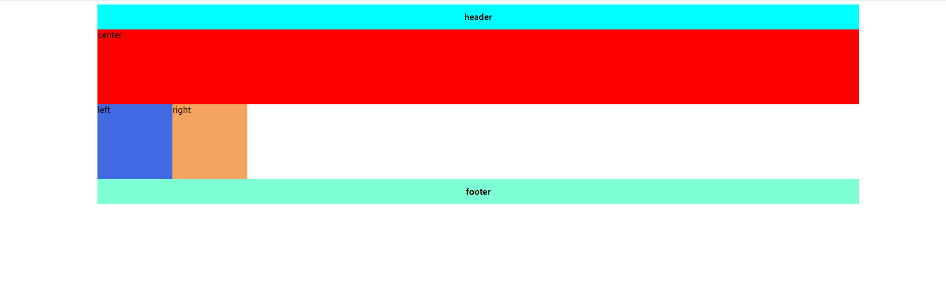
1. 首先我们把基础的东西写好 ,在这里为了样式的好看,将box容器的宽度调整到了80%,并用margin-left给他实现了居中(其中实现居中的方式有很多很多很多种,对居中不太熟悉的同学可以自行百度下)
.box { width: 80%; margin-left: 10%; } .header { width: 100%; height: 50px; text-align: center; line-height: 50px; background-color: aqua; font-weight: 600; } .footer { clear: both; width: 100%; height: 50px; text-align: center; line-height: 50px; background-color: aquamarine; font-weight: 600; } .main { height: 150px; } .center { width: 100%; height: 150px; background-color: red; } .left { width: 150px; height: 150px; background-color: royalblue; } .right { width: 150px; height: 150px; background-color: sandybrown; } 效果图:


注意:center的宽度一定要设置为100%
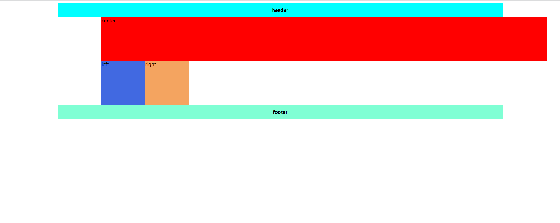
2. 让center,left,right都设置为左浮动。这时因为center设置了宽度100%,所以left和right被“挤”到了下面
.box { width: 80%; margin-left: 10%; } .header { width: 100%; height: 50px; text-align: center; line-height: 50px; background-color: aqua; font-weight: 600; } .footer { clear: both; width: 100%; height: 50px; text-align: center; line-height: 50px; background-color: aquamarine; font-weight: 600; } .main { height: 150px; } .center { float: left; width: 100%; height: 150px; background-color: red; } .left { float: left; width: 150px; height: 150px; background-color: royalblue; } .right { float: left; width: 150px; height: 150px; background-color: sandybrown; } 效果图:
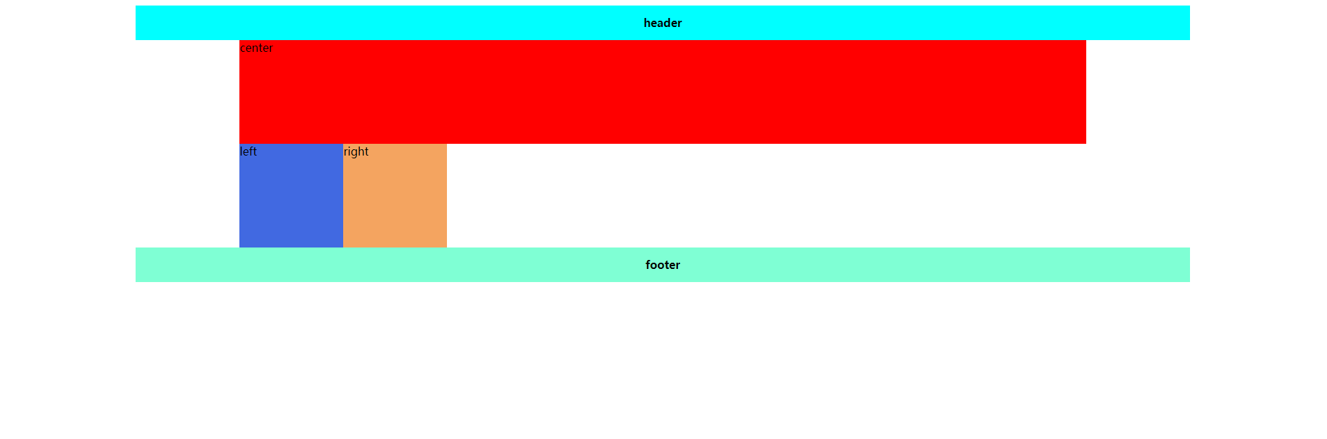
3. 现在我们项让left和right变到上面去,即跟center在同一行,但是呢,center的宽度为100% ,没有left和right的空间了,怎么办呢?我们可以先通过给main加padding,把left和right的空间预留出来,这里有一个需要注意的点。如果一个元素,同时设置了width和padding的话,盒子的总宽度会增加,什么意思呢,看下面这张图
代码:
.main { height: 150px; width: 100%; padding: 0 150px; } /* 这里相对于上面的代码,我只对main进行了更改 */效果图:
但是呢,如果只存在padding,没有width的话,效果图是这样的
对于padding和width的关系。不懂的同学可以自行百度查一下(博主有点懒。。。。),到这里,是不是发现,我们已经预留出来了right和left的位置!!
4. 我们将left和right移动到我们预留出来的位置,这里用到了-margin
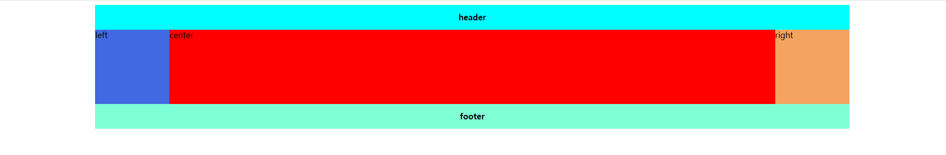
.box { width: 80%; margin-left: 10%; } .header { width: 100%; height: 50px; text-align: center; line-height: 50px; background-color: aqua; font-weight: 600; } .footer { clear: both; width: 100%; height: 50px; text-align: center; line-height: 50px; background-color: aquamarine; font-weight: 600; } .main { height: 150px; padding: 0 150px; } .center { float: left; width: 100%; height: 150px; background-color: red; } .left { float: left; margin-left: -100%; width: 150px; height: 150px; background-color: royalblue; } float: left; margin-left: -150px; width: 150px; height: 150px; background-color: sandybrown; } 效果图:
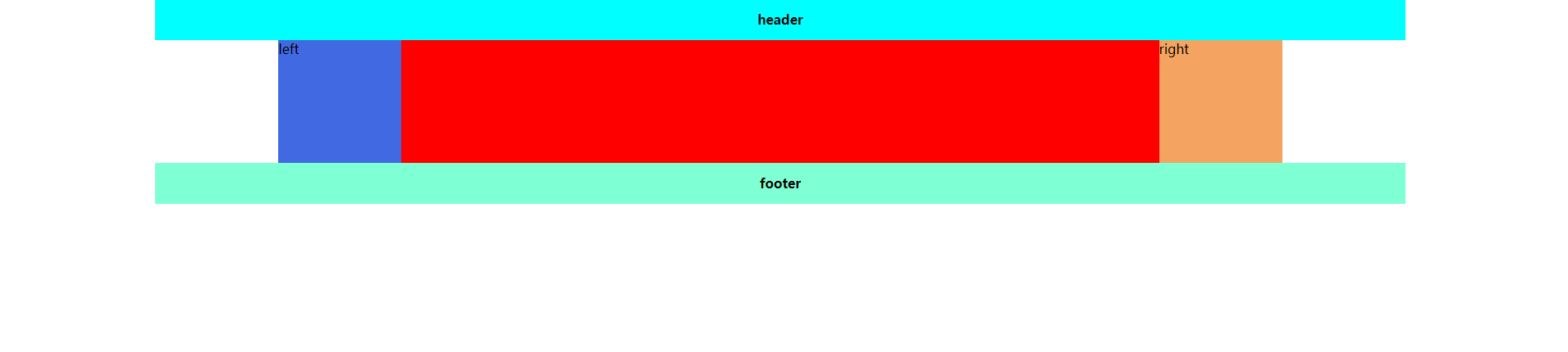
这里,同学有没有发现一个问题,left和right把center的左右两端挡住了(center这个文案不见了),思考下怎么解决,答案马上揭晓
是的!!!就是position属性,给他加定位!!!分别向左向右移动自身大小!!!
最终代码如下
.box { width: 80%; margin-left: 10%; } .header { width: 100%; height: 50px; text-align: center; line-height: 50px; background-color: aqua; font-weight: 600; } .footer { clear: both; width: 100%; height: 50px; text-align: center; line-height: 50px; background-color: aquamarine; font-weight: 600; } .main { height: 150px; padding: 0 150px; } .center { float: left; width: 100%; height: 150px; background-color: red; } .left { position: relative; left: -150px; float: left; margin-left: -100%; width: 150px; height: 150px; background-color: royalblue; } .right { position: relative; left: 150px; float: left; margin-left: -150px; width: 150px; height: 150px; background-color: sandybrown; } 效果图:
到这里,一个两边固定,中间自适应,并且中间优先加载的双飞翼布局就完成了!!!!!!
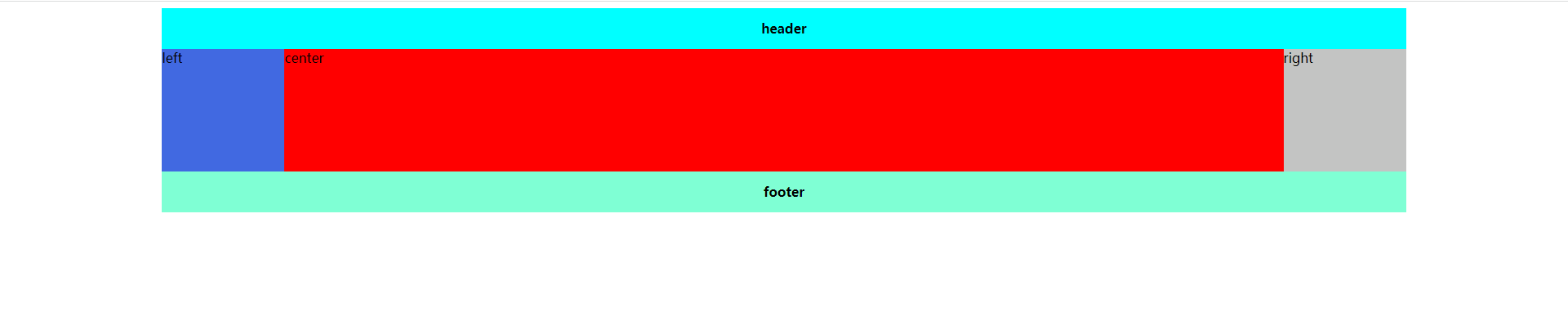
双飞翼布局的实现方式二、(flex)
其实,flex布局很简单,因为flex本身的定义就是弹性盒,他有一个属性flex:1,就是专门解决自适应问题的,如果对flex不熟悉的同学可以戳 flex:1是什么?_CSDN_156的博客-CSDN博客 这篇文章(别问为什么这里有链接,问就是博主给自己做宣传哈哈哈哈哈哈~),废话不多说,代码如下
.box { width: 80%; margin-left: 10%; } .header { width: 100%; height: 50px; text-align: center; line-height: 50px; background-color: aqua; font-weight: 600; } .footer { clear: both; width: 100%; height: 50px; text-align: center; line-height: 50px; background-color: aquamarine; font-weight: 600; } .main { height: 150px; display: flex; } .center { flex: 1; display: flex; background-color: red; } .left { /* order order默认为0,不起作用,从小到大排序,1在前,以此类推 */ order: -1; flex-basis: 150px; background-color: royalblue; } .right { flex-basis: 150px; background-color: rgb(195, 196, 195); } 效果图:
最后!有哪位好心的同学能教教我CSDN怎么放GIF的动图呢,可以私信教教我!!感激不尽
the last, 创作不易,如果这篇文章对您有些许帮助,请留下您的赞~感激不尽!!!
深夜创作,临表涕零,不知所言~~
发布者:全栈程序员-站长,转载请注明出处:https://javaforall.net/213022.html原文链接:https://javaforall.net


