
欢迎关注微信公众号《生信修炼手册》!
line plot在circos中的用法比较简单,示例如下:


对于折线图而言,调整外观的属性有以下4个
1. thickness
thickness 控制线条的粗细
2. color
color 控制线条的颜色
3. fill_color
fill_color控制填充色,在折线的下方进行颜色填充
4. max_gap
在直线图中,会看到如下所示的分割线,max_gap的作用就是设置分割线的间距,max_gap = 1u 代表每隔1个单位画一条分割线,其用法和ticks类似

控制位置的属性在前面的文章中我们已经介绍过了,这里在重复一遍。
r0和r1分别设置圆环的内径和外径,max和min设置y轴的最大值和最小值,orientation控制y轴0点的位置,orientation = in代表 y = 0 位于r1上;orientation = out表示y = 0位于r0 上;z代表优先级,数值越大,优先级越高,当两个折线图重叠时,优先级高的会有先显示。
与backgrounds, axes, rules的结合使用,在scatter plot中,我们也介绍过了,今天解锁一种axes的新用法,代码如下
在之前的文章中,我们看到了用y0, y1指定范围,再用spacing参数设定间隔的用法, 这种用法可以方便的设置多条轴线;今天的这个例子中,通过position直接设置轴线的位置,适合指定单条轴线。
最后放一张line plot的示例,在下图中,除去染色体外,包括3个line plot; 最内圈的line plot有3种填充色,背景色也有3种,另外两圈的line plot中,其axes的定义就是使用了position的用法,可以看到其轴线非常少,只有2,3条;最内圈的line plot的轴线则采用spacing的用法,其轴线非常多,而且均匀分布

完整代码如下
<
> <
> <
>
![]() <
<
>
karyotype = data/karyotype/karyotype.human.txt chromosomes_units = 1000000 chromosomes = hs1 # ;hs2;hs3 chromosomes_display_default = no
type = line thickness = 2
max_gap = 1u file = data/6/snp.density.250kb.txt color = vdgrey min = 0 max = 0.015 r0 = 0.5r r1 = 0.8r fill_color = vdgrey_a3
color = vvlgreen y0 = 0.006
color = vvlred y1 = 0.002
color = lgrey_a2 thickness = 1 spacing = 0.025r
condition = var(value) > 0.006 color = dgreen fill_color = dgreen_a1
condition = var(value) < 0.002 color = dred fill_color = dred_a1
# outside the circle, oriented out
max_gap = 1u file = data/6/snp.density.txt color = black min = 0 max = 0.015 r0 = 1.075r r1 = 1.15r thickness = 1 fill_color = black_a4
color = lgreen thickness = 2 position = 0.006
color = lred thickness = 2 position = 0.002
z = 5 max_gap = 1u file = data/6/snp.density.1mb.txt color = red fill_color = red_a4 min = 0 max = 0.015 r0 = 1.075r r1 = 1.15r
# same plot, but inside the circle, oriented in
max_gap = 1u file = data/6/snp.density.txt color = black fill_color = black_a4 min = 0 max = 0.015 r0 = 0.85r r1 = 0.95r thickness = 1 orientation = in
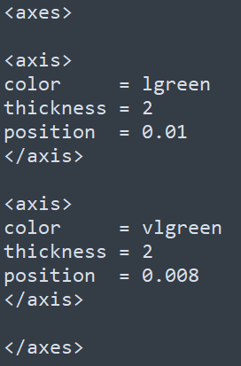
color = lgreen thickness = 2 position = 0.01
color = vlgreen thickness = 2 position = 0.008
color = vlgreen thickness = 2 position = 0.006
color = red thickness = 2 position = 0.002
z = 5 max_gap = 1u file = data/6/snp.density.1mb.txt color = red fill_color = red_a4 min = 0 max = 0.015 r0 = 0.85r r1 = 0.95r orientation = in
<
>
发布者:全栈程序员-站长,转载请注明出处:https://javaforall.net/229000.html原文链接:https://javaforall.net