
大家好,又见面了,我是你们的朋友全栈君。
本文翻译自:Understanding offsetWidth, clientWidth, scrollWidth and -Height, respectively
There are several questions on StackOverflow regarding offsetWidth/clientWidth/scrollWidth (and -Height, respectively), but none give comprehensive explanation of what those values are. StackOverflow上有几个关于offsetWidth / clientWidth / scrollWidth(和-Height)的问题,但没有一个问题可以全面解释这些值是什么。
Also, there are several sources on the web giving confusing or incorrect information. 此外,网上有几个来源,提供令人困惑或不正确的信息。
Can you give a complete explanation including some visual hints? 你能给出一个完整的解释,包括一些视觉提示吗? Also, how can those values be used to calculate scroll bar widths? 另外,如何使用这些值来计算滚动条宽度?
#1楼
参考:https://stackoom.com/question/1QNjZ/分别了解offsetWidth-clientWidth-scrollWidth和-Height
#2楼
The CSS box model is rather complicated, particularly when it comes to scrolling content. CSS框模型相当复杂,特别是在滚动内容时。 While the browser uses the values from your CSS to draw boxes, determining all the dimensions using JS is not straight-forward if you only have the CSS. 虽然浏览器使用CSS中的值来绘制框,但如果只有CSS,则使用JS确定所有维度并不是直截了当的。
That’s why each element has six DOM properties for your convenience: offsetWidth , offsetHeight , clientWidth , clientHeight , scrollWidth and scrollHeight . 这就是为什么每个元素为方便起见都有六个DOM属性: offsetWidth , offsetHeight , clientWidth , clientHeight , scrollWidth和scrollHeight 。 These are read-only attributes representing the current visual layout, and all of them are integers (thus possibly subject to rounding errors). 这些是表示当前可视布局的只读属性,并且它们都是整数 (因此可能会出现舍入错误)。
Let’s go through them in detail: 让我们详细介绍一下:
-
offsetWidth,offsetHeight: The size of the visual box incuding all borders.offsetWidth,offsetHeight:包含所有边框的可视框的大小。 Can be calculated by addingwidth/heightand paddings and borders, if the element hasdisplay: block如果元素有display: block,可以通过添加width/height以及填充和边框来计算 -
clientWidth,clientHeight: The visual portion of the box content, not including borders or scroll bars , but includes padding .clientWidth,clientHeight:框内容的可视部分,不包括边框或滚动条,但包括填充。 Can not be calculated directly from CSS, depends on the system’s scroll bar size. 无法直接从CSS计算,取决于系统的滚动条大小。 -
scrollWidth,scrollHeight: The size of all of the box’s content, including the parts that are currently hidden outside the scrolling area.scrollWidth,scrollHeight:所有框内容的大小,包括当前隐藏在滚动区域外的部分。 Can not be calculated directly from CSS, depends on the content. 无法直接从CSS计算,取决于内容。


Try it out: jsFiddle 尝试一下: jsFiddle
Since offsetWidth takes the scroll bar width into account, we can use it to calculate the scroll bar width via the formula 由于offsetWidth考虑了滚动条宽度,我们可以使用它来通过公式计算滚动条宽度
scrollbarWidth = offsetWidth - clientWidth - getComputedStyle().borderLeftWidth - getComputedStyle().borderRightWidth
Unfortunately, we may get rounding errors, since offsetWidth and clientWidth are always integers, while the actual sizes may be fractional with zoom levels other than 1. 不幸的是,我们可能会得到舍入错误,因为offsetWidth和clientWidth总是整数,而实际大小可能是小于1而不是1的缩放级别。
Note that this 请注意这一点
scrollbarWidth = getComputedStyle().width + getComputedStyle().paddingLeft + getComputedStyle().paddingRight - clientWidth
does not work reliably in Chrome, since Chrome returns width with scrollbar already substracted. 在Chrome中无法正常运行,因为Chrome返回width ,滚动条已经减去。 (Also, Chrome renders paddingBottom to the bottom of the scroll content, while other browsers don’t) (另外,Chrome将paddingBottom渲染到滚动内容的底部,而其他浏览器则不会)
#3楼
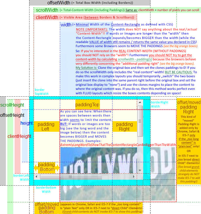
If you want to use scrollWidth to get the “REAL” CONTENT WIDTH/HEIGHT (as content can be BIGGER than the css-defined width/height-Box) the scrollWidth/Height is very UNRELIABLE as some browser seem to “MOVE” the paddingRIGHT & paddingBOTTOM if the content is to big. 如果你想使用scrollWidth来获得“REAL” 内容宽度/高度 (因为内容可能比css定义的宽度/高度框更大 ), scrollWidth / Height非常不可靠,因为某些浏览器似乎“移动”了paddingRIGHT &paddingBOTTOM如果内容很大。 They then place the paddings at the RIGHT/BOTTOM of the “too broad/high content” (see picture below). 然后他们将填充物置于“太宽/高含量”的右/底部(见下图)。
==> Therefore to get the REAL CONTENT WIDTH in some browsers you have to substract BOTH paddings from the scrollwidth and in some browsers you only have to substract the LEFT Padding. ==>因此,要在某些浏览器中获得REAL CONTENT WIDTH,您必须从滚动宽度中减去BOTH填充,在某些浏览器中,您只需要减去LEFT Padding。
I found a solution for this and wanted to add this as a comment, but was not allowed. 我找到了一个解决方案,并希望将其添加为注释,但不允许。 So I took the picture and made it a bit clearer in the regard of the “moved paddings” and the “unreliable scrollWidth”. 所以我拍摄了这张照片,并且在“移动的填充”和“不可靠的scrollWidth”方面让它更加清晰。 In the BLUE AREA you find my solution on how to get the “REAL” CONTENT WIDTH! 在蓝色区域,你找到了我的解决方案,如何获得“真正的”内容宽度!
Hope this helps to make things even clearer! 希望这有助于使事情更清晰!
#4楼
There is a good article on MDN that explains the theory behind those concepts: https://developer.mozilla.org/en-US/docs/Web/API/CSS_Object_Model/Determining_the_dimensions_of_elements 有一篇关于MDN的好文章解释了这些概念背后的理论: https : //developer.mozilla.org/en-US/docs/Web/API/CSS_Object_Model/Determining_the_dimensions_of_elements
It also explains the important conceptual differences between boundingClientRect’s width/height vs offsetWidth/offsetHeight. 它还解释了boundingClientRect的宽度/高度与offsetWidth / offsetHeight之间的重要概念差异。
Then, to prove the theory right or wrong, you need some tests. 然后,为了证明理论是对还是错,你需要进行一些测试。 That’s what I did here: https://github.com/lingtalfi/dimensions-cheatsheet 这就是我在这里所做的: https : //github.com/lingtalfi/dimensions-cheatsheet
It’s testing for chrome53, ff49, safari9, edge13 and ie11. 它正在测试chrome53,ff49,safari9,edge13和ie11。
The results of the tests prove that the theory is generally right. 测试结果证明该理论通常是正确的。 For the tests, I created 3 divs containing 10 lorem ipsum paragraphs each. 对于测试,我创建了3个div,每个div包含10个lorem ipsum段落。 Some css was applied to them: 一些css适用于他们:
.div1{
    width: 500px;
    height: 300px;
    padding: 10px;
    border: 5px solid black;
    overflow: auto;
}
.div2{
    width: 500px;
    height: 300px;
    padding: 10px;
    border: 5px solid black;
    box-sizing: border-box;
    overflow: auto;
}

.div3{
    width: 500px;
    height: 300px;
    padding: 10px;
    border: 5px solid black;
    overflow: auto;
    transform: scale(0.5);
}
And here are the results: 以下是结果:
-
div1 DIV1
- offsetWidth: 530 (chrome53, ff49, safari9, edge13, ie11) offsetWidth:530(chrome53,ff49,safari9,edge13,ie11)
- offsetHeight: 330 (chrome53, ff49, safari9, edge13, ie11) offsetHeight:330(chrome53,ff49,safari9,edge13,ie11)
- bcr.width: 530 (chrome53, ff49, safari9, edge13, ie11) bcr.width:530(chrome53,ff49,safari9,edge13,ie11)
-
bcr.height: 330 (chrome53, ff49, safari9, edge13, ie11) bcr.height:330(chrome53,ff49,safari9,edge13,ie11)
-
clientWidth: 505 (chrome53, ff49, safari9) clientWidth:505(chrome53,ff49,safari9)
- clientWidth: 508 (edge13) clientWidth:508(edge13)
- clientWidth: 503 (ie11) clientWidth:503(ie11)
-
clientHeight: 320 (chrome53, ff49, safari9, edge13, ie11) clientHeight:320(chrome53,ff49,safari9,edge13,ie11)
-
scrollWidth: 505 (chrome53, safari9, ff49) scrollWidth:505(chrome53,safari9,ff49)
- scrollWidth: 508 (edge13) scrollWidth:508(edge13)
- scrollWidth: 503 (ie11) scrollWidth:503(ie11)
- scrollHeight: 916 (chrome53, safari9) scrollHeight:916(chrome53,safari9)
- scrollHeight: 954 (ff49) scrollHeight:954(ff49)
- scrollHeight: 922 (edge13, ie11) scrollHeight:922(edge13,ie11)
-
div2 DIV2
- offsetWidth: 500 (chrome53, ff49, safari9, edge13, ie11) offsetWidth:500(chrome53,ff49,safari9,edge13,ie11)
- offsetHeight: 300 (chrome53, ff49, safari9, edge13, ie11) offsetHeight:300(chrome53,ff49,safari9,edge13,ie11)
- bcr.width: 500 (chrome53, ff49, safari9, edge13, ie11) bcr.width:500(chrome53,ff49,safari9,edge13,ie11)
- bcr.height: 300 (chrome53, ff49, safari9) bcr.height:300(chrome53,ff49,safari9)
- bcr.height: 299.9999694824219 (edge13, ie11) bcr.height:299.9999694824219(edge13,ie11)
- clientWidth: 475 (chrome53, ff49, safari9) clientWidth:475(chrome53,ff49,safari9)
- clientWidth: 478 (edge13) clientWidth:478(edge13)
- clientWidth: 473 (ie11) clientWidth:473(ie11)
-
clientHeight: 290 (chrome53, ff49, safari9, edge13, ie11) clientHeight:290(chrome53,ff49,safari9,edge13,ie11)
-
scrollWidth: 475 (chrome53, safari9, ff49) scrollWidth:475(chrome53,safari9,ff49)
- scrollWidth: 478 (edge13) scrollWidth:478(edge13)
- scrollWidth: 473 (ie11) scrollWidth:473(ie11)
- scrollHeight: 916 (chrome53, safari9) scrollHeight:916(chrome53,safari9)
- scrollHeight: 954 (ff49) scrollHeight:954(ff49)
- scrollHeight: 922 (edge13, ie11) scrollHeight:922(edge13,ie11)
-
div3 DIV3
- offsetWidth: 530 (chrome53, ff49, safari9, edge13, ie11) offsetWidth:530(chrome53,ff49,safari9,edge13,ie11)
- offsetHeight: 330 (chrome53, ff49, safari9, edge13, ie11) offsetHeight:330(chrome53,ff49,safari9,edge13,ie11)
- bcr.width: 265 (chrome53, ff49, safari9, edge13, ie11) bcr.width:265(chrome53,ff49,safari9,edge13,ie11)
- bcr.height: 165 (chrome53, ff49, safari9, edge13, ie11) bcr.height:165(chrome53,ff49,safari9,edge13,ie11)
- clientWidth: 505 (chrome53, ff49, safari9) clientWidth:505(chrome53,ff49,safari9)
- clientWidth: 508 (edge13) clientWidth:508(edge13)
- clientWidth: 503 (ie11) clientWidth:503(ie11)
-
clientHeight: 320 (chrome53, ff49, safari9, edge13, ie11) clientHeight:320(chrome53,ff49,safari9,edge13,ie11)
-
scrollWidth: 505 (chrome53, safari9, ff49) scrollWidth:505(chrome53,safari9,ff49)
- scrollWidth: 508 (edge13) scrollWidth:508(edge13)
- scrollWidth: 503 (ie11) scrollWidth:503(ie11)
- scrollHeight: 916 (chrome53, safari9) scrollHeight:916(chrome53,safari9)
- scrollHeight: 954 (ff49) scrollHeight:954(ff49)
- scrollHeight: 922 (edge13, ie11) scrollHeight:922(edge13,ie11)
So, apart from the boundingClientRect’s height value (299.9999694824219 instead of expected 300) in edge13 and ie11, the results confirm that the theory behind this works. 因此,除了edge13和ie11中的boundingClientRect的高度值(299.9999694824219而不是预期的300)之外,结果证实了这背后的理论有效。
From there, here is my definition of those concepts: 从那里,我是这些概念的定义:
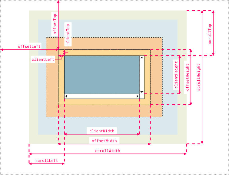
- offsetWidth/offsetHeight: dimensions of the layout border box offsetWidth / offsetHeight:布局边框的尺寸
- boundingClientRect: dimensions of the rendering border box boundingClientRect:渲染边框的尺寸
- clientWidth/clientHeight: dimensions of the visible part of the layout padding box (excluding scroll bars) clientWidth / clientHeight:布局填充框的可见部分的尺寸(不包括滚动条)
- scrollWidth/scrollHeight: dimensions of the layout padding box if it wasn’t constrained by scroll bars scrollWidth / scrollHeight:布局填充框的尺寸,如果它不受滚动条约束
Note: the default vertical scroll bar’s width is 12px in edge13, 15px in chrome53, ff49 and safari9, and 17px in ie11 (done by measurements in photoshop from screenshots, and proven right by the results of the tests). 注意:默认垂直滚动条的宽度为edge13中的12px,chrome53中的15px,ff49和safari9,以及ie11中的17px(通过截屏中的photoshop中的测量完成,并通过测试结果证明)。
However, in some cases, maybe your app is not using the default vertical scroll bar’s width. 但是,在某些情况下,您的应用可能没有使用默认的垂直滚动条的宽度。
So, given the definitions of those concepts, the vertical scroll bar’s width should be equal to (in pseudo code): 因此,给定这些概念的定义,垂直滚动条的宽度应等于(伪代码):
-
layout dimension: offsetWidth – clientWidth – (borderLeftWidth + borderRightWidth) layout dimension:offsetWidth – clientWidth – (borderLeftWidth + borderRightWidth)
-
rendering dimension: boundingClientRect.width – clientWidth – (borderLeftWidth + borderRightWidth) 渲染维度:boundingClientRect.width – clientWidth – (borderLeftWidth + borderRightWidth)
Note, if you don’t understand layout vs rendering please read the mdn article. 注意,如果您不了解布局与渲染,请阅读mdn文章。
Also, if you have another browser (or if you want to see the results of the tests for yourself), you can see my test page here: http://codepen.io/lingtalfi/pen/BLdBdL 此外,如果您有其他浏览器(或者如果您想亲自查看测试结果),可以在此处查看我的测试页面: http : //codepen.io/lingtalfi/pen/BLdBdL
#5楼
I created a more comprehensive and cleaner version that some people might find useful for remembering which name corresponds to which value. 我创建了一个更全面,更清晰的版本,有些人可能会发现这对于记住哪个名称对应哪个值很有用。 I used Chrome Dev Tool’s color code and labels are organized symmetrically to pick up analogies faster: 我使用了Chrome Dev Tool的颜色代码,并且对称地组织标签以更快地获取类比:
-
Note 1:
clientLeftalso includes the width of the vertical scroll bar if the direction of the text is set to right-to-left (since the bar is displayed to the left in that case) 注1:如果文本的方向设置为从右到左,则clientLeft还包括垂直滚动条的宽度(因为在这种情况下条形图显示在左侧) -
Note 2: the outermost line represents the closest positioned parent (an element whose
positionproperty is set to a value different thanstaticorinitial). 注2:最外层线表示最接近的定位的父(一个元件,其position属性被设定为比值不同的值static或initial)。 Thus, if the direct container isn’t a positioned element, then the line doesn’t represent the first container in the hierarchy but another element higher in the hierarchy. 因此,如果直接容器不是定位元素,则该行不表示层次结构中的第一个容器,而是层次结构中较高的另一个元素。 If no positioned parent is found, the browser will take thehtmlorbodyelement as reference 如果找不到定位的父级,则浏览器将使用html或body元素作为参考
Hope somebody finds it useful, just my 2 cents ;) 希望有人发现它有用,只需我2美分;)
发布者:全栈程序员-站长,转载请注明出处:https://javaforall.net/163063.html原文链接:https://javaforall.net


