
你们是否有超级羡慕那些能做一手好图的人,俗语有云一图胜千言,做了一手好图很容易提升我们文章的逼格。所以我也常常在想,网络上有那种可视化的示例代码和示例效果图供我们参考学习的吗?
话不多说,上网址:
https://www.r-graph-gallery.com/
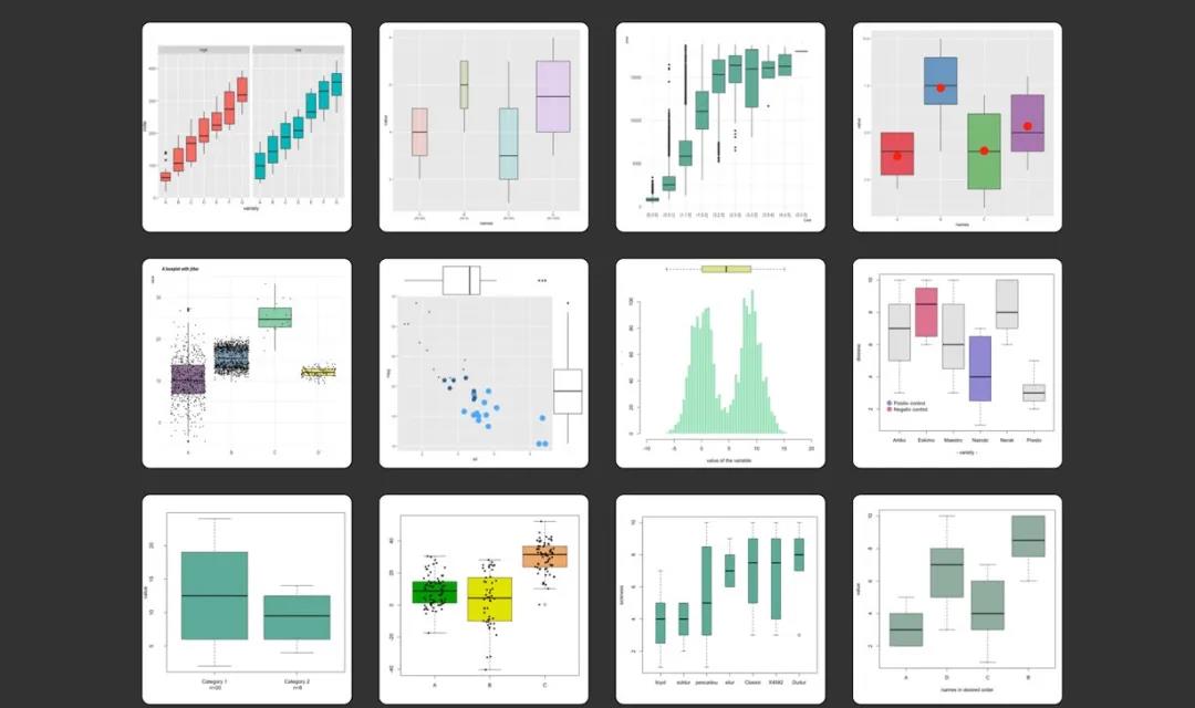
r-garp-gallery收入了大量利用R语言绘制的图形,这些图形包含了很多方面,通过这个网站,我们可以方便直观观察到R语言所能做的一些图形。
1. 简单介绍

- 1. 网站对绘图进行了分类
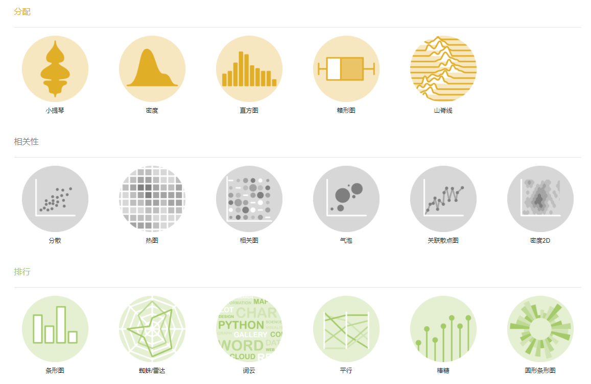
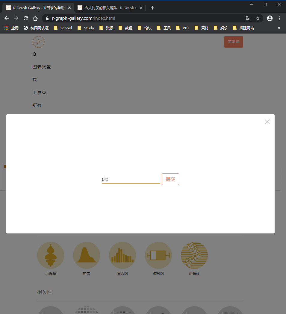
- 2. 网站提供搜索功能,可以搜索需要的图形类型,例如heatmap
- 3. 每一个图形都给出了代码

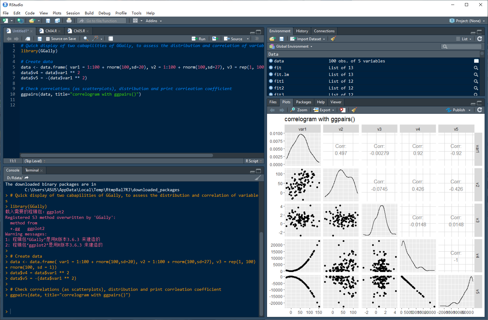
- 4. 将代码复制到Rstudio中逐条运行
2. 样例展示
2.1 词云
- 1. 安装所需要的包
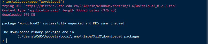
- 2. 载入相关的包

- 3.绘制词云
# Change the shape: wordcloud2(demoFreq, size = 0.7, shape = 'star') # Change the shape using your image wordcloud2(demoFreq, figPath = "~/Desktop/R-graph-gallery/img/other/peaceAndLove.jpg", size = 1.5, color = "skyblue", backgroundColor="black") 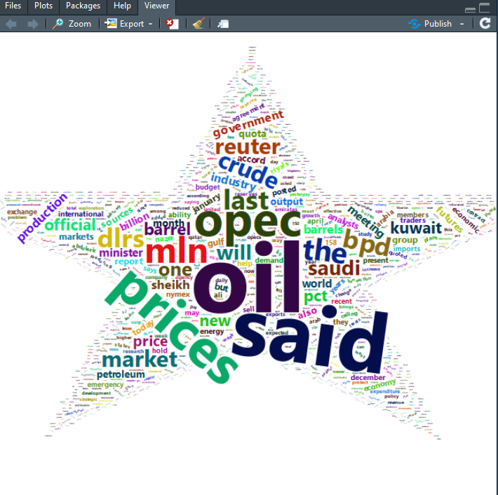
2.2 气泡图
- 1. 安装所需要的包
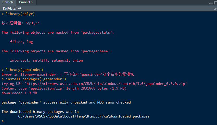
- 2. 载入安装包

- 3. 最基本的气泡图
geom_point()
data <- gapminder %>% filter(year=="2007") %>% dplyr::select(-year) # Most basic bubble plot ggplot(data, aes(x=gdpPercap, y=lifeExp, size = pop)) + geom_point(alpha=0.7) 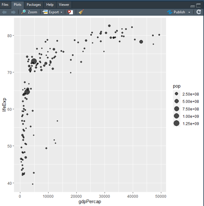
- 4. 用
scale_size()
我们需要在上一张图表上改进的第一件事是气泡大小。scale_size()允许使用range参数设置最小和最大圆圈的大小。请注意,您可以使用来定制图例名称name。
data <- gapminder %>% filter(year=="2007") %>% dplyr::select(-year) # Most basic bubble plot data %>% arrange(desc(pop)) %>% mutate(country = factor(country, country)) %>% ggplot(aes(x=gdpPercap, y=lifeExp, size = pop)) + geom_point(alpha=0.5) + scale_size(range = c(.1, 24), name="Population (M)") 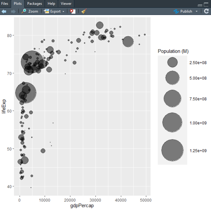
- 5. 添加第四个维度:颜色
data <- gapminder %>% filter(year=="2007") %>% dplyr::select(-year) data %>% arrange(desc(pop)) %>% mutate(country = factor(country, country)) %>% ggplot(aes(x=gdpPercap, y=lifeExp, size=pop, color=continent)) + geom_point(alpha=0.5) + scale_size(range = c(.1, 24), name="Population (M)") 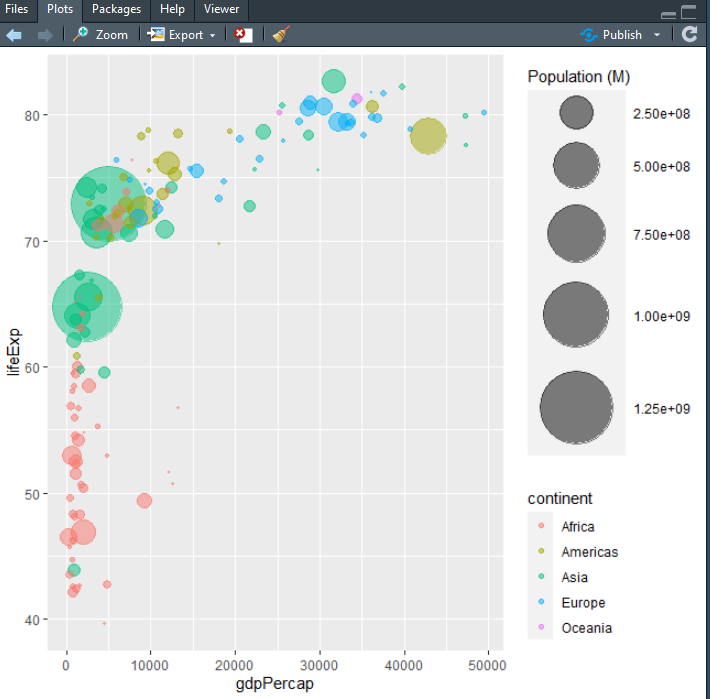
- 6. 变得漂亮
一些经典的改进:
# Libraries library(ggplot2) library(dplyr) library(hrbrthemes) library(viridis) # The dataset is provided in the gapminder library library(gapminder) data <- gapminder %>% filter(year=="2007") %>% dplyr::select(-year) # Most basic bubble plot data %>% arrange(desc(pop)) %>% mutate(country = factor(country, country)) %>% ggplot(aes(x=gdpPercap, y=lifeExp, size=pop, fill=continent)) + geom_point(alpha=0.5, shape=21, color="black") + scale_size(range = c(.1, 24), name="Population (M)") + scale_fill_viridis(discrete=TRUE, guide=FALSE, option="A") + theme_ipsum() + theme(legend.position="bottom") + ylab("Life Expectancy") + xlab("Gdp per Capita") + theme(legend.position = "none") 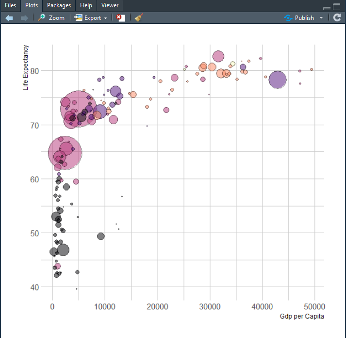
3. 总结
通过不断地对比,是不是发现原来用R语言绘图狠简单,作者由于时间有限,只能列出几个出来,剩下的要靠大家自己进行挖掘尝试。
各位路过的朋友,如果觉得可以学到些什么的话,点个赞再走吧,欢迎各位路过的大佬评论,指正错误,也欢迎有问题的小伙伴评论留言,私信。每个小伙伴的关注都是本人更新博客的动力!!!
版权声明:本文内容由互联网用户自发贡献,该文观点仅代表作者本人。本站仅提供信息存储空间服务,不拥有所有权,不承担相关法律责任。如发现本站有涉嫌侵权/违法违规的内容, 请联系我们举报,一经查实,本站将立刻删除。
发布者:全栈程序员-站长,转载请注明出处:https://javaforall.net/203789.html原文链接:https://javaforall.net