
什么是故障艺术
顾名思义,Glitch art 就是“故障艺术”。
这个词的意思就是“失灵;短时脉冲波干扰”,可以理解成一种自动或人为的bug。但是Glitch art不一定是只限制于数码环境中的,在analog art里出现的机械、或人为干扰产生的故障都可以被归为“故障艺术”;但重要的一点是,这不止是一种故障的呈现和表现,还应该是一种基于“故障”的审美创作,所以Glitch art也可以是看做是“美化故障”,或者通过“故障”完成审美活动的创作手段。
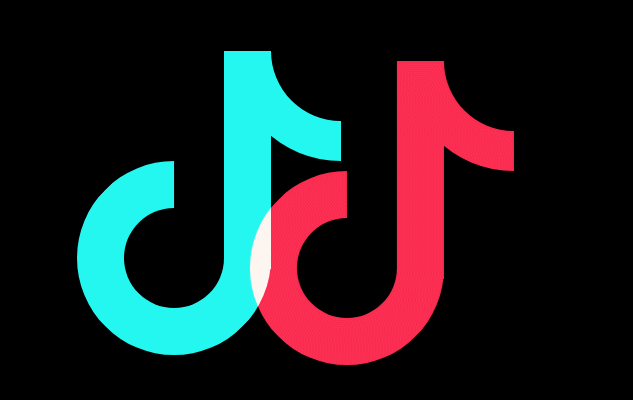
身边的故障艺术–抖音LOGO


抖音的logo就是一种故障艺术,接下来我们使用css来实现它
第一步:logo分解

先不考虑故障效果,通过添加辅助线,整个logo可以分成3部分,一个四分之三的圆+竖线+四分之一的圆。
两个圆可以通过伪类实现,因此只需要一个div即可。
<div class="g-container"> <div class="j">
     div>
      div>
body {
background: #000; } .g-container {
position: relative; width: 200px; margin: 200px auto; } .j {
position: absolute; top: 0; left: 0; width: 47px; height: 218px; background: #24f6f0; } .j:before {
content: ''; position: absolute; width: 100px; height: 100px; border: 47px solid #24f6f0; border-top: 47px solid transparent; border-radius: 50%; left: -147px; top: 110px; transform: rotate(45deg); } .j:after {
content: ''; position: absolute; width: 100px; height: 100px; border: 40px solid #24f6f0; border-top: 40px solid transparent; border-left: 40px solid transparent; border-right: 40px solid transparent; border-radius: 50%; left: 7px; top: -110px; transform: rotate(45deg); } 通过上面的代码,一个logo的雏形就出来了

第二步:混合
继续分析logo,可以看成是两个相同的元素重叠形成的,其中一个为青色,一个为红色,重叠的部分为白色。
<div class="g-container"> <div class="j">
     div> <div class="j">
      div>
       div>
新增 CSS
.j:last-child {
    left: 10px; top: 10px; background: #fe2d52; z-index: 100; mix-blend-mode: lighten; animation: moveLeft 10s infinite; } .j:last-child:before {
    border: 47px solid #fe2d52; border-top: 47px solid transparent; } .j:last-child:after {
    border: 40px solid #fe2d52; border-right: 40px solid transparent; border-top: 40px solid transparent; border-left: 40px solid transparent; } @keyframes moveLeft {
    0% {
    transform: translate(200px); } 50% {
    transform: translate(0px); } 100% {
    transform: translate(0px); } }
看下效果:
关键知识点:
- 通过
mix-blend-mode实现叠加效果,了解更多可查看:【你不知道的CSS】mix-blend-mode
第三步:添加抖动效果
对前后两个都加上抖动效果
.j {
    animation: move 0.95s infinite; } .j:last-child {
    animation: move1 0.95s infinite -0.5s; } @keyframes move1 {
    10% {
    top: 11.4px; left: 11.1px; } 20% {
    top: 12.4px; left: 11.2px; } 30% {
    left: 12.5px; } 40% {
    top: 11.3px; left: 11.7px; } 50% {
    left: 12.2px; } 60% {
    top: 12.8px; left: 11.2px; } 70% {
    top: 11px; left: 12.1px; } 80% {
    top: 11.4px; left: 11.9px; } 90% {
    left: 12.2px; } 100% {
    left: 11.2px; } } @keyframes move {
    10% {
    top: -3.4px; left: -4.1px; } 20% {
    top: 3.4px; left: -3.2px; } 30% {
    left: 3.5px; } 40% {
    top: -3.3px; left: -3.7px; } 50% {
    left: 3.2px; } 60% {
    top: 4.8px; left: -4.2px; } 70% {
    top: -4px; left: 3.1px; } 80% {
    top: -3.4px; left: -3.9px; } 90% {
    left: 4.2px; } 100% {
left: -4.2px; } } 
关键知识点:
- 前后两个动画的所需要的时间应该不同, 以及开始时间也需要错开,这样的抖动效果看起来更有杂乱无序的感觉。
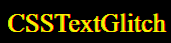
文字上的故障艺术
我们可以将上面的效果放在文字上,并在之前的基础上新增了一些效果,更加富有代入感。

关键知识点:
- 使用CSS的
attr()函数来获取被选中元素的属性值,并且在样式文件中使用。它也可以用在伪类元素里,在伪类元素里使用,它得到的是伪元素的原始元素的值。 - 使用
filter滤镜来达到改变颜色的效果。
<div class="text-magic" data-word="CSSTextGlitch"> <div class="white">
     div>
      div>
body, html {
width: 100%; height: 100%; background: #000; overflow: hidden; } .text-magic {
position: absolute; top: 50%; left: 50%; transform: translate(-50%, -50%) scale(2.5); width: 300px; font-size: 36px; color: transparent; } .white {
position: absolute; left: -10px; width: 100%; height: 1px; background: #000; z-index: 4; animation: whiteMove 10s ease-out infinite; } .text-magic:before {
content: attr(data-word); position: absolute; top: 0; left: 0; height: 36px; color: red; overflow: hidden; z-index: 2; filter: contrast(200%); text-shadow: 1px 0 0 red; animation: move 0.95s infinite; } .text-magic:after {
content: attr(data-word); position: absolute; top: 0; left: -1px; height: 36px; color: rgba(255, 255, 255, 0.8); overflow: hidden; z-index: 3; color: cyan; filter: contrast(200%); text-shadow: -1px 0 0 cyan; mix-blend-mode: lighten; animation: move 1.1s infinite -0.5s; } @keyframes whiteMove {
9% {
top: 38px; } 14% {
top: 8px; } 18% {
top: 42px; } 22% {
top: 1px; } 32% {
top: 32px; } 34% {
top: 12px; } 40% {
top: 26px; } 43% {
top: 7px; } 99% {
top: 30px; } } @keyframes move {
10% {
top: -0.4px; left: -1.1px; } 20% {
filter: hue-rotate(-90deg); top: 0.4px; left: -0.2px; } 30% {
filter: hue-rotate(0); left: .5px; } 40% {
top: -0.3px; left: -0.7px; } 50% {
filter: blur(1px); left: 0.2px; } 60% {
filter: blur(0); top: 1.8px; left: -1.2px; } 70% {
top: -1px; left: 0.1px; } 80% {
top: -0.4px; left: -0.9px; } 90% {
left: 1.2px; } 100% {
left: -1.2px; } } 到这里还没完,还有进一步提升的空间,先看下再次提升后的效果。
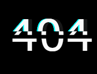
是不是毫无头绪,第一感觉是一个很复杂的动画效果,我们的思想是把它进行分解多个小的步骤去实现。它的演变过程如下:
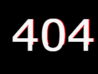
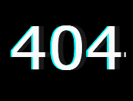
<div class="text-magic" data-word="404"> 404 <div class="white">
     div>
div> 第一步:红色阴影
这里使用伪元素来实现,使用 contrast 降低对比度,再添加一个高度变化的循环动画。
.text-magic:before {
    content: attr(data-word); position: absolute; top: 0; left: 0.5px; height: 0px; color: rgba(255, 255, 255, 0.9); overflow: hidden; z-index: 2; animation: redShadow 1s ease-in infinite; filter: contrast(200%); text-shadow: 1px 0 0 red; } @keyframes redShadow {
    20% {
    height: 32px; } 60% {
    height: 6px; } 100% {
height: 42px; } } 第二步:文字错位
同样新建一个伪元素,将其位置在原来的基础上偏移-3像素,然后通过改变高度就可以看到前后错位断层的感觉。
.text-magic:after {
    content: attr(data-word); position: absolute; top: 0; left: -3px; height: 36px; color: rgba(255, 255, 255, 0.8); overflow: hidden; z-index: 3; background: rgba(0, 0, 0, 0.9); animation: redHeight 1.5s ease-out infinite; filter: contrast(200%); text-shadow: -1px 0 0 cyan; mix-blend-mode: darken; } @keyframes redHeight {
    20% {
    height: 42px; } 35% {
    height: 12px; } 50% {
    height: 40px; } 60% {
    height: 20px; } 70% {
    height: 34px; } 80% {
    height: 22px; } 100% {
height: 0px; } } 第三步:添加黑线
这个就和上面一样了,通过黑线的遮挡,使其变得看起来更加杂款无序。
.white {
    position: absolute; left: -10px; width: 100%; height: 3px; background: #000; z-index: 4; animation: whiteMove 3s ease-out infinite; } @keyframes whiteMove {
    8% {
    top: 38px; } 14% {
    top: 8px; } 20% {
    top: 42px; } 32% {
    top: 2px; } 99% {
    top: 30px; } }
图片上的故障艺术
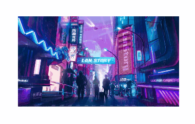
有了上面的灵感,是不是也可以在图片上做点事情,随便找一张图片。

只需要一个标签,通过伪元素设置相同的背景图片,不同的背景色。都需要设置 background-blend-mode 属性,为其中一个加上 mix-blend-mode 属性。
<div class="mix">
     div>
.mix {
width: 600px; height: 400px; background: url(https://www.dengzhanyong.com/PHP/images/.jpg), #0ff; background-blend-mode: lighten; background-size: cover; } .mix:after {
content: ''; position: absolute; margin-left: 10px; width: 600px; height: 400px; background: url(https://www.dengzhanyong.com/PHP/images/.jpg), #f00; background-blend-mode: lighten; mix-blend-mode: darken; background-size: cover; } 就可以得到下面的效果:
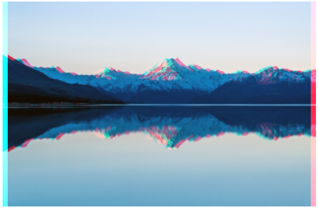
关键知识点:
- 图片本身并不是青色和红色的,需要通过
background-image叠加上这两种颜色, 并通过background-blend-mode: lighten让其表现出来。 - 为了保持中间叠加部分的原色,需要再叠加一个
mix-blend-mode: darken反向处理一下。
clip-path
clip-path 是一个不常用但是非常有意思的CSS属性,使用裁剪方式创建元素的可显示区域。区域内的部分显示,区域外的隐藏。我们可以利用它做出一些断裂效果。
基础用法
clip-path 属性可以裁剪出很多图形,circle、ellipse、polygon、inset,同时也可以使用动画和 SVG 的 clipPath 标签。
兼容性:目前 IE 和 Edge 都不支持这个属性。Firefox 仅部分支持 clip-path,部分支持是指只支持形状和 URL(#path) 内联SVG的语法。Chrome、Safari 和 Opera 需要使用 -webkit- 的前缀兼容此属性。不支持外部的 SVG 形状。

举例
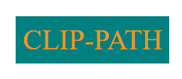
 )
)
<div class="text"> CLIP-PATH
     div>
body,html {
margin: 0; } .text {
display: inline-block; padding: 10px; margin: 100px; color: rgb(248, 148, 18); background: teal; font-size: 40px; -webkit-clip-path: polygon(30% 0%, 70% 0%, 100% 30%, 100% 70%, 70% 100%, 30% 100%, 0% 70%, 0% 30%); clip-path: polygon(30% 0%, 70% 0%, 100% 30%, 100% 70%, 70% 100%, 30% 100%, 0% 70%, 0% 30%); } 推荐一个路径生成器,可通过拖动裁剪的方式,快速生成 clip-path 路径。clip-path生成器
使用 clip-path 实现文字断裂动画

<h1 data-text="Text Crack"> <span>Text Crack
     span>
      h1>
SCSS:
body, html
{
    display: flex;
    height: 100%;
    width: 100%;
    background-color: #000;
    overflow: hidden;
    font-family: sans-serif;
}

h1 {
    position: relative;
    margin: auto;
    font-size: calc(20px + 5vw);
    font-weight: bold;
    color: #fff;
    letter-spacing: 0.02em;
    text-transform: uppercase;
    text-shadow: 0 0 10px blue;
    user-select: none;
    white-space: nowrap;
    filter: blur(0.007em);
    animation: shake 2.5s linear forwards;
}

h1 span {
    position: absolute;
    top: 0;
    left: 0;
    transform: translate(-50%, -50%);
    clip-path: polygon(10% 0%, 44% 0%, 70% 100%, 55% 100%);
}

h1::before,
h1::after {
    content: attr(data-text);
    position: absolute;
    top: 0;
    left: 0;
}

h1::before {
    animation: crack1 2.5s linear forwards;
    clip-path: polygon(0% 0%, 10% 0%, 55% 100%, 0% 100%);
}

h1::after {
    animation: crack2 2.5s linear forwards;
    clip-path: polygon(44% 0%, 100% 0%, 100% 100%, 70% 100%);
}

@keyframes shake {
    5%,
    15%,
    25%,
    35%,
    55%,
    65%,
    75%,
    95% {
        filter: blur(0.018em);
        transform: translateY(0.018em) rotate(0deg);
    }

    10%,
    30%,
    40%,
    50%,
    70%,
    80%,
    90% {
        filter: blur(0.01em);
        transform: translateY(-0.018em) rotate(0deg);
    }

    20%,
    60% {
        filter: blur(0.03em);
        transform: translate(-0.018em, 0.018em) rotate(0deg);
    }

    45%,
    85% {
        filter: blur(0.03em);
        transform: translate(0.018em, -0.018em) rotate(0deg);
    }

    100% {
        filter: blur(0.007em);
        transform: translate(0) rotate(-0.5deg);
    }
}

@keyframes crack1 {
    0%,
    95% {
        transform: translate(-50%, -50%);
    }

    100% {
        transform: translate(-51%, -48%);
    }
}

@keyframes crack2 {
    0%,
    95% {
        transform: translate(-50%, -50%);
    }

    100% {
        transform: translate(-49%, -53%);
    }
}
在图片上使用
关键点:
- 使用元素的两个伪元素,生成图片的两个副本
- 使用
clip-path对两个副本图片元素进行裁剪,然后进行位移、transform变换、添加滤镜等一系列操作。 - 使用scss减少代码量
你可以在这里查看完整的demo代码:
clip-path 实现图片的故障艺术风格动画
最后,【每日一题】小程序版上线啦,快来体验吧
每日坚持打卡,更有奖金等你拿哦

发布者:全栈程序员-站长,转载请注明出处:https://javaforall.net/209694.html原文链接:https://javaforall.net


