
承蒙各位小伙伴的支持,鄙人有幸入围了《CSDN 2020博客之星》的前200名,现在进入投票环节,如果我平时写的文章和分享对你有用的话,请每天点击一下这个链接,投上你们宝贵的一票吧!谢谢!❤️ 每一票都是我坚持的动力和力量! https://bss.csdn.net/m/topic/blog_star2020/detail?username=_
作者:AlbertYang,软件设计师,Java工程师,前端工程师,爱阅读,爱思考,爱编程,爱自由,信奉终生学习,每天学习一点点,就是领先的开始。
微信公众号:AlbertYang 关注我更多精彩等你来发现!

1 什么是响应式布局?
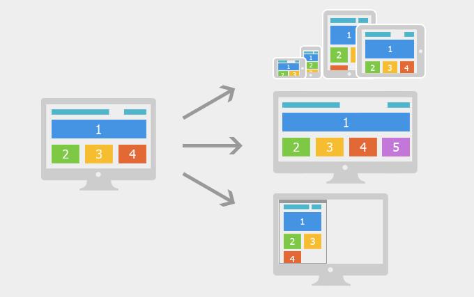
响应式布局指的是同一页面在不同屏幕尺寸下有不同的布局。在移动互联网高度发达的今天,我们在桌面浏览器上开发的网页已经无法满足在移动设备上查看的需求。传统的开发方式是PC端开发一套页面,手机端再开发一套页面。但是这样做非常麻烦,随着不同的终端越来越多,你需要开发多个不同版本的页面。而使用响应式布局只要开发一套就够了。EthanMarcotte在2010年5月份提出了响应式布局的概念,简而言之,就是一个网站能够兼容多个终端。
| 开发方式 | 移动web开发+PC开发 | 响应式开发 |
| 应用场景 | 一般在已经有PC端的网站,开发移动站的时候,只需单独开发移动端。 | 针对新建站的一些网站,现在要求适配移动端,所以就一套页面兼容各种终端,灵活。 |
| 开发 | 针对性强,开发效率高。 | 兼容各种终端,效率低, |
| 适配 | 只适配 移动设备,pad上体验相对较差。 | 可以适配各种终端 |
| 效率 | 代码简洁,加载快。 | 代码相对复杂,加载慢。 |
响应式开发与移动端与PC端分别开发的区别:响应式开发只编写一套界面,通过检测视口分辨率,针对不同客户端在客户端做代码处理,来展现不同的布局和内容。移动端与PC端分别开发,通过检测视口分辨率,来判断当前访问的设备是pc端、平板、手机, 从而请求服务器,返回不同的页面。
2 响应式开发的原理?
响应式开发的原理是使用CSS3中的Media Query(媒体查询)针对不同宽度的设备设置不同的布局和样式,从而适配不同的设备。
CSS3 @media 查询定义和使用:
使用 @media 查询,你可以针对不同的媒体类型定义不同的样式。@media 可以针对不同的屏幕尺寸设置不同的样式,特别是如果你需要设置设计响应式的页面,@media 是非常有用的。当你重置浏览器大小的过程中,页面也会根据浏览器的宽度和高度重新渲染页面。
例如屏幕宽度小于 500 像素则修改背景颜色(background-color)为红色。
@media screen and (max-width: 300px) { body { background-color: red; } }设备的划分情况为:
- 小于768的为超小屏幕(手机)
- 768~992之间的为小屏设备(平板)
- 992~1200的中等屏幕(桌面显示器)
- 大于1200的宽屏设备(大桌面显示器)
但是我们也可以根据实际情况自己定义划分情况。
3 响应式页面开发实战
3.1 视频
视频地址:https://www.bilibili.com/video/BV1mr4y1T7w5
3.2 HTML
响应式页面入门教程:Albert Yang
AlbertYang
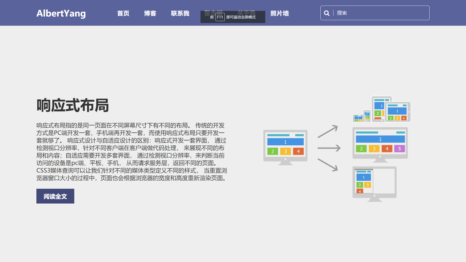
响应式布局
响应式布局指的是同一页面在不同屏幕尺寸下有不同的布局。 传统的开发方式是PC端开发一套,手机端再开发一套,而使用响应式布局只要开发一套就够了。 响应式设计与自适应设计的区别:响应式开发一套界面, 通过检测视口分辨率,针对不同客户端在客户端做代码处理, 来展现不同的布局和内容;自适应需要开发多套界面, 通过检测视口分辨率,来判断当前访问的设备是pc端、平板、手机, 从而请求服务层,返回不同的页面。CSS3媒体查询可以让我们针对不同的媒体类型定义不同的样式, 当重置浏览器窗口大小的过程中,页面也会根据浏览器的宽度和高度重新渲染页面。
阅读全文

3.3 CSS
/* 清除浏览器默认边距, 使边框和内边距的值包含在元素的width和height内 */ * { margin: 0; padding: 0; box-sizing: border-box; } header { position: absolute; left: 0; top: 0; width: 100%; display: flex; justify-content: space-between; align-items: center; padding: 15px 100px; z-index: 10; background: #5b639c; } header .logo { position: relative; font-size: 1.5em; color: #fff; text-decoration: none; font-weight: 600; } header .navigation { display: flex; justify-content: center; flex-wrap: wrap; margin: 10px 0; } header .navigation li { list-style: none; margin: 0 20px; } header .navigation li a { text-decoration: none; color: #fff; font-weight: 600; letter-spacing: 1px; } header .navigation li a:hover{ color: #ffed3b; } header .search { position: relative; width: 300px; height: 40px; } header .search input { position: absolute; top: 0; left: 0; width: 100%; height: 100%; color: #fff; background: transparent; outline: none; border: 1px solid #fff; border-radius: 5px; padding: 0 10px 0 45px; } header .search input::placeholder { color: #fff; } header .search .fa-search { position: absolute; top: 50%; transform: translateY(-50%); left: 10px; color: #fff; border-right: 1px solid #fff; padding-right: 10px; } .banner { background: #eee; padding: 200px 100px 100px; min-height: 100vh; display: flex; justify-content: space-between; align-items: center; } .banner .content { max-width: 1000px; } .banner .content h2 { font-size: 2.5em; color: #333; margin-bottom: 20px; } .banner .content p { font-size: 1em; color: #333; } .banner .content a { display: inline-block; background: #; color: #fff; padding: 10px 20px; text-decoration: none; font-weight: 600; margin-top: 20px; } .banner .image { max-width: 500px; margin-left: 50px; } /*屏幕宽度小于991px,改变布局和样式*/ @media screen and (max-width:991px) { header { padding: 10px 20px; flex-direction: column; } .banner { padding: 150px 20px 50px; flex-direction: column-reverse; } .banner .image { max-width: 80%; margin-left: 0; } .banner .content h2 { font-size: 2em; } } /*屏幕宽度小于600px,改变布局和样式*/ @media screen and (max-width:600px) { header .search { width: 100%; } .banner .image { margin-top: 30px; } }3.4 图片

今天的学习就到这里了,由于本人能力和知识有限,如果有写的不对的地方,还请各位大佬批评指正。有什么不明白的地方欢迎给我留言,如果想继续学习提高,欢迎关注我,每天进步一点点,就是领先的开始,加油。如果觉得本文对你有帮助的话,欢迎转发,评论,点赞!!!
发布者:全栈程序员-站长,转载请注明出处:https://javaforall.net/228449.html原文链接:https://javaforall.net


