
? 个人简介
- ? 作者简介:大家好,我是阿牛?
- ? 个人主页:馆主阿牛?
- ? 支持我:点赞?+收藏⭐️+留言?
- ? 系列专栏:web开发?
- ?格言:迄今所有人生都大写着失败,但不妨碍我继续向前!?

盒子模型
?前言
盒子模型是我们网页布局中很重要的一块内容,今天阿牛就来总结一部分内容,各位小伙伴认真看哦,干货满满!!!
?什么是css中的盒子模型?
?盒子模型的组成
?border(边框)
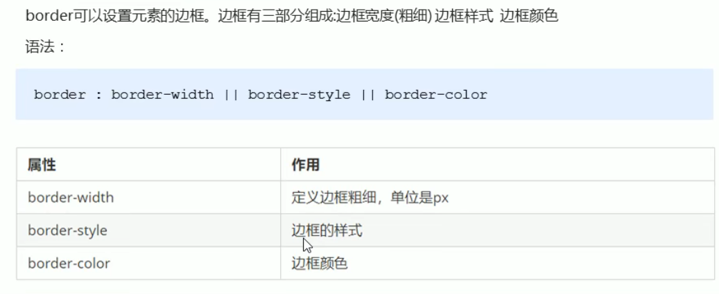
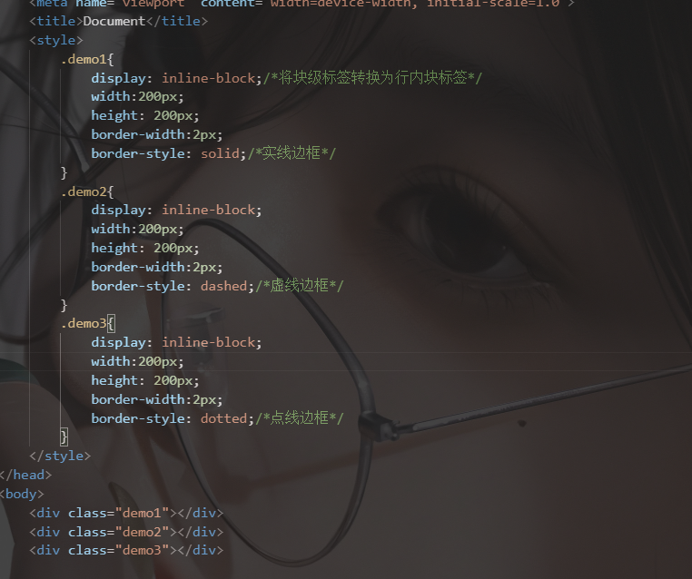
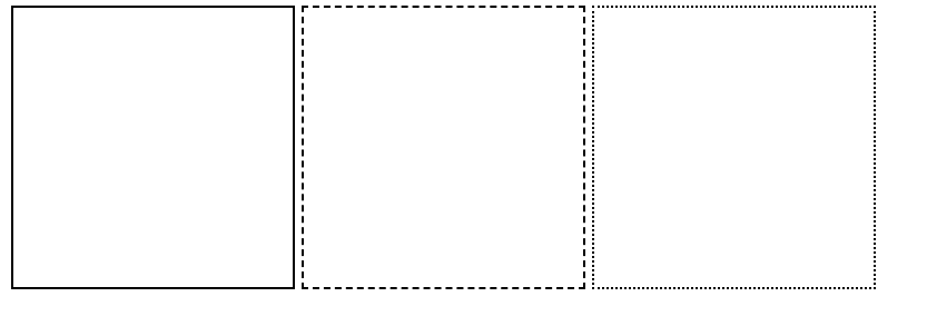
这里着重讲边框样式,常用的有三种,分别是solid(实线),dashed(虚线),dotted(点线)
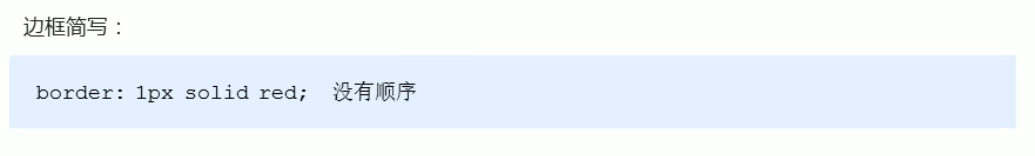
边框可以简写
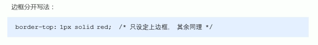
上下左右边框也可以分开写,分别给与不同样式
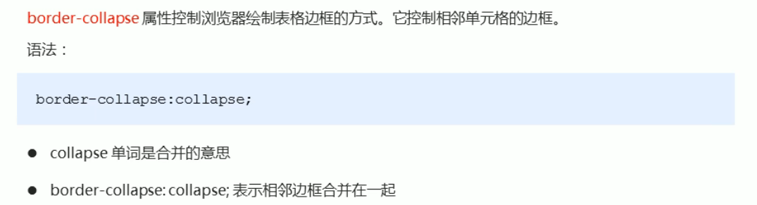
?表格的细线边框border-collapse
<!DOCTYPE html> <html lang="en"> <head> <meta charset="UTF-8"> <meta http-equiv="X-UA-Compatible" content="IE=edge"> <meta name="viewport" content="width=device-width, initial-scale=1.0"> <title>Document</title> <style> table{
      width:500px; height: 300px; text-align: center; } table, td,th{
border:1px solid skyblue; border-collapse: collapse; } </style> </head> <body> <table align="center" cellspacing="0"> <thead> <tr> <th>姓名</th> <th>性别</th> <th>职业</th> <th>地址</th> </tr> </thead> <tbody> <tr> <td rowspan="2">阿牛</td> <td>男</td> <td>学生</td> <td>冰岛</td> </tr> <tr> <td>wa</td> <td colspan="2">wa</td> </tr> </tbody> </table> </body> </html> 
注意:表格属性cellspacing=”0″将单元格合并在一起,边框宽度并没有合并,所以边框看起来较粗,border-collapse:collapse;正好解决这一问题。
所以对于表格可以只用border-collapse:collapse;合并单元格。
同时注意:边框也会影响盒子大小,如果你需要宽高特定的盒子,则盒子的宽高属性是减去边框的像素的。例如一个宽高为200px,边框1px的盒子css应该是下面这样:
 div{
      width: 198px; height: 198px; border: 1px solid pink; }
?padding(内边距)
设置边框与内容之间的距离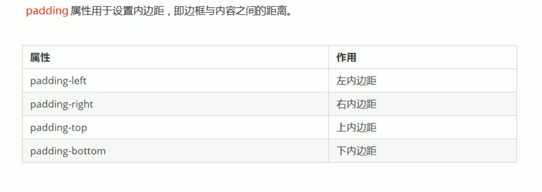
padding属性复合写法
注意:和border属性一样,padding属性也会撑大盒子大小,解决方法和border的一样。
但是如果你给盒子未指定宽度和高度,则padding不会撑开盒子大小。
<!DOCTYPE html> <html lang="en"> <head> <meta charset="UTF-8"> <meta http-equiv="X-UA-Compatible" content="IE=edge"> <meta name="viewport" content="width=device-width, initial-scale=1.0"> <title>Document</title> <style> #mc{
       width: 300px; height: 100px; background-color: purple; } #mc p{
/* 当前块级标签不指定宽高时,padding不会撑大盒子 */ padding: 30px; background-color: skyblue; } </style> </head> <body> <div id="mc"> <p>牛啊啊啊啊啊啊啊啊啊啊啊啊啊 </p> </div> </body> </html> 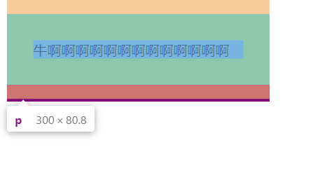
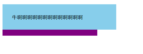
假如你给p标签加width:100%,则会变成这样,撑大了盒子。
?内边距案例:新浪导航栏
<!DOCTYPE html> <html lang="en"> <head> <meta charset="UTF-8"> <meta http-equiv="X-UA-Compatible" content="IE=edge"> <meta name="viewport" content="width=device-width, initial-scale=1.0"> <title>Document</title> <style> .nav{
       height: 41px; background-color: #fcfcfc; border-top: 3px solid #ff8500; border-bottom: 1px solid #edeef0; line-height: 41px; } .nav>a{
       display: inline-block; height:41px; padding: 0 20px;/*盒子未指定宽度,则padding不会撑开盒子宽度大小*/ text-decoration: none; font-size: 12px; color:#4c4c4c; } .nav>a:hover{
background-color: #eee; color: #ff8500; } </style> </head> <body> <div class="nav"> <a href="">新浪导航</a> <a href="">手机新浪网</a> <a href="">移动客户端</a> <a href="">微博</a> <a href="">三个字</a> </div> </body> </html> 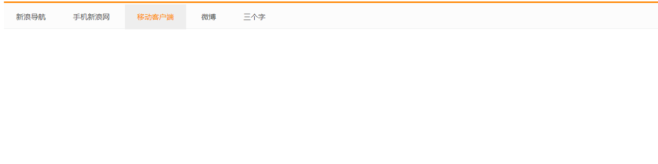
?margin(外边距)
?外边距典型应用:让块级盒子水平居中。
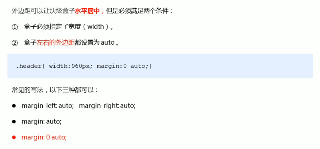
一般采用第三种
<!DOCTYPE html> <html lang="en"> <head> <meta charset="UTF-8"> <meta http-equiv="X-UA-Compatible" content="IE=edge"> <meta name="viewport" content="width=device-width, initial-scale=1.0"> <title>Document</title> <style> div{
width: 200px; height: 200px; margin:100px auto; background-color: pink; } </style> </head> <body> <div class="demo1"></div> </body> </html> 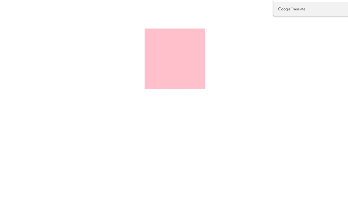
?垂直外边距的合并问题
使用margin定义块元素的垂直外边距时,可能会出现外边距的合并。
<!DOCTYPE html> <html lang="en"> <head> <meta charset="UTF-8"> <meta http-equiv="X-UA-Compatible" content="IE=edge"> <meta name="viewport" content="width=device-width, initial-scale=1.0"> <title>Document</title> <style> .demo1{
       width: 200px; height: 200px; margin:100px auto; background-color: pink; } .demo2{
width: 200px; height: 200px; margin:100px auto; background-color: pink; } </style> </head> <body> <div class="demo1"></div> <div class="demo2"></div> </body> </html> 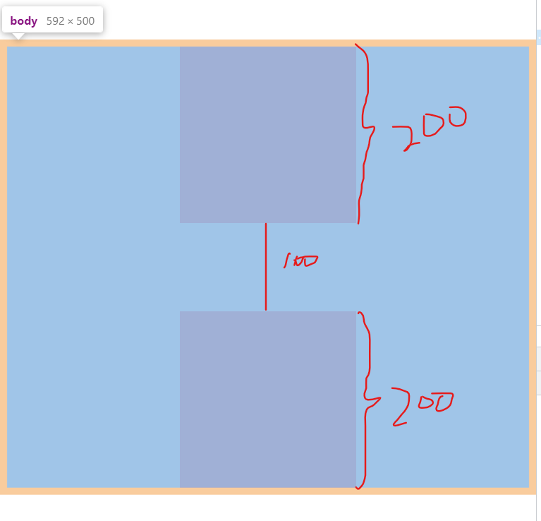
这里按代码的理论,两个盒子之间应该有200px距离,而事实却只有100px,
这就是margin定义块元素的垂直外边距时,可能会出现外边距的合并。
?嵌套块元素垂直外边距的坍塌
<!DOCTYPE html> <html lang="en"> <head> <meta charset="UTF-8"> <meta http-equiv="X-UA-Compatible" content="IE=edge"> <meta name="viewport" content="width=device-width, initial-scale=1.0"> <title>Document</title> <style> /* 嵌套块元素垂直外边距的坍塌 */ .ko{
       width: 400px; height: 400px; background-color: royalblue; margin-top: 50px; /* border: 1px solid transparent; 法一 */ /* padding: 1px; 法二 */ /* overflow: hidden; 法三 */ } .ks{
width: 100px; height: 100px; /*margin-top: 100px;*/ background-color: salmon; } </style> </head> <body> <div class="ko"> <div class="ks"></div> </div> </body> </html> 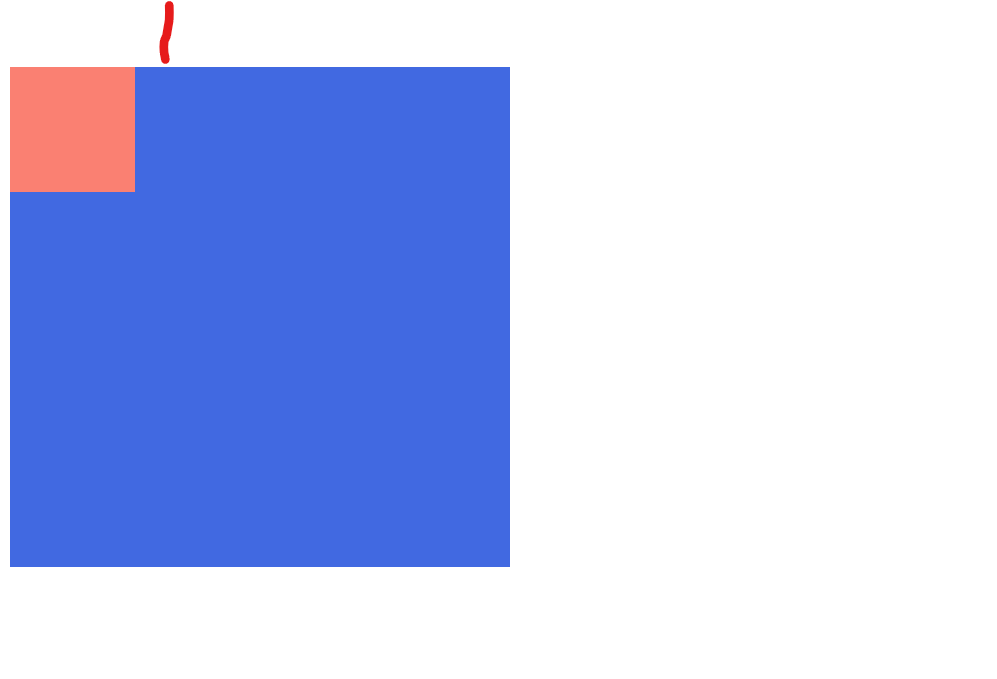
上面这是注释掉子盒子margin-top: 100px;的图,我们取掉注释看一看:
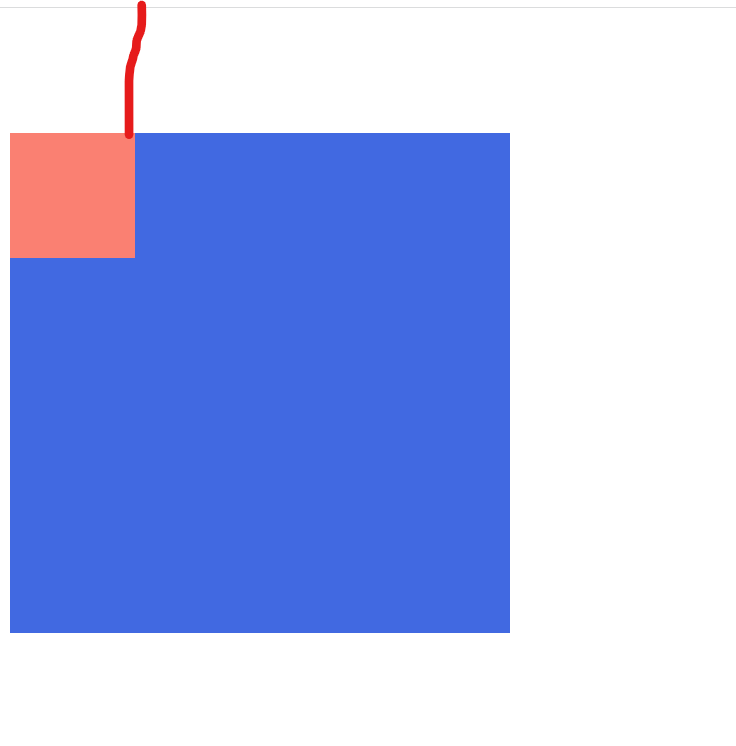
可以看到,子盒子并未与父盒子分开,而发生了坍塌,且只有子盒子margin-top的像素值大于父盒子margin-top的像素值的时候才会发生高度坍塌。
?清除内外边距
网页元素很多都带有默认的内外边距,而且不同浏览器默认的也不一致,因此我们在布局前首先要清除网页元素的内外边距。
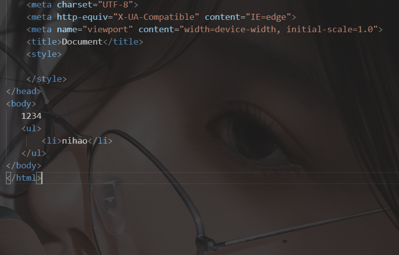
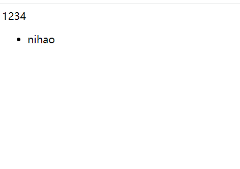
像这样有距离,然后清除内外边距后我们看一下
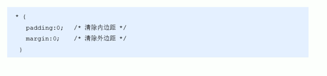
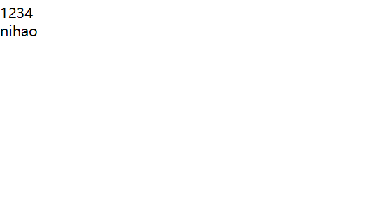
可以看到用了这串css之后,标签之间的默认距离消失了,在开发中我们通常都会先写这串css。
?盒子模型综合案例—产品模块。
<!DOCTYPE html> <html lang="en"> <head> <meta charset="UTF-8"> <meta http-equiv="X-UA-Compatible" content="IE=edge"> <meta name="viewport" content="width=device-width, initial-scale=1.0"> <title>Document</title> <style> /* 去掉内外边距 */ *{
       padding:0; margin:0; } .demo{
       height: 415px; width:298px; margin: 100px auto; background-color: #fff; } .demo p{
       height:70px; font-size: 14px; margin-top: 30px; padding: 0 28px; } .appraise{
       font-size: 12px; color: #b0b0b0; margin-top:20px; padding: 0 28px; } .info{
       font-size: 14px; margin-top: 15px; padding: 0 28px; } .info h4{
       display: inline-block; font-weight: 400; } a{
       color:#333; text-decoration: none; } #first{
       color: #b0b0b0; margin: 0 6px 0 15px; } #last{
color:#ff6700; } </style> </head> <body> <div class="demo"> <img src="123.jpg" style="width:100%" alt=""> <p>哇,这张图片好美呀!我十分喜欢,这是我最喜欢的一张图啦!!!</p> <div class="appraise">来自于 的评价</div> <div class="info"> <h4><a href="#">redmi airdots真无限蓝...</a></h4> <span id="first"> | </span> <span id="last">99.9元</span> </div> </div> </body> </html> 
?结语
?今天的内容总结完毕,我们下期再见,欢迎小伙伴们的三连支持,阿牛会更加努力的!我们一起加油!?
发布者:全栈程序员-站长,转载请注明出处:https://javaforall.net/233075.html原文链接:https://javaforall.net


