
大家好,又见面了,我是你们的朋友全栈君。


<!doctype html>
<html>
<head>
<meta charset="utf-8">
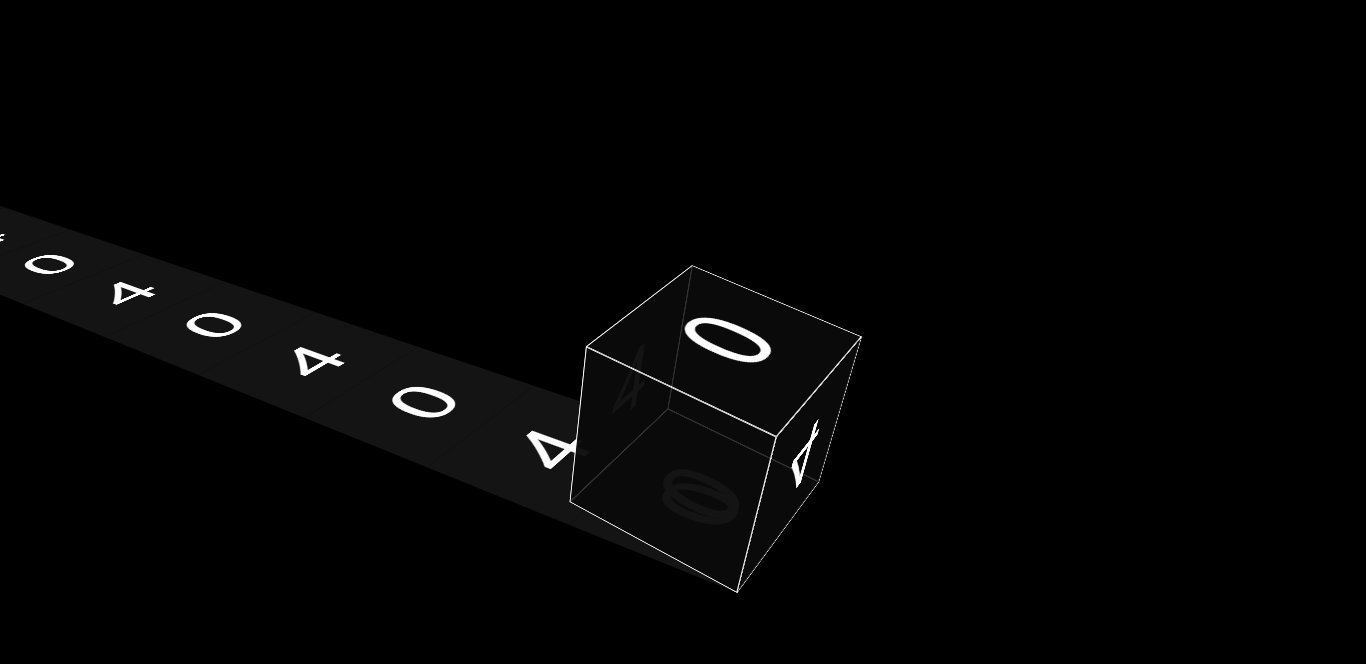
<title>网站404</title>

<style>
body {


  background: #000;
  height: 100vh;
  overflow: hidden;
  display: flex;
  font-family: 'Anton', sans-serif;
  justify-content: center;
  align-items: center;
  -webkit-perspective: 1000px;
          perspective: 1000px;
}

div {


  -webkit-transform-style: preserve-3d;
          transform-style: preserve-3d;
}

.rail {


  position: absolute;
  width: 100%;
  height: 100%;
  display: flex;
  justify-content: center;
  align-items: center;
  -webkit-transform: rotateX(-30deg) rotateY(-30deg);
          transform: rotateX(-30deg) rotateY(-30deg);
}
.rail .stamp {


  position: absolute;
  width: 200px;
  height: 200px;
  display: flex;
  justify-content: center;
  align-items: center;
  background: #141414;
  color: #fff;
  font-size: 7rem;
}
.rail .stamp:nth-child(1) {


  -webkit-animation: stampSlide 40000ms -2300ms linear infinite;
          animation: stampSlide 40000ms -2300ms linear infinite;
}
.rail .stamp:nth-child(2) {


  -webkit-animation: stampSlide 40000ms -4300ms linear infinite;
          animation: stampSlide 40000ms -4300ms linear infinite;
}
.rail .stamp:nth-child(3) {


  -webkit-animation: stampSlide 40000ms -6300ms linear infinite;
          animation: stampSlide 40000ms -6300ms linear infinite;
}
.rail .stamp:nth-child(4) {


  -webkit-animation: stampSlide 40000ms -8300ms linear infinite;
          animation: stampSlide 40000ms -8300ms linear infinite;
}
.rail .stamp:nth-child(5) {


  -webkit-animation: stampSlide 40000ms -10300ms linear infinite;
          animation: stampSlide 40000ms -10300ms linear infinite;
}
.rail .stamp:nth-child(6) {


  -webkit-animation: stampSlide 40000ms -12300ms linear infinite;
          animation: stampSlide 40000ms -12300ms linear infinite;
}
.rail .stamp:nth-child(7) {


  -webkit-animation: stampSlide 40000ms -14300ms linear infinite;
          animation: stampSlide 40000ms -14300ms linear infinite;
}
.rail .stamp:nth-child(8) {


  -webkit-animation: stampSlide 40000ms -16300ms linear infinite;
          animation: stampSlide 40000ms -16300ms linear infinite;
}
.rail .stamp:nth-child(9) {


  -webkit-animation: stampSlide 40000ms -18300ms linear infinite;
          animation: stampSlide 40000ms -18300ms linear infinite;
}
.rail .stamp:nth-child(10) {


  -webkit-animation: stampSlide 40000ms -20300ms linear infinite;
          animation: stampSlide 40000ms -20300ms linear infinite;
}
.rail .stamp:nth-child(11) {


  -webkit-animation: stampSlide 40000ms -22300ms linear infinite;
          animation: stampSlide 40000ms -22300ms linear infinite;
}
.rail .stamp:nth-child(12) {


  -webkit-animation: stampSlide 40000ms -24300ms linear infinite;
          animation: stampSlide 40000ms -24300ms linear infinite;
}
.rail .stamp:nth-child(13) {


  -webkit-animation: stampSlide 40000ms -26300ms linear infinite;
          animation: stampSlide 40000ms -26300ms linear infinite;
}
.rail .stamp:nth-child(14) {


  -webkit-animation: stampSlide 40000ms -28300ms linear infinite;
          animation: stampSlide 40000ms -28300ms linear infinite;
}
.rail .stamp:nth-child(15) {


  -webkit-animation: stampSlide 40000ms -30300ms linear infinite;
          animation: stampSlide 40000ms -30300ms linear infinite;
}
.rail .stamp:nth-child(16) {


  -webkit-animation: stampSlide 40000ms -32300ms linear infinite;
          animation: stampSlide 40000ms -32300ms linear infinite;
}
.rail .stamp:nth-child(17) {


  -webkit-animation: stampSlide 40000ms -34300ms linear infinite;
          animation: stampSlide 40000ms -34300ms linear infinite;
}
.rail .stamp:nth-child(18) {


  -webkit-animation: stampSlide 40000ms -36300ms linear infinite;
          animation: stampSlide 40000ms -36300ms linear infinite;
}
.rail .stamp:nth-child(19) {


  -webkit-animation: stampSlide 40000ms -38300ms linear infinite;
          animation: stampSlide 40000ms -38300ms linear infinite;
}
.rail .stamp:nth-child(20) {


  -webkit-animation: stampSlide 40000ms -40300ms linear infinite;
          animation: stampSlide 40000ms -40300ms linear infinite;
}

@-webkit-keyframes stampSlide {


  0% {
    -webkit-transform: rotateX(90deg) rotateZ(-90deg) translateZ(-200px) translateY(130px);
            transform: rotateX(90deg) rotateZ(-90deg) translateZ(-200px) translateY(130px);
  }
  100% {


    -webkit-transform: rotateX(90deg) rotateZ(-90deg) translateZ(-200px) translateY(-3870px);
            transform: rotateX(90deg) rotateZ(-90deg) translateZ(-200px) translateY(-3870px);
  }
}

@keyframes stampSlide {


  0% {
    -webkit-transform: rotateX(90deg) rotateZ(-90deg) translateZ(-200px) translateY(130px);
            transform: rotateX(90deg) rotateZ(-90deg) translateZ(-200px) translateY(130px);
  }
  100% {


    -webkit-transform: rotateX(90deg) rotateZ(-90deg) translateZ(-200px) translateY(-3870px);
            transform: rotateX(90deg) rotateZ(-90deg) translateZ(-200px) translateY(-3870px);
  }
}
.world {


  -webkit-transform: rotateX(-30deg) rotateY(-30deg);
          transform: rotateX(-30deg) rotateY(-30deg);
}
.world .forward {


  position: absolute;
  -webkit-animation: slide 2000ms linear infinite;
          animation: slide 2000ms linear infinite;
}
.world .box {


  width: 200px;
  height: 200px;
  -webkit-transform-origin: 100% 100%;
          transform-origin: 100% 100%;
  -webkit-animation: roll 2000ms cubic-bezier(1, 0.01, 1, 1) infinite;
          animation: roll 2000ms cubic-bezier(1, 0.01, 1, 1) infinite;
}
.world .box .wall {


  position: absolute;
  width: 200px;
  height: 200px;
  background: rgba(10, 10, 10, 0.8);
  border: 1px solid #fafafa;
  box-sizing: border-box;
}
.world .box .wall::before {


  content: '';
  position: absolute;
  width: 100%;
  height: 100%;
  display: flex;
  justify-content: center;
  align-items: center;
  color: #fff;
  font-size: 7rem;
}
.world .box .wall:nth-child(1) {


  -webkit-transform: translateZ(100px);
          transform: translateZ(100px);
}
.world .box .wall:nth-child(2) {


  -webkit-transform: rotateX(180deg) translateZ(100px);
          transform: rotateX(180deg) translateZ(100px);
}
.world .box .wall:nth-child(3) {


  -webkit-transform: rotateX(90deg) translateZ(100px);
          transform: rotateX(90deg) translateZ(100px);
}
.world .box .wall:nth-child(3)::before {


  -webkit-transform: rotateX(180deg) rotateZ(90deg) translateZ(-1px);
          transform: rotateX(180deg) rotateZ(90deg) translateZ(-1px);
  -webkit-animation: zeroFour 4000ms -2000ms linear infinite;
          animation: zeroFour 4000ms -2000ms linear infinite;
}
.world .box .wall:nth-child(4) {


  -webkit-transform: rotateX(-90deg) translateZ(100px);
          transform: rotateX(-90deg) translateZ(100px);
}
.world .box .wall:nth-child(4)::before {


  -webkit-transform: rotateX(180deg) rotateZ(-90deg) translateZ(-1px);
          transform: rotateX(180deg) rotateZ(-90deg) translateZ(-1px);
  -webkit-animation: zeroFour 4000ms -2000ms linear infinite;
          animation: zeroFour 4000ms -2000ms linear infinite;
}
.world .box .wall:nth-child(5) {


  -webkit-transform: rotateY(90deg) translateZ(100px);
          transform: rotateY(90deg) translateZ(100px);
}
.world .box .wall:nth-child(5)::before {


  -webkit-transform: rotateX(180deg) translateZ(-1px);
          transform: rotateX(180deg) translateZ(-1px);
  -webkit-animation: zeroFour 4000ms linear infinite;
          animation: zeroFour 4000ms linear infinite;
}
.world .box .wall:nth-child(6) {


  -webkit-transform: rotateY(-90deg) translateZ(100px);
          transform: rotateY(-90deg) translateZ(100px);
}
.world .box .wall:nth-child(6)::before {


  -webkit-transform: rotateX(180deg) rotateZ(180deg) translateZ(-1px);
          transform: rotateX(180deg) rotateZ(180deg) translateZ(-1px);
  -webkit-animation: zeroFour 4000ms linear infinite;
          animation: zeroFour 4000ms linear infinite;
}

@-webkit-keyframes zeroFour {


  0% {
    content: '4';
  }
  100% {


    content: '0';
  }
}

@keyframes zeroFour {


  0% {
    content: '4';
  }
  100% {


    content: '0';
  }
}
@-webkit-keyframes roll {


  0% {
    -webkit-transform: rotateZ(0deg);
            transform: rotateZ(0deg);
  }
  85% {


    -webkit-transform: rotateZ(90deg);
            transform: rotateZ(90deg);
  }
  87% {


    -webkit-transform: rotateZ(88deg);
            transform: rotateZ(88deg);
  }
  90% {


    -webkit-transform: rotateZ(90deg);
            transform: rotateZ(90deg);
  }
  100% {


    -webkit-transform: rotateZ(90deg);
            transform: rotateZ(90deg);
  }
}
@keyframes roll {


  0% {
    -webkit-transform: rotateZ(0deg);
            transform: rotateZ(0deg);
  }
  85% {


    -webkit-transform: rotateZ(90deg);
            transform: rotateZ(90deg);
  }
  87% {


    -webkit-transform: rotateZ(88deg);
            transform: rotateZ(88deg);
  }
  90% {


    -webkit-transform: rotateZ(90deg);
            transform: rotateZ(90deg);
  }
  100% {


    -webkit-transform: rotateZ(90deg);
            transform: rotateZ(90deg);
  }
}
@-webkit-keyframes slide {


  0% {
    -webkit-transform: translateX(0);
            transform: translateX(0);
  }
  100% {


    -webkit-transform: translateX(-200px);
            transform: translateX(-200px);
  }
}
@keyframes slide {


  0% {
    -webkit-transform: translateX(0);
            transform: translateX(0);
  }
  100% {


    -webkit-transform: translateX(-200px);
            transform: translateX(-200px);
  }
}
</style>
</head>
<body>

<div class="rail">
  <div class="stamp four">4</div>
  <div class="stamp zero">0</div>
  <div class="stamp four">4</div>
  <div class="stamp zero">0</div>
  <div class="stamp four">4</div>
  <div class="stamp zero">0</div>
  <div class="stamp four">4</div>
  <div class="stamp zero">0</div>
  <div class="stamp four">4</div>
  <div class="stamp zero">0</div>
  <div class="stamp four">4</div>
  <div class="stamp zero">0</div>
  <div class="stamp four">4</div>
  <div class="stamp zero">0</div>
  <div class="stamp four">4</div>
  <div class="stamp zero">0</div>
  <div class="stamp four">4</div>
  <div class="stamp zero">0</div>
  <div class="stamp four">4</div>
  <div class="stamp zero">0</div>
</div>
<div class="world">
  <div class="forward">
    <div class="box">
      <div class="wall"></div>
      <div class="wall"></div>
      <div class="wall"></div>
      <div class="wall"></div>
      <div class="wall"></div>
      <div class="wall"></div>
    </div>
  </div>
</div>

</body>
</html>
版权声明:本文内容由互联网用户自发贡献,该文观点仅代表作者本人。本站仅提供信息存储空间服务,不拥有所有权,不承担相关法律责任。如发现本站有涉嫌侵权/违法违规的内容, 请发送邮件至 举报,一经查实,本站将立刻删除。
发布者:全栈程序员-站长,转载请注明出处:https://javaforall.net/124649.html原文链接:https://javaforall.net