
前段时间在《@font-face制作Web Icon》一文收集了三种webfont通过CSS3的@font-face来制作Icon图标。现在在网上最为流行的是@robmadole和@supercodepoet两位大师制作的Font Awesome:


两位大师给大家准备近两百种不同的Icon图标,都是使用@font-face应用自定义的字体实现的。但有一个不足之处,有很多图标,我们无法使用字符或者实体符来识别,如果需要使用,只能把所有标签都应用,有时我们只需要一两个,而使用这么一个庞大的字符系统,好像有点不太划算。那么今天我要给大家介绍的是使用网络工具Fontomas自定义需要的font icon图标。
Fontomas为我们提供了四种不同的字体来制作Icon图标:
- Entypo
- IconicFill
- IconicStroke
- WebSymbolsRegular
Fontomas为大家提供的四种字体都是以svg的格式,我们可以下载所需的字体,通过FontSquirrel或者OnlineFontconverter工具来帮助我们转换成所需的字体。下面我们就一起来看看如何得到所需的svg字体,并如何转换成字体。
第一步:打开Fontomas
要制作,必须要保证你那连网了,并且能正常登录到Fontomas网站。进入后你能看到下面这样的页面:

上面显示的是其中一种字体,下面还有其他三种字体,这些我们并不是非常关心,因为知道一种的做法,就知道其他的做法。我们关键来看上面的两个部分:

我们要用到的就是上图的两个部分,第一个部分告诉我们要先做什么,后做什么。而第二部分可以帮助我们设置icon的大小,如果你有font icon字体,你也可以上传,并定制。那么我们就按现成的来做吧。
第二步:选择需要的Icon
这步其实很简单,你可以在所需要的字体范围内选择你需要的icon。

你选中后,第二步的“Rearrange”会告诉你选中多少个icon,如上图所示。
第三步:获取字符号或实体符编辑
接下来点击蓝色导航中的“Rearrange”,我们就可以获取刚才选择的“14”个Icon相对应的“字符号”或者“实体符编码”:

第四步:获取svg字体以及字符号的编码
接下来这一步是关键的一步,点击“Save Font”我们就可以得到刚才选中的字符的svg字体以及对应的字符编码,并且需要下载到本地来:

并把对应的编码copy下来:

第五步:转换字体
这一步也是关键的一步,刚才我们得到的仅是“svg”字体,但有些浏览器并不支持这种字体(详细的参见@font-face),所以我们还需要借助工具将其转换成所需的字体,我习惯使用FontSquirrel工具。详细的转换请参考@font-face。此处我们只看看几张截图,帮助大家理解如何得到自己需的字体:
打开工个界面:

添加字体:

转换字体:

字体转换过来了,我们就可以正常使用了。下面提供这四种字体的全部代码:
@font-face调用转用的字体:
/*Entypo font*/ @font-face { font-family: 'FontomasEmtypo'; src: url('entypo/fontomas-webfont.eot'); src: url('entypo/fontomas-webfont.eot?#iefix') format('embedded-opentype'), url('entypo/fontomas-webfont.woff') format('woff'), url('entypo/fontomas-webfont.ttf') format('truetype'), url('entypo/fontomas-webfont.svg#FontomasCustomRegular') format('svg'); font-weight: normal; font-style: normal; } /*IconicFill font*/ @font-face { font-family: 'FontomasIconicFill'; src: url('iconicfill/fontomas-webfont.eot'); src: url('iconicfill/fontomas-webfont.eot?#iefix') format('embedded-opentype'), url('iconicfill/fontomas-webfont.woff') format('woff'), url('iconicfill/fontomas-webfont.ttf') format('truetype'), url('iconicfill/fontomas-webfont.svg#FontomasCustomRegular') format('svg'); font-weight: normal; font-style: normal; } /*IconicStroke Font*/ @font-face { font-family: 'FontomasIconicStroke'; src: url('iconicstroke/fontomas-webfont.eot'); src: url('iconicstroke/fontomas-webfont.eot?#iefix') format('embedded-opentype'), url('iconicstroke/fontomas-webfont.woff') format('woff'), url('iconicstroke/fontomas-webfont.ttf') format('truetype'), url('iconicstroke/fontomas-webfont.svg#FontomasCustomRegular') format('svg'); font-weight: normal; font-style: normal; } /*WebSymbolsRegular Font*/ @font-face { font-family: 'FontomasWebSymbolsRegular'; src: url('websymbolsregular/fontomas-webfont.eot'); src: url('websymbolsregular/fontomas-webfont.eot?#iefix') format('embedded-opentype'), url('websymbolsregular/fontomas-webfont.woff') format('woff'), url('websymbolsregular/fontomas-webfont.ttf') format('truetype'), url('websymbolsregular/fontomas-webfont.svg#FontomasCustomRegular') format('svg'); font-weight: normal; font-style: normal; }
下面我们来看一个简单的详细运用:
HTML Markup
       !
        !
        !
       content:'!'
在“.fontomas”上调用上面定义的font:
.fontomas { font-family: 'FontomasEmtypo'; }
此时将显示为:

上面只是简单的介绍了其中几种字符的icon的调用,你可以按上面的方法尝试其他的字符制作,我在这里整理了他们四种字符的所有icon的demo,有兴趣的同学可以点击这里。并且可以点击下载,获取相应的字体以及对应的就用编码。
下面附上对应字符的编码:


更详细的编码对照表可以点击这里。
上面介绍的只是如何自定义自己所需的字体来制作字符icon,当然大家得到自己的font icon后,完全可以对其进行更多的扩展制作,比如说类似于Font Awesome。有兴趣的同学自己可以去一试。
那么有关于自定义font icon就说到这里了,希望上面的方法对大家有所帮助。如果你有更好的方法或更好的资源可以一起分享。
如需转载烦请注明出处:W3CPLUS
如何解决inline-block元素的空白间距
评论关闭
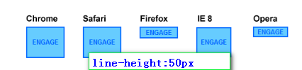
有关于使用inline-block来代替float的讨论也蛮多的,最常说的就是使用inline-block来代替float进行布局,或者使用inline-block来实现元素的居中效果。前面《CSS3制作的分页导航》一文中就是使用的inline-block制作的居中效果,不过留下了一上问题,就是使用inline-block的元素之间会存在“4px”的空白间距。那么今天我们就一起来说说这个“4px”的问题。
大家首先来看一个DEMO:
HTML Markup
- item1
- item2
- item3
- item4
- item5
CSS Code
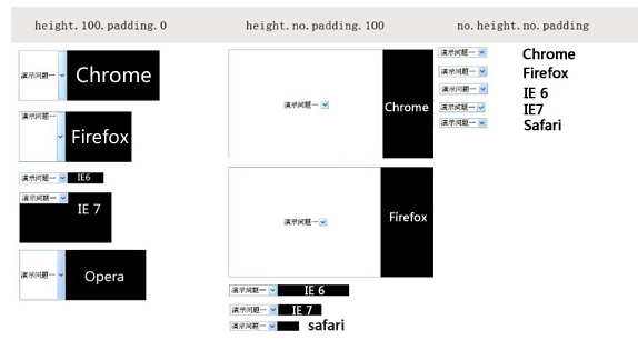
*{ margin: 0; padding: 0; } ul { list-style: none outside none; padding: 10px; background: green; text-align: center; } ul li { display: inline-block; *display: inline; zoom: 1; background: orange; padding: 5px; }
上面的demo效果,明显的可以看出,在inline-block的元素之间存在“4px”的空白:

上面截图是:IE8-9、Firefox、Safari等浏览器下的效果,换句话说,这种现像只有在这几种浏览器中才会出现。下面我们就来说说解决这个“4px”(Chrome下是8px)的几种方法:
方法一:改变HTML结构
简单一点的方法就是就是改变HTML的结构,你可以使用下面几种方法的任何一种都可以达到效果:
结构一:
- item1
- item2
- item3
- item4
- item5
这种方法接近标签换行格式的写法,也更趋近阅读。
结构二:
- item1
- item2
- item3
- item4
- item5
结构二和结构一极呼是一样,结束标签的“>”成了另一行的起始标签。
结构三:
- item1
- item2
- item3
- item4
- item5
结构三的方法采用的是html的注释的方法,这种方法我想大家不太常见,不过同样能解决我们需要解决的问题。
结构四:
- item1
- item2
- item3
- item4
- item5
结构四,我想是大家常用来解决这样的问题的方法吧,下面我们来看看按上述几种方法写的效果:

方法一所说的是通过标签来解决,虽然问题是解决了,但可以说不能称作是技巧。而且上面的方法只适合于写静态页面的时候,一旦你的HTML不是自己写,而是后台生成,就比如CMS来说,标签后台生成,此时,我想大家又要骂街了,这可怎么办?其实我们除了上面的方法,还可以使用CSS来解决的。
方法二:负的margin
很多地方讨论使用负的margin来解决,比如说:
ul { font-size: 12px; } ul li { margin-right: -4px; *margin-right: 0; }
这种解决方法并不完美,如果你的父元素设置的字号不一样,可能你的“-4px”就不能解决问题。况且在Chrome中你需要另外设置一个负的margin值才能实现同等的效果。

当然有些文章介绍使用”-0.25em”来解决,这也是跟元素的字号有极大的关系。所以我个人建议不使用负的margin来解决这样的问题。
方法三:设置父元素字体为0
第三种方法设置父元素的字体为“0”,然后在“inline-block”元素上重置字体需要的大小。
ul { list-style: none outside none; padding: 10px; background: green; text-align: center; font-size: 0px; } ul li { display: inline-block; *display: inline; zoom: 1; background: orange; padding: 5px; font-size: 12px; }
这样处理在Firexfox,chrome等浏览器下是达到了效果,可是在Safari下可问题依然存在:

按此来说,方法三也不是绝佳的好方法,用不用大家自己考虑。
方法四:丢失结束标签
说实在的,这种方法又回到了方法一,在html标签上动手脚。就是让“inline-block”元素丢失关闭标签
- item1
- item2
- item3
- item4
- item5
样式基本不变,我们来看看效果:

这种方法虽然能达到各浏览器的兼容,但还是有一个前提,那就是“DOCTYPE”要选择对,在“XHTML”下可就问题又出来了。
方法五:jquery方法
最后在给大家提供一种jquery的方法:
HTML Markup
- item1
- item2
- item3
- item4
- item5
CSS Code
ul { list-style: none outside none; padding: 10px; background: green; text-align: center; font-size: 12px; } ul li { display: inline-block; *display: inline; zoom: 1; background: orange; padding: 5px; }
jQuery Code
$('.removeTextNodes').contents().filter(function() { return this.nodeType === 3; }).remove();
最后一种方法是通过jQuery来改变“nodeType”的值,从而实现我们需要的效果。
上面讲述了多种方法,但要兼容多个浏览器版本,并不每种方法实用,以前常用的方法,这次测试并不兼容所有浏览器。要做到兼容所有浏览器,个人认为还是在html的标签上做一定的处理,或者采用最后一种方法,通过“jQuery”来改变“nodeType”值达到效果。针对这个“inline-block”之间的间距有几篇文章做过介绍,但里面的方法,和上面介绍的测试的基本一样,具体如何运用,大家还是根据自己的需求进行选择或处理。
扩展阅读:
- Fighting the Space Between Inline Block Elements
- display: inline-block et les espaces indésirables
- 去除inline-block元素间间距的N种方法
那么有关于“inline-block”的间距如何去除,今天就扯到这了,希望这篇文章对喜欢用inline-block的童鞋有所帮助。如果您有更好的方法,记得与我们一起分享,欢迎在下面的评论中留下您的经验,或者指正上面的不对之处。
更新:全兼容的样式解决方法
经过高人指点,使用纯CSS还是找到了兼容的方法,就是在父元素中设置font-size:0,用来兼容chrome,而使用letter-space:-N px来兼容safari:
.finally-solve { letter-spacing: -4px;/*根据不同字体字号或许需要做一定的调整*/ word-spacing: -4px; font-size: 0; } .finally-solve li { font-size: 16px; letter-spacing: normal; word-spacing: normal; display:inline-block; *display: inline; zoom:1; }
如需转载烦请注明出处:W3CPLUS
CSS3 Media Queries在iPhone4和iPad上的运用
评论关闭
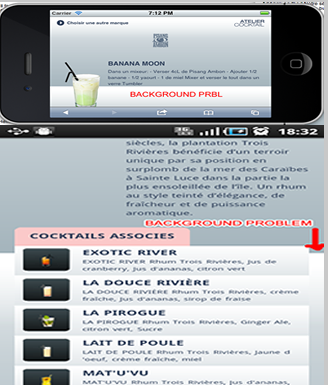
CSS3 Media Queries的介绍在本站上的介绍已有好几篇文章了,但自己碰到的问题与解决的文章还是相对的较少。前几天在《修复iPhone上submit按钮bug》上介绍了修复form中sumit按钮的bug。同一个项目,为了实现iPhone和iPad横板与竖板的风格,让我还是头疼了一翻。
一开始按照CSS3 Media Queries模板中的介绍来运用,虽然帮我解决了iPad的横板与竖板的风格渲染问题,但在iPhone4上还是存在问题的。后来结过网上的查找,总算是问题解决了,下面就来看看问题是如何解决的。
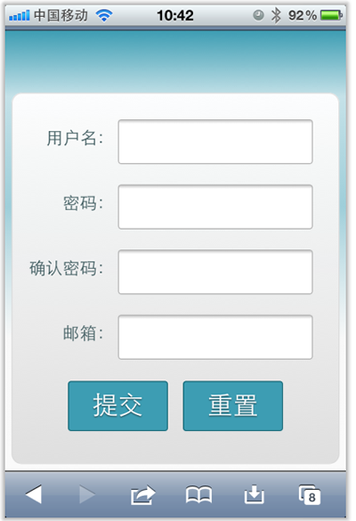
在具体开始之前,先来看看他的源码:
login form
现在在iPhone4竖板是OK的,如下图所示
但现在需求是,在iPhone4的横板以及iPad的横板与竖板下,也需要让表单居中显示:
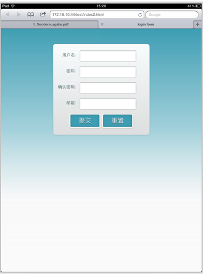
上图显示的是iPad竖板下的需求,横板下也需要类似的效果。
需求明确,做法也是有思路的,首先我按照:CSS3 Media Queries模板中的模板在样式中增加了代码:
/*iPad竖板*/ @media screen and (max-device-width: 768px) and (orientation: portrait) { form { margin: 0 25%; } } /*iPad横板*/ @media screen and (max-device-width: 1024px) and (orientation: landscape) { form { margin: 0 25%; } } /*iPhone4*/ @media only screen and (max-device-width: 480px), only screen and (-webkit-min-device-pixel-ratio: 2) { form { margin: 0 ; } .controls { width: 68%; } }
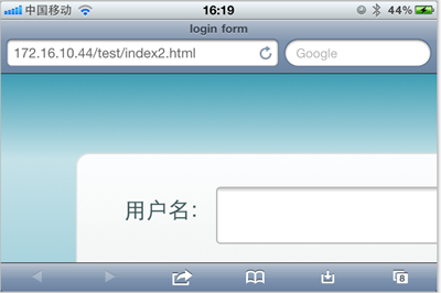
加上上面代码后在iPad下是正常了,而且不会有什么问题存在。但在iPhone4上依然存在一个怪异的现象:当你iPhone4加载页面是用横板加载,再旋转到竖板,不会存在任何问题,而且显示也是蛮正常的。但是初始加载页面是竖板,然后在旋转到横板,就有问题了,表单给放大了
初步给我感觉就是放大了,但具体是不是因为这个原因,我也不太清楚,查找了一些资料,也尝试了无解决办法。最后也从横板竖板的思路出发查找资料,经过一试,给解决了,下面来看看这段代码:
/* iPhone 4 竖板 */ @media only screen and (-webkit-min-device-pixel-ratio : 1.5) and (orientation:portrait), only screen and (min-device-pixel-ratio : 1.5) and (orientation:portrait){ form { margin:0; } .controls { width: 68%; } } /* iPhone 4 横板 */ @media only screen and (-webkit-min-device-pixel-ratio : 1.5) and (orientation:landscape), only screen and (min-device-pixel-ratio : 1.5) and (orientation:landscape){ form { margin:0 10%; } .controls { width: 68%; } }
这样一来就OK了。在iPhone4和iPad的横竖板下都能正常让表单居中显示。

那么以后大家在iPhone4和iPad设备上,就可以按照横竖板来定样式了:
1、iPhone4竖板
@media only screen and (-webkit-min-device-pixel-ratio : 1.5) and (orientation:portrait), only screen and (min-device-pixel-ratio : 1.5) and (orientation:portrait){ /*你的样式写在这里*/ }
2、iPhone横板
@media only screen and (-webkit-min-device-pixel-ratio : 1.5) and (orientation:landscape), only screen and (min-device-pixel-ratio : 1.5) and (orientation:landscape){ /*你的样式写在这里*/ }
3、iPad竖板
@media screen and (max-device-width: 768px) and (orientation: portrait) { /*你的样式写在这里*/ }
4、iPad横板
@media screen and (max-device-width: 1024px) and (orientation: landscape) { /*你样式写在这里*/ }
上面四种CSS3 Media Queries就是用来对付iPhone4和iPad的,至于其他的运用,大家参考下面我重新整理的CSS3 Media Queries模板:
CSS3 Media Queries 模板:
1、Smartphones (竖板和横板)
@media only screen and (min-device-width : 320px) and (max-device-width : 480px) { /* 你的样式写在这里 */ } //===或者====// < link rel="stylesheet" href="smartphones.css" media="only screen and (min-device-width : 320px) and (max-device-width : 480px)" />
2、Smartphones (横板)
@media only screen and (min-width : 321px) { /* 你的样式写在这里 */ } //===或者====// < link rel="stylesheet" href="smartphones-landscape.css" media="only screen and (min-width : 321px)" />
3、Smartphones (竖板)
@media only screen and (max-width : 320px) { /* 你的样式写在这里 */ } //===或者====// < link rel="stylesheet" href="smartphones-portrait.css" media="only screen and (max-width : 320px)" />
4、iPad(竖板和横板)
@media only screen and (min-device-width : 768px) and (max-device-width : 1024px) { /* 你的样式写在这里 */ } //===或者====// < link rel="stylesheet" href="ipad.css" media="only screen and (min-device-width : 768px) and (max-device-width : 1024px)" />
5、iPad横板
@media only screen and (min-device-width : 768px) and (max-device-width : 1024px) and (orientation : landscape) { /* 你的样式写在这里 */ } //===或者====// < link rel="stylesheet" href="ipad-landscape.css" media="only screen and (min-device-width : 768px) and (max-device-width : 1024px) and (orientation : landscape)" />
6、iPad的竖板
@media only screen and (min-device-width : 768px) and (max-device-width : 1024px) and (orientation : portrait) { /* 你的样式写在这里 */ } //===或者====// < link rel="stylesheet" href="ipad-portrait.css" media="only screen and (min-device-width : 768px) and (max-device-width : 1024px) and (orientation : portrait)" />
7、Desktops and laptops
@media only screen and (min-width : 1224px) { /* 你的样式写在这里 */ } //===或者====// < link rel="stylesheet" href="desktops-and-laptops.css" media="only screen and (min-width : 1224px)" />
8、Large screens
@media only screen and (min-width : 1824px) { /* 你的样式写在这里 */ } //===或者====// < link rel="stylesheet" href="large-screens.css" media="only screen and (min-width : 1824px)" />
9、iPone4
@media only screen and (-webkit-min-device-pixel-ratio : 1.5),only screen and (min-device-pixel-ratio : 1.5) { /* 你的样式写在这里 */ } //===或者====// < link rel="stylesheet" href="iphone4.css" media="only screen and (-webkit-min-device-pixel-ratio : 1.5),only screen and (min-device-pixel-ratio : 1.5)" />
10、iPhone4竖板
@media only screen and (-webkit-min-device-pixel-ratio : 1.5) and (orientation:portrait), only screen and (min-device-pixel-ratio : 1.5) and (orientation:portrait){ /*你的样式写在这里*/ } //===或者====// < link rel="stylesheet" href="iphone4-portrait.css" media="only screen and (-webkit-min-device-pixel-ratio : 1.5) and (orientation:portrait), only screen and (min-device-pixel-ratio : 1.5) and (orientation:portrait)" />
11、iPhone4横板
@media only screen and (-webkit-min-device-pixel-ratio : 1.5) and (orientation:landscape),only screen and (min-device-pixel-ratio : 1.5) and (orientation:landscape){ /*你的样式写在这里*/ } //===或者====// < link rel="stylesheet" href="iphone4-landscape.css" media="only screen and (-webkit-min-device-pixel-ratio : 1.5) and (orientation:landscape),only screen and (min-device-pixel-ratio : 1.5) and (orientation:landscape)" />
上面罗列了常用的CSS3 Media Queries模板,特别是在移动设备上的几种,希望对大家在今后的移动开发端上的运用有所帮助。当然CSS3 Media Queries的运用条件往往不只这些,大家完全可以根据自己的需求去定义不同的条件,但个人建议,使用CSS3 Media Queries采用主流就Ok了。随着潮流走嘛。那么今天就扯到这了。如果大家有更好的经验,可以通过下面的评论与我们一起分享。
2012年04月16日更新:iPad 3 Media Query
@media only screen and (min-device-width: 1536px) and (max-device-width: 2048px) and (-webkit-min-device-pixel-ratio: 2) { // your CSS }
如需转载烦请注明出处:W3CPLUS
手机上网站导航的制作
评论关闭
为了让Web页面在手机上显示流畅,现在国外很多网站都使用Responsive设计和CSS3 Media Queries的结合来实现。这样的实例到处可见,那么今天我想和大家一起学习的是有关于这种方法实现手机布局中的导航制作。
如果你的导航选项比较多,放到手机上来浏览就会挤到一起,造成美观性的不足。下面为了解决这样的问题,我们就一起跟随Nick La写的教程《Mobile Navigation Design & Tutorial》学习如何使用jQuery来解决刚才所说的问题。
问题的描述
下面的截图说明了导航布局在手机上的问题。如果你的导航只有三到四个选项,如Web Designer Wall网站,导航刚好一行能显示,但当你的导航选项包含更多时,其实的选项就会被挤压下去,比如说Bitfoundry网站。下面可以看看他们对比的截图:

解决方法
Nick La在教程中罗列了几种相关的解决方法:
1、下拉选择
这种方法是将所有的导航选项放到一个下拉选择控制(select)中,但这种方法并不是很好,因为select的样式要制作到让各浏览器下完全一致是非常的麻烦。除非你使用jQuery的插件,比如说Chosen插件能帮你实现select的样式美化,否则的话你只好采用select的默认样式风格。这也将导致用户的体验不一样,在桌面系统下是链接标签,而在手机上却是下拉选择框。如果你喜欢这种解决方式,你可以仔细阅读CSS-Tricks写的Convert a Menu to a Dropdown for Small Screens一文。也可以参考下面的网站


2、显示成块状
第二种方法是将所有导航通过”display:block”,并将float去掉,将每个导航项设置成一个块项,这是一种快速的解决方法,不过同时也带来一个不足之处,给头部带来很大的空间,本来手机屏幕空间就小,这样一来,整个屏幕或许只能看到你的导航选项了。这样导致用户体验就差,需要滚动到底部才能看到页面的主内容。比如说下面的几个案例。


3、菜单图标
最后一种解决方法是使用菜单图标名菜单按钮。这种效果是借助jquery来实现的。在页面截入时,显示一个菜单的图标或按钮,而导航选项是隐藏的,当你点击这个图标时导航选项将显示出来,再次点击时这们导航选项将隐藏。这种方法将是最适合的一种方法,完全可以通过css来实现,如果你还需要兼容ie的话,那这种功能你就在考虑配合jQ来完成,下面列出几个案例,供大家参考:


在众多按例中,我比较喜欢bootstrap的,大家感兴趣可以去看看bootstrap的api。
jQuery制作手机导航
上面给大家展示了三种不同的方法实现手机导航效果,下面我们来看看如何使用jQuery实现上面介绍的第三种方法。
方法很简单,使用jQuery的prepend方法在导航中插入一个菜单按钮,然后给这个按钮绑定一个click事件,点击实现显示/隐藏效果,具体方法如下:
HTML Markup
上面结构是一个制作导航菜单的模板,极其的常见,在些不做过多描述。
jQuery Code
使用jQuery的prepend方法,将“
 jQuery(document).ready(function($){ /* prepend menu icon */ $('#nav-wrap').prepend('

        Menu
      '); /* toggle nav */ $("#menu-icon").on("click", function(){ $("#nav").slideToggle(); $(this).toggleClass("active"); }); });
此时导航的HTML Markup并变成下面这样:
CSS Code
结构有了,功能也有了,但还需要CSS来美化,那么有关于CSS详细的代码在此就不做过多得的罗列,此处只给大家介绍几个关键部分。
首先在样式中将“div#menu-icon”隐藏起来(display:none),然后通过CSS3 Media Queries来重置div#menu-icon样式。换句话说当显屏宽度小于600px时,将div#menu-icon重设置为显示(display:block)。
@media screen and (max-width:600px){ #menu-icon { color: #000; width: 42px; height: 30px; background: url(images/menu-icon.png) no-repeat left center; padding: 8px 10px 42px; cursor: pointer; border: 1px solid #666; display: block;/*显示div#menu-icon*/ } #nav { clear: both; position: absolute; top: 38px; width: 160px; z-index: 10000; padding: 5px; background: #f8f8f8; border: 1px solid #999; display: none;/*默认隐藏,通过jq实现显示隐藏切换*/ } }
通过CSS3 Media Queries在手机浏览器上,将#nav设置为隐藏,这样主要实现实初截入时隐藏导航,然后通过上面写的jq来实现,点击“div#menu-icon”图标时,显示导航菜单项,在点击时就隐藏导航菜单项。如图所示:

DEMO效果

上面DEMO是Nick La给大家写的一个效果,感兴趣的话可以看看,不过记得使用iPhone查看,不然就看不到下图的效果:

那么有关于手机上导航制作方法就介绍完了,上面方法各有所长,就像Nick La介绍的一样,最后取决需要大家自己根据需求去定夺,此文仅供参考,希望大家喜欢,如果您觉得对你有所帮助,请将此文发送给你的朋友,如果你还有更好的建议也可以在下面的评论中与我们一起分享您的经验。最后再次感谢Nick La给我们带来这么好的教程。
如需转载烦请注明出处:W3CPLUS
修复iPhone上submit按钮bug
评论关闭
自从完成上次iPhone的几个页面效果后,一直在没有制作iPhone的页面效果了,今天在公司写了一个登录页面效果,让我碰到一个怪异的问题——“表单中的input[type=”submit”]和input[type=”reset”]按钮在iPhone的safari浏览器下圆角有一个bug”。下面我来简单的描述一下这个bug的样子:
初载入页面后,表单中的input[type=”submit”]和input[type=”reset”]按钮渲染成下图的样子:

奇怪的是你点击以后就会正常:
对比一下,你也会觉得怪,怪都算了,还不知道如何下手:

或许很多同学会认为我的样式代码没写好,那么想让大家知道是怎么一回事,先来看看我写的代码:
input[type=”submit”]和input[type=”reset”]样式代码:
.form-actions input{ width: 30%; cursor: pointer; background: rgb(61, 157, 179); padding: 8px 5px; font-family: 'BebasNeueRegular','Arial Narrow',Arial,sans-serif; color: #fff; font-size: 24px; margin: 5px; border: 1px solid rgb(28, 108, 122); margin-bottom: 10px; text-shadow: 0 1px 1px rgba(0, 0, 0, 0.5); border-radius: 3px; box-shadow:0px 1px 6px 4px rgba(0, 0, 0, 0.07) inset, 0px 0px 0px 3px rgb(254, 254, 254), 0px 5px 3px 3px rgb(210, 210, 210); -webkit-transition: all 0.2s linear; transition: all 0.2s linear; } .form-actions input:hover{ background: rgb(74, 179, 198); } .form-actions input:active, .form-actions input:focus{ background: rgb(40, 137, 154); position: relative; top: 1px; border: 1px solid rgb(12, 76, 87); box-shadow: 0px 1px 6px 4px rgba(0, 0, 0, 0.2) inset; }
这样的代码在浏览器中浏览是完全没有问题的:

注:请使用safari测试上面代码。
可是上面的代码就在iPhone的Safari浏览器下出开头所陈述的问题。一下真不好如何动手解决,因为从来没有接触过,所以就一直没有碰到过。但问题出了,就要想办法解决,于是在GG上搜索“input submit for iPhone”,还真找到了问题所在。Keir Whitaker在Styling Submit Buttons for Mobile Safari中介绍的内容和我碰到的问题可真是一模一样,按其方法在样式中加入:
.form-actions input{ ... -webkit-appearance: none; }
更新到iPhone一看,真爽,问题解决了。

原来问题出在这里,iPhone上的safari解析input[type=”submit”]和input[type=”reset”]按钮会以苹果浏览器的默认UI渲染,这样就出现我刚才那种现像,我们在样式中明确的设置了button的圆角值,但到iPhone的safari上就不生效了。要想让他生效,就需要在样式中明确的指名:
.form-actions input{ ... -webkit-appearance: none; }
告诉浏览器我们不希望按钮按苹果的默认UI来渲染。
那么”-webkit-appearance”对button还有什么影响呢?大家可以参考下面的截图:


上图所显示的效果,都将button设置了:
.button { border-radius: 0; }
效果图明显的告诉我们,在不同的“-webkit-appearance”选值情况下,button所渲染的效果是不一样的,详细的测试代码大家可使用safari浏览器点击这里。有关于“-webkit-appearance”的详细介绍,大家还可以参阅:
- -webkit-appearance properties
- Trent Walton on -webkit-appearance
- Safari CSS Reference
这回算是知道了,最后我建议大家,我们可以直接在“reset.css”样式文件中加处这么一句:
input[type="submit"], input[type="reset"], input[type="button"], button { -webkit-appearance: none; }
这样一来就不会为这样的问题头痛了。
如果你还没有碰到,或者你也在开发移动端web,都希望你记住这个小技巧,因为当你在制作中碰到这样的问题时,不会为此抓破头皮,能解决你问题。最后希望大家喜欢这篇文章,如果你觉得对你有所帮助,可以推荐给你的朋友,或者有更好的分享可以在下面的评论中直接给我们留言。
如需转载烦请注明出处:W3CPLUS
@font-face制作Web Icon
评论关闭
@font-face是CSS3中有关于字体设置的属性,通过@font-face可以将本地字体设置为Web页面字体,并能兼容所有浏览器,使用这个属性就不必担心用户本地不具备这样的字体。因为我们把字体都上传到服务器上,不过这样一来很多人担心影响性能问题。鱼和熊掌不能兼得嘛,我们就不在为这个问题说太多的话了,不过我今天要与大家分享的主题和这个@font-face还是有很在关系的,使用他配合一定的字体来制作Web页面中的Icon图标。初一看有点不实际,以前的Icon都是依靠图片来完成,怎么可能用字体就能实现呢?如果你以前有用过HTML的实体符,我想就不会那么惊奇了。
如果你以前关注过本站,我想这个你并不会陌生,因为我在css3制作3D分页导航一文中就有用到@font-face来制作icon的效果:

今天我想和大家进一步的探讨这方面的应用,同时为大家准备了多种字体制作Icon的效果,下面我们一起来看看吧。
制作思路
思路其实很清晰,我们就是需要得到font icon的字体,然后通过@font-face将这个字体运用到一定的字符上,从而让他渲染出来是ICON的效果。难就难在无法得到这样的字体,今天我给大家搜集了三种免费的字体,以供大家学习。接下来我们一起来学习这三种字体如何转换成Web上的Icon图标。
第一种:Guifx字体
要使用Guifx字体制作Icon,你首先要得到相应的字体,然后通过fontsquirrel转换各浏览器所需的字体,详细的操作过程大家可以参考@font-face。
字体得到了就好办了,现在只需要使用一定的编码来代表相应的字符,打个比方来说:
A
那么上面的“A”字符代表的就是一个Icon,只不过我们需要把刚才得到字体运用上去:
@font-face { font-family: 'GuifxIcon'; src: url('Guifx/guifx_v2_transports-webfont.eot'); src: url('Guifx/guifx_v2_transports-webfont.eot?#iefix') format('embedded-opentype'), url('Guifx/guifx_v2_transports-webfont.woff') format('woff'), url('Guifx/guifx_v2_transports-webfont.ttf') format('truetype'), url('Guifx/guifx_v2_transports-webfont.svg#Guifxv2TransportsRegular') format('svg'); font-weight: normal; font-style: normal; } .icon { font-family: 'GuifxIcon'; }
这样运用过后,”A”在web中就渲染成下图的icon效果:

上面拿了一个简单的Icon来做实例,其他的运用也是这样的,下面我将对应的字符和Icon对照表放上来让大家使用时好参考,省得测试的时间:

有关于详细的代码大家可以查看这里,当然你可以点击下载相关字体和代码。
第二种:websymbols字体
这种字体其实运用和前面介绍的方法是一样的,唯一区别是使用的字体不一样,从而字母渲染出来的Icon也就不一样了。下面我们同样来看“A”渲染出来的效果
A
样式的使用:
@font-face{ font-family: 'WebSymbolsRegular'; src: url('websymbols/fonts/websymbols-regular-webfont.eot'); src: url('websymbols/fonts/websymbols-regular-webfont.eot?#iefix') format('embedded-opentype'), url('websymbols/fonts/websymbols-regular-webfont.woff') format('woff'), url('websymbols/fonts/websymbols-regular-webfont.ttf') format('truetype'), url('websymbols/fonts/websymbols-regular-webfont.svg#WebSymbolsRegular') format('svg'); } .icon { font-family: 'WebSymbolsRegular'; }
对应出来的Icon就是下图的样子了:

我想大家肯定也在头痛字体的来源吧,不急,点这里下载吧。同样给大家附上相应的字符照图,以供大家参考:

有关于详细的代码大家可以查看这里,当然你可以点击下载相关字体和代码。
第三种:Font Awesome
Font Awesome是一个强大的字体制作Icon的案例,作者在Bootstrap Icon的基础上将Icon图片换成了字体来制作。初看真的让我汗颜呀,太强大了。下面我们一起来看看如何使用?
HTML Markup
相对来说这个字体制作ICON复杂一点,他是在Bootstrap Icon基础上扩展的,只不过区别是Bootstrap Icon采用的是IMG,而他采用的是@font-face:
@font-face { font-family: 'FontAwesome'; src: url('font/fontawesome-webfont.eot'); src: url('font/fontawesome-webfont.eot?#iefix') format('embedded-opentype'), url('../font/fontawesome-webfont.woff') format('woff'), url('../font/fontawesome-webfont.ttf') format('truetype'), url('../font/fontawesome-webfont.svgz#FontAwesomeRegular') format('svg'), url('../font/fontawesome-webfont.svg#FontAwesomeRegular') format('svg'); font-weight: normal; font-style: normal; } /* sprites.less reset */ [class^="icon-"], [class*=" icon-"] { display: inline; width: auto; height: auto; line-height: inherit; vertical-align: baseline; background-image: none; background-position: 0% 0%; background-repeat: repeat; } [class^="icon-"]:before, [class*=" icon-"]:before { font-family: FontAwesome; font-weight: normal; font-style: normal; display: inline-block; text-decoration: inherit; } /* Font Awesome uses the Unicode Private Use Area (PUA) to ensure screen readers do not read off random characters that represent icons */ .icon-glass:before { content: "\f000"; } .icon-music:before { content: "\f001"; } .icon-search:before { content: "\f002"; } .icon-envelope:before { content: "\f003"; } .icon-heart:before { content: "\f004"; } .icon-star:before { content: "\f005"; } .icon-star-empty:before { content: "\f006"; } .icon-user:before { content: "\f007"; } .icon-film:before { content: "\f008"; } .icon-th-large:before { content: "\f009"; } .icon-th:before { content: "\f00a"; } .icon-th-list:before { content: "\f00b"; } .icon-ok:before { content: "\f00c"; } .icon-remove:before { content: "\f00d"; } .icon-zoom-in:before { content: "\f00e"; } .icon-zoom-out:before { content: "\f010"; } .icon-off:before { content: "\f011"; } .icon-signal:before { content: "\f012"; } .icon-cog:before { content: "\f013"; } .icon-trash:before { content: "\f014"; } .icon-home:before { content: "\f015"; } .icon-file:before { content: "\f016"; } .icon-time:before { content: "\f017"; } .icon-road:before { content: "\f018"; } .icon-download-alt:before { content: "\f019"; } .icon-download:before { content: "\f01a"; } .icon-upload:before { content: "\f01b"; } .icon-inbox:before { content: "\f01c"; } .icon-play-circle:before { content: "\f01d"; } .icon-repeat:before { content: "\f01e"; } /* \f020 is not a valid unicode character. all shifted one down */ .icon-refresh:before { content: "\f021"; } .icon-list-alt:before { content: "\f022"; } .icon-lock:before { content: "\f023"; } .icon-flag:before { content: "\f024"; } .icon-headphones:before { content: "\f025"; } .icon-volume-off:before { content: "\f026"; } .icon-volume-down:before { content: "\f027"; } .icon-volume-up:before { content: "\f028"; } .icon-qrcode:before { content: "\f029"; } .icon-barcode:before { content: "\f02a"; } .icon-tag:before { content: "\f02b"; } .icon-tags:before { content: "\f02c"; } .icon-book:before { content: "\f02d"; } .icon-bookmark:before { content: "\f02e"; } .icon-print:before { content: "\f02f"; } .icon-camera:before { content: "\f030"; } .icon-font:before { content: "\f031"; } .icon-bold:before { content: "\f032"; } .icon-italic:before { content: "\f033"; } .icon-text-height:before { content: "\f034"; } .icon-text-width:before { content: "\f035"; } .icon-align-left:before { content: "\f036"; } .icon-align-center:before { content: "\f037"; } .icon-align-right:before { content: "\f038"; } .icon-align-justify:before { content: "\f039"; } .icon-list:before { content: "\f03a"; } .icon-indent-left:before { content: "\f03b"; } .icon-indent-right:before { content: "\f03c"; } .icon-facetime-video:before { content: "\f03d"; } .icon-picture:before { content: "\f03e"; } .icon-pencil:before { content: "\f040"; } .icon-map-marker:before { content: "\f041"; } .icon-adjust:before { content: "\f042"; } .icon-tint:before { content: "\f043"; } .icon-edit:before { content: "\f044"; } .icon-share:before { content: "\f045"; } .icon-check:before { content: "\f046"; } .icon-move:before { content: "\f047"; } .icon-step-backward:before { content: "\f048"; } .icon-fast-backward:before { content: "\f049"; } .icon-backward:before { content: "\f04a"; } .icon-play:before { content: "\f04b"; } .icon-pause:before { content: "\f04c"; } .icon-stop:before { content: "\f04d"; } .icon-forward:before { content: "\f04e"; } .icon-fast-forward:before { content: "\f050"; } .icon-step-forward:before { content: "\f051"; } .icon-eject:before { content: "\f052"; } .icon-chevron-left:before { content: "\f053"; } .icon-chevron-right:before { content: "\f054"; } .icon-plus-sign:before { content: "\f055"; } .icon-minus-sign:before { content: "\f056"; } .icon-remove-sign:before { content: "\f057"; } .icon-ok-sign:before { content: "\f058"; } .icon-question-sign:before { content: "\f059"; } .icon-info-sign:before { content: "\f05a"; } .icon-screenshot:before { content: "\f05b"; } .icon-remove-circle:before { content: "\f05c"; } .icon-ok-circle:before { content: "\f05d"; } .icon-ban-circle:before { content: "\f05e"; } .icon-arrow-left:before { content: "\f060"; } .icon-arrow-right:before { content: "\f061"; } .icon-arrow-up:before { content: "\f062"; } .icon-arrow-down:before { content: "\f063"; } .icon-share-alt:before { content: "\f064"; } .icon-resize-full:before { content: "\f065"; } .icon-resize-small:before { content: "\f066"; } .icon-plus:before { content: "\f067"; } .icon-minus:before { content: "\f068"; } .icon-asterisk:before { content: "\f069"; } .icon-exclamation-sign:before { content: "\f06a"; } .icon-gift:before { content: "\f06b"; } .icon-leaf:before { content: "\f06c"; } .icon-fire:before { content: "\f06d"; } .icon-eye-open:before { content: "\f06e"; } .icon-eye-close:before { content: "\f070"; } .icon-warning-sign:before { content: "\f071"; } .icon-plane:before { content: "\f072"; } .icon-calendar:before { content: "\f073"; } .icon-random:before { content: "\f074"; } .icon-comment:before { content: "\f075"; } .icon-magnet:before { content: "\f076"; } .icon-chevron-up:before { content: "\f077"; } .icon-chevron-down:before { content: "\f078"; } .icon-retweet:before { content: "\f079"; } .icon-shopping-cart:before { content: "\f07a"; } .icon-folder-close:before { content: "\f07b"; } .icon-folder-open:before { content: "\f07c"; } .icon-resize-vertical:before { content: "\f07d"; } .icon-resize-horizontal:before { content: "\f07e"; } .icon-bar-chart:before { content: "\f080"; } .icon-twitter-sign:before { content: "\f081"; } .icon-facebook-sign:before { content: "\f082"; } .icon-camera-retro:before { content: "\f083"; } .icon-key:before { content: "\f084"; } .icon-cogs:before { content: "\f085"; } .icon-comments:before { content: "\f086"; } .icon-thumbs-up:before { content: "\f087"; } .icon-thumbs-down:before { content: "\f088"; } .icon-star-half:before { content: "\f089"; } .icon-heart-empty:before { content: "\f08a"; } .icon-signout:before { content: "\f08b"; } .icon-linkedin-sign:before { content: "\f08c"; } .icon-pushpin:before { content: "\f08d"; } .icon-external-link:before { content: "\f08e"; } .icon-signin:before { content: "\f090"; } .icon-trophy:before { content: "\f091"; } .icon-github-sign:before { content: "\f092"; } .icon-upload-alt:before { content: "\f093"; } .icon-lemon:before { content: "\f094"; }
有关详细的使用大家可以点击官网。下图是部分类名对应的icon图标
这个比较有名气的使用方法,也是一个开源的宝贝,大家可以通过多种路径下载到相应的源码,然后按其api运用到你的项目中。如果你对这个感兴趣可以点击这里下载所需文件和源码。或者到Github上查和下载所有源码。
上面给大家介绍了三种字体,配合@font-face制作web icon方法,希望对大家以后的运用上有所帮助。
如需转载烦请注明出处:W3CPLUS
CSS3 Media Queries模板
评论关闭
最早在《CSS3 Media Queries》一文中初探了CSS3的媒体类型和媒体特性的相关应用。简单的知道了使用这个能在各种不同的设备显示不一样的样式风格。随着Responsive的响应式设计的兴起,前面跟大家一起学习了:
- 《Responsive设计和CSS3 Media Queries的结合》
- 《了解Responsive网页设计的三个特性》
- 《Responsive设计的关键三步》
从这几篇文章中可以知道,在Responsiv的设计中,CSS3的Media是起着非常关键性的作用,也可以说没有CSS3 Media这个属性,Responsiv设计是玩不起来,也是玩不转的。大家都知道Responsiv是为各种不同的设备进行样式设计的,但有一个问题大家或许还处在模糊状态,这个CSS3 Media要如何设置各自的临界点?
那么今天我们就针对上面的问题,一起来探讨一下CSS3 Media Queries在各种不同设备(桌面,手机,笔记本,ios等)下的模板制作。那么Media Queries是如何工作的?那么有关于他的工作原理大家要是感兴趣的话可以参考《CSS3 Media Queries》一文,里面已经做过详细的介绍,这里就不在进行过多的阐述。
CSS3 Media Queries模板
CSS3 Media Queries一般都是使用“max-width”和“min-width”两个属性来检查各种设备的分辨大小与样式表所设条件是否满足,如果满足就调用相应的样式。打个比方来说,如果你的Web页面在960px的显屏下显示,那么首先会通过CSS3 Media Queries进行查询,看看有没有设置这个条件样式,如果找到相应的,就会采用对应下的样式,其他的设备是一样的道理。下面具体看看“max-width”和“min-width”模板:
使用max-width
@media screen and (max-width: 600px) { //你的样式放在这里.... }
使用min-width
@media screen and (min-width: 900px) { //你的样式放在这里... }
max-width和min-width的混合使用
@media screen and (min-width: 600px) and (max-width: 900px) { //你的样式放在这里... }
同时CSS3 Media Queries还能查询设备的宽度“device-width”来判断样式的调用,这个主要用在iPhone,iPads设备上,比如像下面的应用:
iPhone和Smartphones上的运用
/* iPhone and Smartphones (portrait and landscape) */ @media screen and (min-device-width : 320px) and (max-device-width: 480px) { //你的样式放在这里... }
max-device-width指的是设备整个渲染区宽度(设备的实际宽度)
iPads上的运用
/* iPads (landscape) */ @media screen and (min-device-width : 768px) and (max-device-width : 1024px) and (orientation : landscape) { //你的样式放在这里... } /* iPads (portrait) */ @media screen and (min-device-width : 768px) and (max-device-width : 1024px) and (orientation : portrait) { //你的样式放在这里... }
针对移动设备的运用,如果你想让样式工作得比较正常,需要在“ ”添加“viewport”的meta标签:
有关于这方面的介绍大家可以看看这个blog上进行的的移动端开发的相关总结。
调用独立的样式表
你可能希望在不同的设备下调用不同的样式文件,方便管理或者维护,那么你可以按下面的这种方式进行调用:
CSS3 Media Queries在标准设备上的运用
下面我们一起来看看CSS3 Meida Queries在标准设备上的运用,大家可以把这些样式加到你的样式文件中,或者单独创建一个名为“responsive.css”文件,并在相应的条件中写上你的样式,让他适合你的设计需求:
1、1024px显屏
@media screen and (max-width : 1024px) { /* CSS Styles */ }
2、800px显屏
@media screen and (max-width : 800px) { /* CSS Styles */ }
3、640px显屏
@media screen and (max-width : 640px) { /* CSS Styles */ }
4、iPad横板显屏
@media screen and (max-device-width: 1024px) and (orientation: landscape) { /* CSS Styles */ }
5、iPad竖板显屏
@media screen and (max-device-width: 768px) and (orientation: portrait) { /* CSS Styles */ }
iPhone 和 Smartphones
@media screen and (min-device-width: 320px) and (min-device-width: 480px) { /* CSS Styles */ }
现在有关于这方面的运用也是相当的成熟,twitter的Bootstrap第二版本中就加上了这方面的运用。大家可以对比一下:
// Landscape phones and down @media (max-width: 480px) { ... } // Landscape phone to portrait tablet @media (max-width: 768px) { ... } // Portrait tablet to landscape and desktop @media (min-width: 768px) and (max-width: 980px) { ... } // Large desktop @media (min-width: 1200px) { .. }
在bootstrap中的responsive.css采用的是网格布局,大家可以到官网查看或下载其源码进行学习。另外960gs为大家提供了一个Adapt.js也很方便的帮大家实现上述效果。感兴趣的同学可以去了解了解。
下面给大家提供几个这方面的案例,以供大家参考:
- 《CSS3 Media Queries案例——Hicksdesign》
- 《CSS3 Media Queries案例——Tee Gallery》
- 《CSS3 Media Queries案例——A List Apart》
更新CSS3 Media Queries模板查询
1、Smartphones (portrait and landscape)
@media only screen and (min-device-width : 320px) and (max-device-width : 480px) { /* Styles */ }
2、Smartphones (landscape)
@media only screen and (min-width : 321px) { /* Styles */ }
3、Smartphones (portrait)
@media only screen and (max-width : 320px) { /* Styles */ }
4、iPads (portrait and landscape)
@media only screen and (min-device-width : 768px) and (max-device-width : 1024px) { /* Styles */ }
5、iPads (landscape)
@media only screen and (min-device-width : 768px) and (max-device-width : 1024px) and (orientation : landscape) { /* Styles */ }
6、iPads (portrait)
@media only screen and (min-device-width : 768px) and (max-device-width : 1024px) and (orientation : portrait) { /* Styles */ }
7、iPhone 4
@media only screen and (-webkit-min-device-pixel-ratio : 1.5),only screen and (min-device-pixel-ratio : 1.5) { /* Styles */ }
8、640px显屏
@media screen and (max-width : 640px) { /* CSS Styles */ }
9、800px显屏
@media screen and (max-width : 800px) { /* CSS Styles */ }
10、1024显屏
@media screen and (max-width : 1024px) { /* CSS Styles */ }
11、Desktops and laptops
@media only screen and (min-width : 1224px) { /* Styles */ }
12、Large screens
@media only screen and (min-width : 1824px) { /* Styles */ }
那么有关于CSS3 Media Queries模板的相关介绍就说到这里了,最后希望大家喜欢。如果你觉得这篇文章对你有所帮助或者比较有实用价值,您可以把他推荐给您的朋友,如果你有更好的分享可以在下面的评论中直接与我们一起分享您的经验。
如需转载烦请注明出处:W3CPLUS
Pure CSS3 Ribbons
评论关闭
前面在CSS3 Ribbons一文中介绍了一个纯CSS3制作的“Ribbons”效果,今天收集了更多的“Ribbons”效果,以供大家参考与学习,希望大家能喜欢。
在看具体每个demo之前,我们一起来看下面一个截图:
上图是一个典型的“Ribbons”各部位的示意图,但每一个“Ribbons”并不会都使用上图示意的各个部分,在下面的实例中大家可以明显的看到或者说感受到。别的我就不多说了,我想上图能示意出“Ribbons”各个部位。那么每个部位我们可以使用一个“html”标签,当然有了CSS3的伪元素“::before”和“::after”后,我们可以省去一些标签。
效果一:
HTML Markup
Ribbon-1
CSS Code
#ribbon-1 { font: bold 16px/48px Cambria,Georgia,Times,serif; color: #000; text-shadow: 1px 0 0 hsla(20,50%,30%,0.6); width: 300px; padding: 0 0 0 30px; background: hsla(200, 20%, 80%, 0.8); position: relative; } #ribbon-1::after { content: ""; position: absolute; top: 0; left: 100%; width: 0; height: 0; border: 24px solid hsla(200, 20%, 80%, 0.8); border-right-color: transparent; }
DEMO效果

效果二
HTML Markup
Ribbon-2
CSS Code
#ribbon-2 { font: bold 16px/48px Cambria,Georgia,Times,sans-serif; color:hsla(25,50%,80%,1); text-shadow: 1px 0 0 hsla(20,50%,30%,0.6); width: 300px; position: relative; background: hsla(255,45%,50%,0.8); } #ribbon-2::before { content:""; position: absolute; top:0; right: 100%; width: 0; height: 0; border: 24px solid hsla(255,45%,50%,0.8); border-left-color:transparent; } #ribbon-2::after { content:""; position:absolute; top:0px; left: 100%; width:0; height:0; border:24px solid transparent; border-left-color: hsla(255,45%,50%,0.8); }
DEMO效果:

效果三
HTML Markup
Ribbon-3
CSS Code
#ribbon-3 { font: bold 16px/48px Cambria,Georgia,Times,serif; color: hsla(100,80%,20%,0.6); text-shadow: 1px 0 0 hsla(20,50%,30%,0.6); width: 300px; padding: 0 0 0 30px; position: relative; background: hsla(200,80%,50%,0.8); } #ribbon-3::before { content:""; position: absolute; top:100%; left:0px; width:0; height: 0; border: 5px solid transparent; border-color: hsla(200,70%,42%,0.8) hsla(200,70%,42%,0.8) transparent transparent; } #ribbon-3::after { content:""; position: absolute; top:0; left: 100%; width:0; height: 0; border: 24px solid hsla(200,80%,50%,0.8); border-right-color: transparent; }
DEMO效果:

效果四
HTML Markup
Ribbon-4
CSS Code
#ribbon-4 { font: bold 16px Cambria,Georgia,Times,serif; line-height: 48px; width: 315px; padding: 0 30px; position: relative; text-align: center; color: hsla(180,60%,80%,0.8); text-shadow: 1px 0 0 hsla(20,50%,30%,0.6); background: hsla(20,30%,30%,0.8); } #ribbon-4::before { content:""; position: absolute; top: 100%; left:0; width: 0; height: 0; border: 5px solid transparent; border-color: hsla(20,25%,25%,0.85) hsla(20,25%,25%,0.85) transparent transparent; } #ribbon-4::after { content:""; position: absolute; top: 100%; right: 0; width: 0; height: 0; border: 5px solid transparent; border-color: hsla(20,25%,25%,0.85) transparent transparent hsla(20,25%,25%,0.85); }
DEMO效果:

效果五
HTML Markup
Ribbon-5
CSS Code
#ribbon-5-wrap { position: relative; z-index: 1; } #ribbon-5 { font: bold 16px Cambria,Georgia,Times,serif; line-height: 48px; width: 300px; padding: 0 30px; position: relative; color: hsla(350,80%,30%,0.8); text-shadow: 1px 0 0 hsla(20,50%,30%,0.6); background: hsla(315,40%,60%,1); text-align: center; } #ribbon-5::before { content:""; position:absolute; top:100%; left:0; width:0; height:0; border: 5px solid transparent; border-color: hsla(315,28%,50%,0.95) hsla(315,28%,50%,0.95) transparent transparent; } #ribbon-5::after { content:""; position:absolute; top:100%; right:0; width:0; height:0; border: 5px solid transparent; border-color: hsla(315,28%,50%,0.95) transparent transparent hsla(315,28%,50%,0.95); } #ribbon-5 > div { width: 100%; } #ribbon-5 > div::before, #ribbon-5 > div::after { content:""; position: absolute; width: 0; height:0; border: 24px solid hsla(315,23%,40%,0.95); top:10px; z-index: -1; } #ribbon-5 > div::before { border-left-color: transparent; right: 100%; margin-right: -10px; } #ribbon-5 > div::after { border-right-color: transparent; left: 100%; margin-left: -10px; }
DEMO效果:

效果六
HTML Markup
Ribbon-6
CSS Code
#ribbon-6 { font: bold 12px Cambria,Georgia,Times,sans-serif; color:hsla(315,28%,50%,0.95); text-align: center; width: 90px; height: 50px; line-height: 50px; padding:15px 0; position: relative; background: hsla(5,58%,20%,0.95); margin-bottom: 120px; } #ribbon-6::after{ content:""; position: absolute; top: 100%; width: 0; height: 0; border: 45px solid hsla(5,58%,20%,0.95); left: 0; border-bottom-color: transparent; }
DEMO效果:

效果七
HTML Markup
Ribbon-7
CSS Code
#ribbon-7 { font:bold 12px Cambria,Georgia,Times,Serif; color:#fff; width:100px; text-align:center; padding:15px 0px 15px; height:100px; line-height: 40px; background:#3B5998; position:relative; margin:20px auto 100px; } #ribbon-7:before, #ribbon-7:after { content:""; position:absolute; bottom:-20px; left:-10px; width:0px; height:20px; border-width:20px 60px; border-style:solid; border-color:transparent #3B5998; } #ribbon-7:after { bottom:10px; }
DEMO效果:

效果八
HTML Markup
Ribbon-8
CSS Code
#ribbon-8-wrap { position: relative; z-index: 1; } #ribbon-8 { font:bold 16px Cambria,Georgia,Times,Serif; color:#fff; width:50%; height:48px; text-align:center; padding:0px 30px; background:#AF3605; position:relative; line-height:48px; margin:50px auto; } #ribbon-8:before { content:""; position:absolute; top:100%; left:0px; width:0px; height:0px; border-width:10px; border-style:solid; border-color:#76290A #76290A transparent transparent; } #ribbon-8:after { content:""; position:absolute; top:100%; right:0px; width:0px; height:0px; border-width:10px; border-style:solid; border-color:#76290A transparent transparent #76290A; } #ribbon-8 div { width:100%; height:100%; } #ribbon-8 div:before, #ribbon-8 div:after { content:""; position:absolute; width:40px; height:100%; background:#; top:20px; z-index:-1; } #ribbon-8 div:before { border-left-color:transparent; right:100%; margin-right:-20px; } #ribbon-8 div:after { border-right-color:transparent; left:100%; margin-left:-20px; } #ribbon-8 div div:before, #ribbon-8 div div:after { content:""; position:absolute; width:20px; height:0px; background:transparent; border:25px solid #AF3605; top:10px; z-index:3; } #ribbon-8 div div:before { border-left-color:transparent; margin-right:10px; } #ribbon-8 div div:after { border-right-color:transparent; margin-left:10px; } #ribbon-8 div div div:before, #ribbon-8 div div div:after { content:""; position:absolute; width:0px; height:0px; background:transparent; border:5px solid transparent; top:100%; margin-top:10px; z-index:1; } #ribbon-8 div div div:before { border-top-color:#76290A; border-left-color:#76290A; margin-left:20px; } #ribbon-8 div div div:after { border-top-color:#76290A; border-right-color:#76290A; margin-right:20px; }
DEMO效果:

效果九
HTML Markup
CSS Code
.ribbon-holder { position: relative; } .ribbon-holder { position: absolute; top: 0; overflow: hidden; height: 10em; } .left.ribbon-holder { left: 0; } .ribbon-holder .ribbon, .ribbon-holder .ribbon:hover { text-decoration: none; } .ribbon-holder .ribbon{ font-family: Collegiate, sans-serif; letter-spacing: -.1px; opacity: 0.95; padding: 0.25em 0; position: relative; top: 3.2em; box-shadow: 0 0 13px #888; color: #FFF; display: block; line-height: 1.35em; } .ribbon-holder .ribbon .text { padding: 0.1em 3em; } .left .ribbon { -moz-transform: rotate(-45deg); -webkit-transform: rotate(-45deg); -ms-transform: rotate(-45deg); -o-transform: rotate(-45deg); transform: rotate(-45deg); left: -2.82em; } .red.ribbon { background-color: #9a0000; background-image: linear-gradient(bottom, #9a0000, #a90000); background-image: -o-linear-gradient(bottom, #9a0000, #a90000); background-image: -moz-linear-gradient(bottom, #9a0000, #a90000); background-image: -webkit-linear-gradient(bottom, #9a0000, #a90000); background-image: -ms-linear-gradient(bottom, #9a0000, #a90000); background-image: -webkit-gradient( linear, left bottom, left top, color-stop(#9a0000), color-stop(#a90000) ); } .red.ribbon .text { border: 1px solid #bf6060; }
DEMO效果:

效果十
HTML Markup
CSS Code
.ribbon-holder { position: relative; } .ribbon-holder { position: absolute; top: 0; overflow: hidden; height: 10em; } .right.ribbon-holder { right: 0; } .ribbon-holder .ribbon, .ribbon-holder .ribbon:hover { text-decoration: none; } .ribbon-holder .ribbon{ font-family: Collegiate, sans-serif; letter-spacing: -.1px; opacity: 0.95; padding: 0.25em 0; position: relative; top: 3.2em; box-shadow: 0 0 13px #888; color: #FFF; display: block; line-height: 1.35em; } .ribbon-holder .ribbon .text { padding: 0.1em 3em; } .right .ribbon { -moz-transform: rotate(45deg); -webkit-transform: rotate(45deg); -o-transform: rotate(45deg); -ms-transform: rotate(45deg); transform: rotate(45deg); right: -2.82em; } .green.ribbon { background-color: #006e00; background-image: linear-gradient(bottom, #006e00, #007200); background-image: -o-linear-gradient(bottom, #006e00, #007200); background-image: -moz-linear-gradient(bottom, #006e00, #007200); background-image: -webkit-linear-gradient(bottom, #006e00, #007200); background-image: -ms-linear-gradient(bottom, #006e00, #007200); background-image: -webkit-gradient( linear, left bottom, left top, color-stop(#006e00), color-stop(#007200) ); } .green.ribbon .text { border: 1px solid #6bac6b; }
DEMO效果:

效果十一
HTML Markup
Ribbon-11
CSS Code
#ribbon-11 { padding: 0 25px; height: 80px; color: #; background-color: #c94700; background-image: -webkit-gradient(linear, left top, left bottom, from(#c94700), to(#b84100)); background-image: -webkit-linear-gradient(top, #c94700, #b84100); background-image: -moz-linear-gradient(top, #c94700, #b84100); background-image: -ms-linear-gradient(top, #c94700, #b84100); background-image: -o-linear-gradient(top, #c94700, #b84100); background-image: linear-gradient(top, #c94700, #b84100); border-bottom: 1px solid rgba(255, 255, 255, 0.3); position: relative; float: left; clear: left; font-family: 'Montez', cursive; font-size: 32px; line-height: 80px; text-shadow: 1px 1px 0 rgba(255, 255, 255, 0.3); box-shadow: -7px 7px 0px rgba(0, 0, 0, 0.3); border-radius: 0 0 20px 0 / 0 0 5px 0; margin-top: 60px; } #ribbon-11::after { content: ""; display: block; width: 40px; height: 0px; position: absolute; right: 0; bottom: 4px; z-index: 20; border-bottom: 80px solid #de6625; border-right: 80px solid transparent; -webkit-transform: rotate(90deg); -webkit-transform-origin: right bottom; -moz-transform: rotate(90deg); -moz-transform-origin: right bottom; -o-transform: rotate(90deg); -o-transform-origin: right bottom; -ms-transform: rotate(90deg); -ms-transform-origin: right bottom; transform: rotate(90deg); transform-origin: right bottom; } #ribbon-11::before { content: ""; display: block; width: 20px; height: 0px; position: absolute; right: 0; bottom: 4px; z-index: 10; border-bottom: 80px solid rgba(0, 0, 0, 0.3); border-right: 80px solid transparent; -webkit-transform: rotate(80deg); -webkit-transform-origin: right bottom; -moz-transform: rotate(80deg); -moz-transform-origin: right bottom; -o-transform: rotate(80deg); -o-transform-origin: right bottom; -ms-transform: rotate(80deg); -ms-transform-origin: right bottom; transform: rotate(80deg); transform-origin: right bottom; }
DEMO效果:

效果十二
HTML Markup
Ribbon-12
CSS Code
#ribbon-12 { background-color: #; box-shadow: 0 2px 4px #; color: #; font-size: 1.5em; font-weight: bold; padding: 6px 20px 6px 71px; position: relative; text-shadow: 0 1px 2px #BBBBBB; width: 50%; clear: both; } #ribbon-12::before, #ribbon-12::after { content: " "; height: 0; position: absolute; width: 0; } #ribbon-12::before { border-color: # # # transparent; border-style: solid; border-width: 20px 10px; left: -30px; top: 12px; width: 30px; } #ribbon-12::after { border-color: # # transparent transparent; border-style: solid; border-width: 5px 10px; left: 0; top: 100%; }
DEMO效果:

效果十三
HTML Markup
CSS Code
#ribbon-13 { width: 300px; position: relative; text-align: center; font-size: 20px!important; background: #d64b4b; background: -webkit-gradient(linear, left top, left bottom, from(#d64b4b), to(#ab2c2c)); background: -webkit-linear-gradient(top, #d64b4b, #ab2c2c); background: -moz-linear-gradient(top, #d64b4b, #ab2c2c); background: -ms-linear-gradient(top, #d64b4b, #ab2c2c); background: -o-linear-gradient(top, #d64b4b, #ab2c2c); background-image: -ms-linear-gradient(top, #d64b4b 0%, #ab2c2c 100%); -webkit-box-shadow: rgba(000,000,000,0.3) 0 1px 1px; -moz-box-shadow: rgba(000,000,000,0.3) 0 1px 1px; box-shadow: rgba(000,000,000,0.3) 0 1px 1px; font-family: 'Helvetica Neue',Helvetica, sans-serif; margin: 50px auto; } #ribbon-13 h1 { color: #; text-shadow: #d65c5c 0 1px 0; margin:0px; padding: 15px 10px; font-size: 1em; } #ribbon-13::before, #ribbon-13::after { content: ''; position: absolute; display: block; bottom: -1em; border: 1.5em solid #c23a3a; z-index: -1; } #ribbon-13::before { left: -2em; border-right-width: 1.5em; border-left-color: transparent; -webkit-box-shadow: rgba(000,000,000,0.4) 1px 1px 1px; -moz-box-shadow: rgba(000,000,000,0.4) 1px 1px 1px; box-shadow: rgba(000,000,000,0.4) 1px 1px 1px; } #ribbon-13::after { right: -2em; border-left-width: 1.5em; border-right-color: transparent; -webkit-box-shadow: rgba(000,000,000,0.4) -1px 1px 1px; -moz-box-shadow: rgba(000,000,000,0.4) -1px 1px 1px; box-shadow: rgba(000,000,000,0.4) -1px 1px 1px; } #ribbon-13 .ribbon-content:before, #ribbon-13 .ribbon-content:after { border-color: # transparent transparent transparent; position: absolute; display: block; border-style: solid; bottom: -1em; content: ''; } #ribbon-13 .ribbon-content:before { left: 0; border-width: 1em 0 0 1em; } #ribbon-13 .ribbon-content:after { right: 0; border-width: 1em 1em 0 0; } #ribbon-13 a::before{ content:""; display:block; margin-top:2px; border-top: 1px dashed rgba(0, 0, 0, 0.2); box-shadow: 0px 0px 2px rgba(255, 255, 255, 0.5); position: absolute; top: 0; left: 0; width: 100%; } #ribbon-13 a::after{ margin-bottom:2px; border-top: 1px dashed rgba(0, 0, 0, 0.2); box-shadow: 0px 0px 2px rgba(255, 255, 255, 0.3); content: ""; display:block; width: 100%; bottom: 0; left: 0; position: absolute; }
DEMO效果:

效果十四
HTML Markup
NEWS
CSS Code
#ribbon-14 { margin: 50px auto; width: 280px; height: 100px; background: white; border-radius: 10px; box-shadow: 0px 0px 8px rgba(0,0,0,0.3); position: relative; z-index: 90; } #ribbon-14 .ribbon-wrapper{ width: 85px; height: 88px; overflow: hidden; position: absolute; top: -3px; right: -3px; } #ribbon-14 .ribbon{ font: bold 15px Sans-Serif; color: #333; text-align: center; text-shadow: rgba(255,255,255,0.5) 0px 1px 0px; -webkit-transform: rotate(45deg); -moz-transform: rotate(45deg); -ms-transform: rotate(45deg); -o-transform: rotate(45deg); position: relative; padding: 7px 0; left: -5px; top: 15px; width: 120px; background-color: #BFDC7A; background-image: -webkit-gradient(linear, left top, left bottom, from(#BFDC7A), to(#8EBF45)); background-image: -webkit-linear-gradient(top, #BFDC7A, #8EBF45); background-image: -moz-linear-gradient(top, #BFDC7A, #8EBF45); background-image: -ms-linear-gradient(top, #BFDC7A, #8EBF45); background-image: -o-linear-gradient(top, #BFDC7A, #8EBF45); color: #6a6340; box-shadow: 0px 0px 3px rgba(0,0,0,0.3); } #ribbon-14 .ribbon::before, #ribbon-14 .ribbon::after { content: ""; border-top: 3px solid #6e8900; border-left: 3px solid transparent; border-right: 3px solid transparent; position:absolute; bottom: -3px; } #ribbon-14 .ribbon::before { left: 0; } #ribbon-14 .ribbon::after { right: 0; }
DEMO效果:

效果十五
HTML Markup
          NEWS


           box
CSS Code
#ribbon-15 { margin: 50px aut0; position: relative; width: 400px; } #ribbon-15 .ribbon-wrap { position: absolute; tip: 0; left: 0; width: 100%; padding: 5px; overflow: hidden; } #ribbon-15 .content { box-shadow: 0 0 1px rgba(0, 0, 0, 0.15); color: #; font: 12px/14px Arial,Helvetica,Sans-serif; margin: 0 auto 30px; position: relative; border: 1px solid #ccc; border-radius: 5px; background: #fff; min-height: 100px; } #ribbon-15 .ribbon { display: inline; } #ribbon-15 .ribbon span { -moz-transform: rotate(-45deg); -webkit-transform: rotate(-45deg); -o-transform: rotate(-45deg); -ms-transform: rotate(-45deg); transform: rotate(-45deg); background: none repeat scroll 0 0 #D93131; box-shadow: 0 0 10px rgba(0, 0, 0, 0.2), 0 5px 30px rgba(255, 255, 255, 0.2) inset; color: #FFFFFF; display: inline-block; font-weight: 900; padding: 3px 10px; position: absolute; left: -29px; text-align: center; text-transform: uppercase; top: 16px; width: 90px; } #ribbon-15 .ribbon::before { border-color: transparent transparent #; border-style: solid; border-width: 17px; content: ""; height: 0; position: absolute; left: 54px; top: -23px; width: 0; z-index: -1; } #ribbon-15 .ribbon::after { border-color: # transparent transparent; border-style: solid; border-width: 17px; content: ""; height: 0; position: absolute; left: -10px; top: 67px; width: 0; z-index: -1; } #ribbon-15 .box { margin-left: 50px; padding: 20px; }
DEMO效果:

效果十六
HTML Markup
CSS Code
#ribbon-16::after, #ribbon-16::before { margin-top:0.5em; content: ""; float:left; border:1.5em solid hsla(20,50%,23%,0.3); } #ribbon-16::after { border-right-color:transparent; } #ribbon-16::before { border-left-color:transparent; } #ribbon-16 a:link, #ribbon-16 a:visited { color:#000; text-decoration:none; float:left; height:3.45em; overflow:hidden; } #ribbon-16 span { background:hsla(20,50%,23%,0.3); display:inline-block; line-height:2.9em; padding:0 1em; margin-top:0.5em; position:relative; -webkit-transition: background-color 0.2s, margin-top 0.2s; /* Saf3.2+, Chrome */ -moz-transition: background-color 0.2s, margin-top 0.2s; /* FF4+ */ -ms-transition: background-color 0.2s, margin-top 0.2s; /* IE10 */ -o-transition: background-color 0.2s, margin-top 0.2s; /* Opera 10.5+ */ transition: background-color 0.2s, margin-top 0.2s; } #ribbon-16 a:hover span { background:#FFD204; margin-top:0; } #ribbon-16 span::before { content: ""; position:absolute; top:3em; left:0; border-right:0.5em solid #9B8651; border-bottom:0.5em solid hsla(20,50%,23%,0.3); } #ribbon-16 span::after { content: ""; position:absolute; top:3em; right:0; border-left:0.5em solid #9B8651; border-bottom:0.5em solid hsla(20,50%,23%,0.3); }
DEMO效果:

效果十七
HTML Markup
Ribbon-17
CSS Code
#ribbon-17 { background-color:#999; background-image:-webkit-linear-gradient(top, rgba(255,255,255,0.1), rgba(0,0,0,.1)); background-image:-moz-linear-gradient(top, rgba(255,255,255,0.1), rgba(0,0,0,.1)); background-image:linear-gradient(top, rgba(255,255,255,0.1), rgba(0,0,0,.1)); height:40px; clear:both; color:#fff; font:bold 12px/40px sans-serif; text-align:center; text-shadow:0 1px #666; position:relative; box-shadow: 0 1px 3px rgba(0,0,0,.3),0 0 0 1px #777,0 1px 0 #bbb inset; } #ribbon-17::before, #ribbon-17::after { content:''; border:6px solid transparent; position:absolute; display:block; width:0; height:0; top:100%; } #ribbon-17::before{ left:0; border-top-color:#666; border-left-width:7px; border-right-width:0; } #ribbon-17::after { right:0; border-top-color:#666; border-right-width:7px; border-left-width:0; } #ribbon-17 h1::after, #ribbon-17 h1::before{ content:""; border:19px solid #999; position:absolute; display:block; width:0; height:0; top:7px; z-index:-1; } #ribbon-17 h1::after{ box-shadow: 0 1px 0 #777, 0 -1px 0 #bbb, 0 -2px 0 #777, 1px 0 0 #777; border-left-color:transparent; left:-32px; } #ribbon-17 h1::before { box-shadow: 0 1px 0 #777, 0 -1px 0 #bbb, 0 -2px 0 #777, -1px 0 0 #777; border-right-color:transparent; right:-32px; }
DEMO效果:

效果十八
HTML Markup
CSS Demo
#ribbon-18 { width: 180px; height: 280px; margin: 50px auto 0; position: relative; overflow: hidden; } #ribbon-18 .inset { width: 200px; height: 55px; position: absolute; top: -50px; left: -10px; z-index: 5; border-radius: 50%; background: rgba(0,0,0,0.3); box-shadow: 0px 5px 10px 0px rgba(0,0,0,0.3); } #ribbon-18 .container { position: relative; width: 100px; height: 250px; overflow: hidden; margin: 0 auto; border-left: 1px solid #631a15; border-right: 1px solid #631a15; } #ribbon-18 .base { height: 200px; width: 100px; background: rgb(199,59,60); background: -moz-linear-gradient(top, rgba(199,59,60,1) 0%, rgba(184,32,31,1) 100%); background: -webkit-gradient(linear, left top, left bottom, color-stop(0%,rgba(199,59,60,1)), color-stop(100%,rgba(184,32,31,1))); background: -webkit-linear-gradient(top, rgba(199,59,60,1) 0%,rgba(184,32,31,1) 100%); background: -o-linear-gradient(top, rgba(199,59,60,1) 0%,rgba(184,32,31,1) 100%); background: -ms-linear-gradient(top, rgba(199,59,60,1) 0%,rgba(184,32,31,1) 100%); background: linear-gradient(top, rgba(199,59,60,1) 0%,rgba(184,32,31,1) 100%); filter: progid:DXImageTransform.Microsoft.gradient( startColorstr='#c73b3c', endColorstr='#b8201f',GradientType=0 ); position: relative; z-index: 2; } #ribbon-18 .base:after { content: ''; position: absolute; top: 0; width: 86px; left: 6px; height: 242px; border-left: 1px dashed #631a15; border-right: 1px dashed #631a15; } #ribbon-18 .base:before { content: ''; position: absolute; top: 0; width: 86px; left: 7px; height: 242px; border-left: 1px dashed #da5050; border-right: 1px dashed #da5050; } #ribbon-18 .left_corner { width: 100px; height: 100px; background: #b8201f; position: absolute; bottom: 20px; left: -50px; z-index: 1; -webkit-transform: rotate(45deg); -moz-transform: rotate(45deg); -ms-transform: rotate(45deg); -o-transform: rotate(45deg); transform: rotate(45deg); } #ribbon-18 .right_corner { width: 100px; height: 100px; background: #b8201f; position: absolute; bottom: 20px; right: -50px; z-index: 1; -webkit-transform: rotate(45deg); -moz-transform: rotate(45deg); -ms-transform: rotate(45deg); -o-transform: rotate(45deg); transform: rotate(45deg); }
效果:

上面总共收集了十八种CSS3制作的Ribbons,我想这些效果较为齐全了,希望对大家日后的工作有所帮助,或者对您的学习有所帮助,希望大家喜欢。如果您想了解更多,可以点击这里查看所有DEMO效果,也可以下载源码到本地慢慢学习。如果您有更好的实例或者想法可以在下面的评论中给我留言,与我们一起分享。
如需转载烦请注明出处:W3CPLUS
jQuery Timeline
评论关闭
Timeline是VeriteCo写的一个jQuery插件。它将一连串的事件集合到一起,按时间轴的顺序展示这些发生的事件。你可以将各种媒体、图片、视频、地图等相关信息插入到timeline。结合设计可以完美的展示你的工作效率或者更强的信息。比如说你一年,或者多年下来人生中的大事等。
VeriteCo的Timeline与Facebook的timeline都有类似功能之处。前面在jQuery制作Facebook Timeline一文中学习了Facebook的timeline使用。今天主要想让大家和我一起跟着VeriteCo和Martin Angelov 学习如何使用timeline。

准备工作
要成功的使用Timeline,首先需要做好以下的准备工作:
- jQuery版本库:可以到官网下载最新版本库;
- timeline插件:点击下载;
- timeline样式:点击下载,当然样式大家可以在自己的项目中,使用覆盖的方式去覆盖这个样式文件;
- json文件:这个文件大家需要根据自己的需求去下写了(我也不懂,所以我使用了一个在线的json文件),当然大家还可以使用Google Doc Template,说细的介绍点击这里。
大家也可以从github中下载所需文件,当然还可以到官网点击Download按钮下载。文件下载到本地后进行解压缩后就可以按照下面的方法进行使用了。
HTML Markup
timeline带有一个默认的主题,当然大家可以根据自己的设计需求进行主题的覆写。
首先,让我们看看首页的基本模板
如果你只想让整个页面是timeline效果,在body中放一个div#timeline容器就够了,这里需要特别声明一点“使用这个timeline必需要这个id为‘timeline’,不然将会失去效果。”如果你需要其他的效果,可以在div#timeline添加别的类名,或者在其外部添加别的容器。
接着在 中载入你下载的timeline.css样式文件:
你也可以加载在线样式文件:
不过加载在线样式文件的风险大家知道的,我就不多说了。
样式加载完后,其后在你的 底部加载js文件:
这两件文件也和样式文件一样,可以加载在线的文件:
最后启用这个插件:
此时你将看到timline在默认主题下的一个效果了。
大家都看到了上面的效果了,当我们启用了timeline.js后,就会搜索文档中的div#timeline容器,并按下面的模板格式将json中的数据加载到div#timeline容器中:
           Johnny B Goode
           Designer & Developer


           March 2009
           My first experiment in time-lapse photography
           Nature at its finest in this video.


           March 2010


           Logo Design for a pet shop


           July 2009


           Another time-lapse experiment
CSS Code
上面展示的是timeline的一个默认主题样式,下面我们一起来看看Martin Angelov是如何覆写主题样式。
首先需要创建一个新的主题样式文件“style.css”并且加载到项目中,下面我们具体来看是怎样一步一步覆写主题:
1、修改timeline的背景
#timeline{ background:none; } /* The individual events in the slider */ .slider .slider-container-mask .slider-container{ background:none; } /* Setting a custom background image */ #timeline div.navigation{ background: url('../img/timeline_bg.jpg') repeat; border-top:none; }
2、修改时间轴navigation样式
#timeline div.navigation:before{ position:absolute; content:''; height:40px; width:100%; left:0; top:-40px; background: url('../img/timeline_bg.jpg') repeat; } #timeline div.navigation:after{ position:absolute; content:''; height:10px; width:100%; left:0; top:-40px; background:repeat-x; background-image: linear-gradient(bottom, # 0%, # 100%); background-image: -o-linear-gradient(bottom, # 0%, # 100%); background-image: -moz-linear-gradient(bottom, # 0%, # 100%); background-image: -webkit-linear-gradient(bottom, # 0%, # 100%); background-image: -ms-linear-gradient(bottom, # 0%, # 100%); }
3、给tooltips样式
#timeline div.timenav-background{ background-color:rgba(0,0,0,0.4) !important; } #timeline .navigation .timenav-background .timenav-interval-background{ background:none; } #timeline .top-highlight{ background-color:transparent !important; }
4、覆写toolbar工具栏样式
#timeline .toolbar{ border:none !important; background-color: # !important; } #timeline .toolbar div{ border:none !important; }
5、底部数据轴的样式
#timeline .navigation .timenav .time .time-interval-minor .minor{ margin-left:-1px; } #timeline .navigation .timenav .time .time-interval div{ color: #CCCCCC; }
6、向前向后按钮样式
.slider .nav-previous .icon { background: url("timeline.png") no-repeat scroll 0 -293px transparent; } .slider .nav-previous,.slider .nav-next{ font-family:'Segoe UI',sans-serif; } .slider .nav-next .icon { background: url("timeline.png") no-repeat scroll 72px -221px transparent; width: 70px !important; } .slider .nav-next:hover .icon{ position:relative; right:-5px; } .slider .nav-previous:hover, .slider .nav-next:hover { color: #666; cursor: pointer; } #timeline .thumbnail { border: medium none; }
7、loading样式
#timeline .feedback { background-color: #; box-shadow: 0 0 30px rgba(0, 0, 0, 0.2) inset; border:none; } #timeline .feedback div{ color: #AAAAAA; font-size: 14px !important; font-weight: normal; }
8、slider的样式
#timeline .slider-item h2, #timeline .slider-item h3{ font-family:'Antic Slab','Segoe UI',sans-serif; } #timeline .slider-item h2{ color:#fff; } #timeline .slider-item p{ font-family:'Segoe UI',sans-serif; } #timeline .slider-item img, #timeline .slider-item iframe{ border:none; }
9、页面样式
/* Customizing the first slide - the cover */ #timeline .slider-item:nth-child(1) h2{ font:normal 70px/1 'Antic Slab','Segoe UI',sans-serif; background:rgba(0,0,0,0.3); white-space: nowrap; padding:10px 5px 5px 20px; position:relative; right:-60px; z-index:10; } #timeline .slider-item:nth-child(1) p i{ font:normal normal 40px 'Dancing Script','Segoe UI',sans-serif; background:rgba(0,0,0,0.3); white-space: nowrap; padding:5px 20px; position:relative; right:-60px; z-index:10; } #timeline .slider-item:nth-child(1) p .c1{ color:#1bdff0; } #timeline .slider-item:nth-child(1) p .c2{ color:#c92fe6; } #timeline .slider-item:nth-child(1) .media-container { left: -30px; position: relative; z-index: 1; } #timeline .slider-item:nth-child(1) .credit{ text-align: center; }
到这主题就覆写完了,大家可以看看覆写后的样效果:
那么有关于timeline的使用就说到这里了。最后在结束此篇文章时,非常感谢VeriteCo提供的Timeline插件,特别感谢Martin Angelov 的覆写模板教程。
如果你对这个感兴趣可以到Timeline的官网查看详细的doc文档,也可以点击这里查看具体使用的案例,或者直接下载对应的demo学习。
特别声明:上面的代码来自于VeritoCo和Martin Angelov。
如需转载烦请注明出处:W3CPLUS
CSS3制作表单动态帮助信息
评论关闭
前几天在W3cplus Demo站上放了一个CSS3 Sliding Form Helps效果。

今天我们就一起来看看他是如何实现的。
实现方法
在表单制作中,往往都在一个input后面或者右边有一个提示框效果,特别是表单验证的制作上。有错误的,警告的,正确的等多种帮助信息。以前大多数看到的有提示信息一直显示,第二种,当表单验正完后显示提示信息,第三种就是input得到焦点时提示用户如何操作。而这些效果以前都是依附在jQuery的上面实现,今天我想和大家一起探讨的是使用CSS3来实现。
实现原理也是来源于jQuery,在这个案例中,当表单载入时,所有提示信息都处理隐藏状态,一但input得到焦点,相对应的提示信息就会显示出来。
HTML Markup
这个结构很简单,渲染出来后就是左边label右边文本框的效果。在这里采用了Bootstrap的form结构和样式风格。详细的运用大家可以点击这里。我想在这里特别提出的是“帮助信息”的结构:
行内显示
Please Input Your Password!
表单的帮助信息和input将在同一行显示,在Bootstrap form基础上进行了扩展,给div.controls容器添加一个新类名“controls-inline”。
块状显示
> Please Input Your Password!
同样的道理,只不过更换了一个类名“controls-block”。
CSS Code
form { margin: 20px 0 18px; } fieldset { padding: 0; margin: 0; border: 0; } label, input, button{ font-size: 13px; font-weight: normal; line-height: 18px; } input, button{ font-family: "Helvetica Neue", Helvetica, Arial, sans-serif; } label { display: block; margin-bottom: 5px; color: #; } input{ display: inline-block; width: 210px; height: 18px; padding: 4px; margin-bottom: 9px; font-size: 13px; line-height: 18px; color: #; border: 1px solid #cccccc; -webkit-border-radius: 3px; -moz-border-radius: 3px; border-radius: 3px; } input[type="button"], input[type="reset"], input[type="submit"] { width: auto; height: auto; } input { -webkit-box-shadow: inset 0 1px 1px rgba(0, 0, 0, 0.075); -moz-box-shadow: inset 0 1px 1px rgba(0, 0, 0, 0.075); box-shadow: inset 0 1px 1px rgba(0, 0, 0, 0.075); -webkit-transition: border linear 0.2s, box-shadow linear 0.2s; -moz-transition: border linear 0.2s, box-shadow linear 0.2s; -ms-transition: border linear 0.2s, box-shadow linear 0.2s; -o-transition: border linear 0.2s, box-shadow linear 0.2s; transition: border linear 0.2s, box-shadow linear 0.2s; } input:focus, textarea:focus { border-color: rgba(82, 168, 236, 0.8); -webkit-box-shadow: inset 0 1px 1px rgba(0, 0, 0, 0.075), 0 0 8px rgba(82, 168, 236, 0.6); -moz-box-shadow: inset 0 1px 1px rgba(0, 0, 0, 0.075), 0 0 8px rgba(82, 168, 236, 0.6); box-shadow: inset 0 1px 1px rgba(0, 0, 0, 0.075), 0 0 8px rgba(82, 168, 236, 0.6); outline: 0; outline: thin dotted \9; } input{ margin-left: 0; } input:focus:required:invalid, textarea:focus:required:invalid, select:focus:required:invalid { color: #b94a48; border-color: #ee5f5b; } input:focus:required:invalid:focus, textarea:focus:required:invalid:focus, select:focus:required:invalid:focus { border-color: #e9322d; -webkit-box-shadow: 0 0 6px #f8b9b7; -moz-box-shadow: 0 0 6px #f8b9b7; box-shadow: 0 0 6px #f8b9b7; } :-moz-placeholder { color: #; } ::-webkit-input-placeholder { color: #; } .help-block, .help-inline { color: #; } .help-block { display: block; margin-bottom: 9px; } .help-inline { display: inline-block; *display: inline; *zoom: 1; vertical-align: middle; padding-left: 5px; } .form-horizontal input, .form-horizontal .help-inline { display: inline-block; margin-bottom: 0; } .control-group { margin-bottom: 9px; } .form-horizontal .control-group { margin-bottom: 18px; *zoom: 1; } .form-horizontal .control-group:before, .form-horizontal .control-group:after { display: table; content: ""; } .form-horizontal .control-group:after { clear: both; } .form-horizontal .control-label { float: left; width: 140px; padding-top: 5px; text-align: right; } .form-horizontal .controls { margin-left: 160px; *display: inline-block; *margin-left: 0; *padding-left: 20px; } .form-horizontal .help-block { margin-top: 9px; margin-bottom: 0; } .form-horizontal .form-actions { padding-left: 160px; } /*helps info*/ .form-horizontal .help-inline { position: relative; padding: 3px 6px; background: #444; color: #fff; z-index: -2; border-radius: 3px; -webkit-transition:all 0.5s; -moz-transition:all 0.5s; -o-transition:all 0.5s; -ms-transition:all 0.5s; transition:all 0.5s; position: relative; margin-left: -500px; } .form-horizontal .help-inline::before { content:""; display: block; height: 0; width: 0; position: absolute; top: 7px; left: -12px; border: 6px solid transparent; border-right-color: #444; z-index: 2; } .controls { position: relative; overflow: hidden; } .form-horizontal .help-block { background: #444; border-radius: 3px; padding: 3px 6px; position: absolute; top: 28px; left: 0; z-index: -2; color: #fff; -webkit-transition:all 0.5s; -moz-transition:all 0.5s; -o-transition:all 0.5s; -ms-transition:all 0.5s; transition:all 0.5s; } .form-horizontal .help-block::after { border: 6px solid transparent; border-bottom-color: #444; content:""; display: block; height:0; width: 0; left: 5px; top: -12px; z-index: 2; position: absolute; } .form-horizontal input:active + .help-inline, .form-horizontal input:focus + .help-inline { margin-left: 8px; } .form-horizontal .controls-block input:active, .form-horizontal .controls-block input:focus { margin-bottom: 35px; }
上面表单样式代码都是现成的,我就是一个拿来主义者,将bootstrap的表单的样式运用过来了,不过bootstrap表单的样式可没有动态显示帮助信息的功能。那么我在下面想给大家介绍的是这段代码。
1、提示信息样式
.controls { position: relative; overflow: hidden; } .form-horizontal .help-inline { position: relative; padding: 3px 6px; background: #444; color: #fff; z-index: -2; border-radius: 3px; -webkit-transition:all 0.5s; -moz-transition:all 0.5s; -o-transition:all 0.5s; -ms-transition:all 0.5s; transition:all 0.5s; position: relative; margin-left: -500px; } .form-horizontal .help-inline::before { content:""; display: block; height: 0; width: 0; position: absolute; top: 7px; left: -12px; border: 6px solid transparent; border-right-color: #444; z-index: 2; } .form-horizontal .help-block { background: #444; border-radius: 3px; padding: 3px 6px; position: absolute; top: 28px; left: 0; z-index: -2; color: #fff; -webkit-transition:all 0.5s; -moz-transition:all 0.5s; -o-transition:all 0.5s; -ms-transition:all 0.5s; transition:all 0.5s; } .form-horizontal .help-block::after { border: 6px solid transparent; border-bottom-color: #444; content:""; display: block; height:0; width: 0; left: 5px; top: -12px; z-index: 2; position: absolute; }
上面采用了一些CSS3属性,制作了一个tooltip的样式效果,代码很简单,不过有两种我单独提出来:
.form-horizontal .help-inline { margin-left: -500px; }
在“help-inline”样式中,使用“margin-left”的负值来隐藏帮助信息,当然大家可以将其值设置的更大,按需设置吧。
.form-horizontal .help-block { position: absolute; top: 28px; left: 0; z-index: -2; }
上面的这几行代码是用来设置块状帮助信息,在表单加入的时候不显示出来,位置的定制主要是靠“top”和“left”值,而隐藏是依靠“z-index”的值。
2、显示提示信息
这一步是今天的最关键的地方了,就是如何让表单的文本框得到焦点时,相对应的表单帮助信息能显示出来,下面我们先来看实现这个功能的代码:
.form-horizontal input:active + .help-inline, .form-horizontal input:focus + .help-inline { margin-left: 8px; } .form-horizontal .controls-block input:active, .form-horizontal .controls-block input:focus { margin-bottom: 35px; }
上面的几行代码就实现了我们需要功能,大家此时肯定会问为什么了?其实也并不是想像的那么复杂。关键性的功能来自于“CSS选择器”。一个是“相邻兄弟元素选择器(E + F)” ,另一个是伪类选择器。说得简单点“当表单得到焦点(:active和:focus)时其相邻的兄弟元素“help-inline/help-block”元素将做什么?”。因此在“.help-inline”我们改变了margin-left的值,由当初的“-500px”变成了“8px”。而对于块状提示信息,一但表单input得到焦点,就会增加一个“margin-bottom”值,从而使“help-block”显示出来。
功能就是这样实现的,是不是觉得很神呀,只可惜的是在IE下实现起来困难。不过对于不鸟IE的同学来说还是很适用的。我就把这个效果运用到一个iPhone的项目上。(^-^)
那么关于这个教程就说到这了,如果你感兴趣,可以点击这里查看所有代码,也可以下载源码自己学习。
最后希望大家喜欢,如果觉得这篇教程对你学习有帮助,多多支持本站。如果你有更好的思路可以在下面的评论中给我留言,与大家一起分享你的经验。
如需转载烦请注明出处:W3CPLUS
CSS3制作菜单的Hover效果
评论关闭
最近一直在整理W3cplus Demo站点,收集和写了一些CSS3的Demo效果。今天整理了一下Mary Lou写的《How to spice up your menu with CSS3》效果,整理一下与大家一起学习。
目的
这是一个简单的列表菜单,当你鼠标移到菜单项时,有一张图片慢慢的从左边向右边移动,并淡淡显示出来,而且此时的菜单项背景色和字体色也同时会改变。
下面我们一起来简单的学习这种效果的制作。
HTML Markup
制作上面的效果需要的HTML结构很简单,在每个列表项中放置两个span制作菜单的内容,并同时放置了一张图片,用来制作hover时图片显示出来的效果,具体的代码如下:

CSS Code
接下来制作样式效果。制作这个效果关键有以下几步:
第一步:
设置列表项中a元素的背景色,并在悬停状态下改变他的背景色:
.mh-menu li a{ display: block; width: 220px; padding: 0px 10px; text-align: right; position: relative; z-index: 10; height: 97px; border-right: 1px solid #ddd; background: rgba(255,255,255, 0.8); } .mh-menu li:hover a{ background: rgba(225,239,240, 0.4); }
第二步:
第二步是改变每个列表项的第二个span的字体颜色。在这个效果中,使用了两个CSS3效果,其一是transition,第二个就是CSS3的伪类选择器:nth-child
.mh-menu li a span:nth-child(2){ font-weight: 400; font-style: italic; font-size: 28px; font-family: 'Alegreya SC', Georgia, serif; -webkit-transition: color 0.2s linear; -moz-transition: color 0.2s linear; -o-transition: color 0.2s linear; -ms-transition: color 0.2s linear; transition: color 0.2s linear; } .mh-menu li:nth-child(1):hover span:nth-child(2){ color: #ae3637; } .mh-menu li:nth-child(2):hover span:nth-child(2){ color: #c3d243; } .mh-menu li:nth-child(3):hover span:nth-child(2){ color: #d38439; } .mh-menu li:nth-child(4):hover span:nth-child(2){ color: #8e7463; }
第三步:
最后一个效果就是鼠标悬停状态时显示隐藏的img,在这个效果中通过transition改变left和opacity的值。left值从0变到240px,而opacity值从0变到1.
.mh-menu li img{ position: absolute; z-index: 1; left: 0px; top: 0px; opacity: 0; -webkit-transition: left 0.4s ease-in-out, opacity 0.6s ease-in-out; -moz-transition: left 0.4s ease-in-out, opacity 0.6s ease-in-out; -o-transition: left 0.4s ease-in-out, opacity 0.6s ease-in-out; -ms-transition: left 0.4s ease-in-out, opacity 0.6s ease-in-out; transition: left 0.4s ease-in-out, opacity 0.6s ease-in-out; } .mh-menu li:hover img{ left: 240px; opacity: 1; }
完成上面的关键几步,效果就算是完成了。当然要实现上面demo效果,还需要别的代码支撑。详细的代码大家可以点击这里。
上面的效果只是其中的一种,你可以发挥自己的想像力,在li之类上动动心思,会实现更多的效果。如demo 2、demo 3效果。
到这里效果就算是完成了,不知道大家是否喜欢。如果有更好的心路和创意欢迎在下面的评论中与我们一起分享。或者制作demo效果放在w3cplus demo站上。
如需转载烦请注明出处:W3CPLUS
CSS的陷阱
评论关闭
我们写CSS的在写CSS总会碰到一些这样那样的问题,为了应付这些问题,我们需要一些特殊的技巧才能解决。今天这篇文章我收集了几个怪异的问题,放上来给大家分享,希望大家以后碰到这样的问题能得心应手的解决。
Select最佳设置
昨天在携程UED中看到一篇关于表单元素中的Select的设置的文章,写的很有意思,详细的不多说,截了里面的一张图来说明Select的在各浏览器的测试情况:
最终得到select的最佳设置的值:
select{height:22px; line-height:18px; padding:2px 0;font-size: 12px;}
详细的介绍参考:携程UED的《select的最佳预设(reset)》
Buttons样式
制作按钮时,我们平常都用“
/*IE下除去多余的边距 */ .button{ overflow: visible; } /* Firefox下去除焦点虚线框 */ .button::-moz-focus-inner{ border: 0; padding: 0; } /*实现图片按钮*/ .button { font: 0/0 a; color: transparent; }
另外在这些按钮中使用padding值来代替行高居中的效果,在firefox和opera浏览器下只识别默认行高:
扩展阅读
- 表单button的行高问题
- 表单button的outline问题
- 表单button的text-indent问题
- input 按钮在IE下兼容问题
使用伪元素
“:before”和“:after”我想很多人都有见过,知道他是“伪类”,但对于“::before”和“::after”我想还是有蛮多人不清楚这个是什么?一个“:”和两个“:”有什么区别。从简单的称呼上来说,一个“:”的叫做“伪类”,而两个“:”的是CSS3的产物,称为伪元素。具体的区别可以点击这里查阅。
我在这里不想说他们的区别,大家都认为在任何元素上通过他们都能为某个元素添加内容,或者写任何效果,其实不是的。他们在“input”和“img”元素是使用是没有任何效果的,还有一点伪元素的动画效果在“-webkit”内容下不起作用。
整个body的渐变色
这次做一个iphone上的项目在body中运用了一个渐变色。我采用的是CSS Gradient写的:
	html,body {
		height: 100%;
		margin: 0;
	}
	body {
		background: -webkit-gradient(linear, left top, left bottom, color-stop(0%,rgba(255,255,255,1)), color-stop(5%,rgba(255,255,255,0.3)), color-stop(30%,rgba(164,180,188,.5)),color-stop(40%,rgba(164,180,188,.6)),color-stop(100%,rgba(164,180,188,1)));
		background: -webkit-linear-gradient(top, rgba(255,255,255,1) 0%,rgba(255,255,255,0.3) 5%,rgba(164,180,188,.5) 30%,rgba(164,180,188,.6) 40%,rgba(164,180,188,1) 100%);
		background: -moz-linear-gradient(top, rgba(255,255,255,1) 0%,rgba(255,255,255,0.3) 5%,rgba(164,180,188,.5) 30%,rgba(164,180,188,.6) 40%,rgba(164,180,188,1) 100%);
		background: -ms-linear-gradient(top, rgba(255,255,255,1) 0%,rgba(255,255,255,0.3) 5%,rgba(164,180,188,.5) 30%,rgba(164,180,188,.6) 40%,rgba(164,180,188,1) 100%);
		background: -o-linear-gradient(top, rgba(255,255,255,1) 0%,rgba(255,255,255,0.3) 5%,rgba(164,180,188,.5) 30%,rgba(164,180,188,.6) 40%,rgba(164,180,188,1) 100%);
	}
结果碰到这样一个问题:
屏幕在旋转后渐变背景色会显示不全,另外当滚动屏幕到底部分时,渐变色也将显示不全。可以通过下面的方法解决这个问题:
body { background-repeat: no-repeat; background-attachment: fixed; }
IE9下的圆角与渐变
前段时间有一友人在制作了一个Buuton,带圆角和渐变效果,同样采用的是CSS3来制作,但在IE9下将会有一个Bug,渐变色会冒出圆角,最终采用的是Ultimate CSS Gradient Generator工具,在IE9下使用SVG解决。

假过渡的渐变
说起渐变,有时想使用梯渡实现渐变效果,可惜的是现在浏览器都不支持,但Twitter’s Bootstrap有一种方法能帮我们实现。
Twitter’s Bootstrap使用的是这种技巧:
在“:hover”上使用“background-position”来实现梯度的渐变效果,唯一的技巧就是改变“background-position”的“Y轴”效果:
a{ background: linear-gradient(orange, red) repeat-x; display: inline-block; padding: 20px; } a:hover{ background-color: red; background-position: 0 -15px; transition: background-position .1s linear; }
第二种比较好的方法就是改变“background-color”值,不过需要使用到“background-image”
a{ background-color: orangered; background-image: linear-gradient(top, rgba(255,255,255,.3), rgba(255,255,255,0)); transition: background-color .1s linear; display: inline-block; padding: 20px; } a:hover{ background-color: red; }
inline-block的缺口
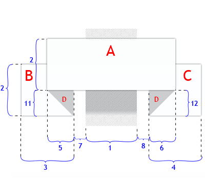
有很多地方介绍过使用“display:inline-block”来替代“float”制作水平布局效果。如果你也使用过的话,你肯定有碰到过,元素之间会有一个左右2px的margin一样产生。
解决这样的问题有两种方法:
方法一有点龌龊,就是在html结构中改变他的书写方式:
原来的写法
- one
- two
- three
修改后的结构
- one
- two
- three
另外一种方法就是将父元素字号设置为0;然后在li元素上恢复字号大小
ul { font-size: 0; } li { font-size: 12px; }
详细的介绍可以参考:
- CSS display: inline-block: why it rocks, and why it sucks
- CSS3制作的分页导航
100%高度的运用
有些同学总是喜欢给一个元素设置高度为100%;想让他填充父元素的整个高度。但是有一点不知道大家有没有试过,当你的父元素没有明确指定一个高度的值,你在其子元素中设置一个高度为100%;会有作用?所以说,如果你想给元素指定100%的高度,最好在父元素中指定一个明确的高度值。
2
相应的样式
#parent{ height: 400px; padding:10px; background:red; } #child{ height: 100%; background:green; }
只有这样设置,子元素#child才会拉伸和父元素#parent一样的高度。
table的圆角设置
如果你想给表格设置圆角效果,那么最好在你的表格中加上下面的样式
table { *border-collapse: collapse; /* IE7 and lower */ border-spacing: 0; border-radius: 5px; }
上面介绍的几个CSS小技巧在平时的运用中是非常有实用价值的,不信你可以尝试一下。上面的小技巧帮我在项目中解决了一些难以想像的bug,我也希望对你在今后的项目中有所帮助。如果你有更好更多的小技巧,不仿与我们一起分享,希望在下面的评论中留下您的足迹,我会在第一时间更新您提供的小技巧。
发布者:全栈程序员-站长,转载请注明出处:https://javaforall.net/204189.html原文链接:https://javaforall.net


