
文章目录
前言
本来没打算写这篇文章,因为自己主要在搞Java相关的,前端的仅仅是使用。但是最近由于开发人手不够,一个人被迫开启全栈,一边写接口一边写页面,刚好项目中有一个需求,所以尝试使用自定义组件开发这块,开始前浅浅看了一下开发者文档【微信开发者文档-组件化】。下面就一起来看一下吧。
项目需求
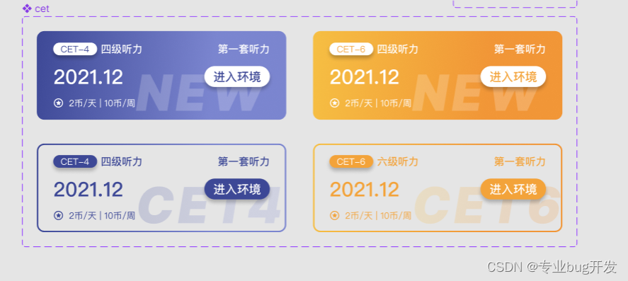
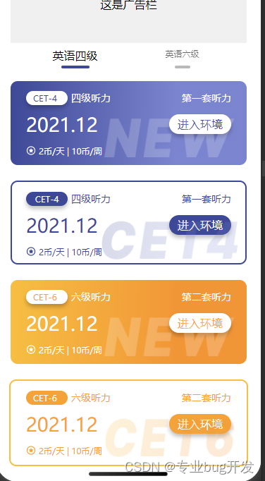
小程序中有一个页面显示四六级相关内容,卡片内容分为如下四种样式,整体布局是一样的,差异出现在细节的样式,如果不考虑组件开发,那我们直接写完一个,其他三个改一改样式就可以了,这样做虽然没有什么不妥,但前端开发也要有所追求,精简代码必须得试试。接下来我们根据项目需求来使用一般方式和组件化方式浅试一下。

一般方式开发
第一步:分析布局
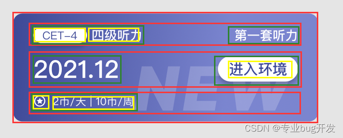
- 根据UI设计分析其中一个的整体布局方式;
第二步:编写代码
- 选择使用flex布局方式完成整体布局;实现细节不做赘述
<view class="cet-box-1"> <view class="cet-boxa-s"> <view class="boxa-s-left"> <view class="boxa-left-1"> <text class="boxa-left-text-1">CET-4 text> view> <text class="boxa-left-title-1">四级听力 text> view> <view class="boxa-s-right-1">第一套听力 view> view> <view class="cet-boxb-s"> <view class="boxb-s-left-1">2021.12 view> <view class="boxb-s-right-1"> <text class="boxb-s-text-1">进入环境 text> view> view> <view class="cet-boxc-s"> <view class="boxc-s-left"> <image class="jinbi" src="/images/jinbi-s-1.png"> image> <text class="box-tip-1">2币/天 | 10币/周 text> view> view> <image class="tag-1" src="/images/cet-1.png"> image> view> /* pages/CET/CET.wxss */ .cet-box-1 { /* 自动布局 */ display: flex; flex-direction: column; align-items: center; width: 335px; height: 119px; background: linear-gradient(91.81deg, #3D4896 -0.63%, #7B85CF 69.88%); border-radius: 10px; margin-bottom: 22px; } .cet-boxa-s { /* 自动布局 */ display: flex; flex-direction: row; justify-content: space-between; align-items: flex-start; width: 291px; height: 20px; margin-top: 14px; /* background-color: aqua; */ } .boxa-s-left { /* 自动布局 */ display: flex; flex-direction: row; align-items: center; gap: 5px; width: 120px; height: 20px; /* background-color: blue; */ } .boxa-left-1 { /* 自动布局 */ display: flex; flex-direction: row; justify-content: center; align-items: center; width: 59px; height: 20px; background: #FFFFFF; box-shadow: 0px 4px 6px rgba(0, 0, 0, 0.25); border-radius: 56px; } .boxa-left-title-1 { width: 56px; height: 20px; font-family: 'PingFang SC'; font-style: normal; font-weight: 500; font-size: 14px; line-height: 20px; color: #FFFFFF; } .boxa-left-text-1 { width: 39px; height: 17px; font-family: 'PingFang SC'; font-style: normal; font-weight: 400; font-size: 12px; line-height: 17px; color: #3D4896; } .boxa-s-right-1 { width: 70px; height: 20px; font-family: 'PingFang SC'; font-style: normal; font-weight: 500; font-size: 14px; line-height: 20px; text-align: right; color: #FFFFFF; } .cet-boxb-s { display: flex; flex-direction: row; justify-content: space-between; align-items: center; width: 291px; height: 38px; margin-top: 8px; /* background-color: aquamarine; */ } .boxb-s-left-1 { width: 95px; height: 38px; font-family: 'PingFang SC'; font-style: normal; font-weight: 500; font-size: 27px; line-height: 38px; color: #FFFFFF; } .boxb-s-right-1 { display: flex; flex-direction: row; justify-content: center; align-items: center; width: 88px; height: 28px; background: #FFFFFF; box-shadow: 0px 4px 6px rgba(0, 0, 0, 0.25); border-radius: 56px; } .boxb-s-text-1 { width: 64px; height: 22px; font-family: 'PingFang SC'; font-style: normal; font-weight: 500; font-size: 16px; line-height: 22px; color: #3D4896; } .cet-boxc-s { display: flex; flex-direction: row; width: 291px; height: 20px; /* background-color: aqua; */ align-items: center; margin-top: 8px; } .boxc-s-left { display: flex; flex-direction: row; align-items: center; width: 120px; height: 14px; } .jinbi { width: 14px; height: 14px; } .box-tip-1 { width: 90px; height: 14px; font-family: 'PingFang SC'; font-style: normal; font-weight: 400; font-size: 12px; line-height: 17px; color: #FFFFFF; margin-left: 4px; } .tag-1 { position: absolute; width: 185px; height: 55px; z-index: 0; margin-top: 53px; margin-left: 115px; }
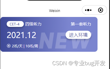
第三步:效果预览
- 实现的效果如图;
第四步:对比差异修改样式
- 对比其他三个的差异,简单修改样式后直接C、V完成;


实现方式总结
按照布局简单实现一个以后复制粘贴修改样式。缺点很明显,代码冗余、复用性差,可读性差。
自定义组件开发
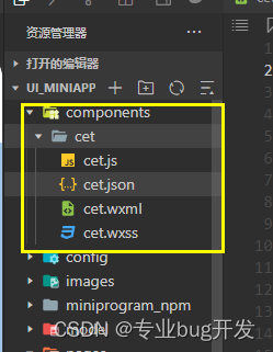
第一步:新建文件夹和组件
- 新建组件文件夹和components
第二步:编写wxml结构文件
- 复制一个卡片的wxml文件到组件的wxml文件里
<view class="cet-box-1">
<view class="cet-boxa-s"> <view class="boxa-s-left"> <view class="boxa-left-1"> <text class="boxa-left-text-1">CET-4
text>
view> <text class="boxa-left-title-1">四级听力
text>
view> <view class="boxa-s-right-1">第一套听力
view>
view>
<view class="cet-boxb-s"> <view class="boxb-s-left-1">2021.12
view> <view class="boxb-s-right-1"> <text class="boxb-s-text-1">进入环境
text>
view>
view>
<view class="cet-boxc-s"> <view class="boxc-s-left"> <image class="jinbi" src="/images/jinbi-s-1.png">
image> <text class="box-tip-1">2币/天 | 10币/周
text>
view>
view> <image class="tag-1" src="/images/cet-1.png">
image>
view> 第三步:修改组件差异样式
- 我们在组件的wxss文件里面写我们需要的四种样式,这里我直接使用 横线加数字 的方式标明不同的样式。这样处理以后我们可以再来一个组件传值,动态决定使用什么样式,如下图所示。

第四步:使用组件传值实现动态样式
第五步:在需要的页面使用组件
- 在json文件引入组件;

- 在wxml使用组件并动态传值;

第六步:使用预览
实现方式总结
我们把具有相同样式的部分统一成一个组件,根据组件传值的不同决定显示效果,减少了代码的耦合、有效对代码进行了复用,这里只是使用组件开发的一个简单的例子,其实很多组件库都是这么开发的。
总结
前端开发和后端开发其实一样,都是追求“高内聚,低耦合”,所以如何使用最少的代码实现效果一直是我们开发者的追求,组件化开发对于减少前端代码冗余发挥了很大的作用。
版权声明:本文内容由互联网用户自发贡献,该文观点仅代表作者本人。本站仅提供信息存储空间服务,不拥有所有权,不承担相关法律责任。如发现本站有涉嫌侵权/违法违规的内容, 请联系我们举报,一经查实,本站将立刻删除。
发布者:全栈程序员-站长,转载请注明出处:https://javaforall.net/221853.html原文链接:https://javaforall.net


