
大家好,又见面了,我是你们的朋友全栈君。如果您正在找激活码,请点击查看最新教程,关注关注公众号 “全栈程序员社区” 获取激活教程,可能之前旧版本教程已经失效.最新Idea2022.1教程亲测有效,一键激活。
Jetbrains全家桶1年46,售后保障稳定
使用CSS渐变
CSS渐变类型的一种特殊类型 表示,由两种或多种颜色之间的渐进过渡组成。您可以选择三种类型的渐变:线性 (由 linear-gradient 函数创建),径向(由 radial-gradient() 函数创建) 和圆锥 (由 conic-gradient (en-US) 函数创建)。您还可以使用 repeating-linear-gradient 和 repeating-radial-gradient 函数创建重复渐变。
渐变可以在任何使用 的地方使用,例如在背景中。 由于渐变是动态生成的,因此它们可以消除对传统用于实现类似效果的栅格图像文件的需求。 此外,由于渐变是由浏览器生成的,因此在放大时它们看起来比栅格图像更好,并且可以动态调整大小。
我们将从线性渐变开始介绍,然后以线性渐变为例介绍所有渐变类型支持的功能,然后继续介绍径向渐变,圆锥渐变和重复渐变。
使用线性渐变
线性渐变创建了一条沿直线前进的颜色带。
基础线性渐变
要创建最基本的渐变类型,您只需指定两种颜色即可。 这些被称为色标。 至少指定两个色标,也可以指定任意数量。
.simple-linear {
  background: linear-gradient(blue, pink);
}
改变渐变方向
默认情况下,线性渐变的方向是从上到下, 你可以指定一个值来改变渐变的方向。
.horizontal-gradient {
  background: linear-gradient(to right, blue, pink);
}
对角线渐变
你甚至可以设置渐变方向为从一个对角到另一个对角。
.diagonal-gradient {
  background: linear-gradient(to bottom right, blue, pink);
}
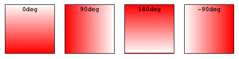
设置渐变角度
如果你想要更精确地控制渐变的方向,你可以给渐变设置一个具体的角度。
.angled-gradient {
  background: linear-gradient(70deg, blue, pink);
}
在使用角度的时候, 0deg 代表渐变方向为从下到上, 90deg 代表渐变方向为从左到右,诸如此类正角度都属于顺时针方向。 而负角度意味着逆时针方向。

声明颜色和创建效果
无需局限于使用两种颜色,你想使用多少种颜色都可以! 默认情况下,所设置颜色会均匀分布在渐变路径中。
.auto-spaced-linear-gradient {
  background: linear-gradient(red, yellow, blue, orange);
}
颜色终止位置
你不需要让你设置的颜色在默认位置终止。 你可以通过给每个颜色设置0,1%或者2%或者其他的绝对数值来调整它们的位置。如果你将位置设置为百分数, 0% 表示起始点, 而100%表示终点,但是如果需要的话你也可以设置这个范围之外的其他值来达到你想要的效果。如果有些位置你没有明确设置,那么它将会被自动计算,第一种颜色会在0%处停止,而最后一种颜色是100%,至于其他颜色则是在它邻近的两种颜色的中间停止。
.multicolor-linear {
   background: linear-gradient(to left, lime 28px, red 77%, cyan);
}
创建实线
要在两种颜色之间创建一条硬线,即创建一个条纹而不是逐渐过渡,可以将相邻的颜色停止设置为相同的位置。在此示例中,两种颜色在50%标记处共享一个颜色停止点,即渐变的一半:
.striped {
   background: linear-gradient(to bottom left, cyan 50%, palegoldenrod 50%);
}
渐变提示
默认情况下,渐变会平滑地从一种颜色过渡到另一种颜色。你可以通过设置一个值来将渐变的中心点移动到指定位置。 在如下示例中, 我们将渐变的中心点由50%设为10%。
.color-hint {
  background: linear-gradient(blue, 10%, pink);
}
.simple-linear {
  background: linear-gradient(blue, pink);
}
创建色带和条纹
要在渐变中包含一个实心的非过渡颜色区域,请包含颜色起止点的两个位置。颜色起止点可以有两个位置,这相当于两个连续颜色在不同位置具有相同的颜色起止点。颜色将在第一个颜色起止点时达到完全饱和,保持该饱和度到第二个颜色起止点,并通过相邻颜色起止点的第一个位置过渡到相邻颜色起止点的颜色。
.multiposition-stops {
   background: linear-gradient(to left,
       lime 20%, red 30%, red 45%, cyan 55%, cyan 70%, yellow 80% );
   background: linear-gradient(to left,
       lime 20%, red 30% 45%, cyan 55% 70%, yellow 80% );
}
.multiposition-stop2 {
   background: linear-gradient(to left,
      lime 25%, red 25%, red 50%, cyan 50%, cyan 75%, yellow 75% );
   background: linear-gradient(to left,
      lime 25%, red 25% 50%, cyan 50% 75%, yellow 75% );
}
In the first example above, the lime goes from the 0% mark, which is implied, to the 20% mark, transitions from lime to red over the next 10% of the width of the gradient, reach solid red at the 30% mark, and staying solid red up until 45% through the gradient, where it fades to cyan, being fully cyan for 15% of the gradient, and so on.
In the second example, the second color stop for each color is at the same location as the first color stop for the adjacent color, creating a striped effect.
In both examples, the gradient is written twice: the first is the CSS Images Level 3 method of repeating the color for each stop and the second example is the CSS Images Level 4 multiple color stop method of including two color-stop-lengths in a linear-color-stop declaration.
Controlling the progression of a gradient(色彩色阶梯度)
By default, a gradient evenly progresses between the colors of two adjacent color stops, with the midpoint between those two color stops being the midpoint color value. You can control the interpolation, or progression, between two color stops by including a color hint location. In this example, the color reaches the midpoint between lime and cyan 20% of the way through the gradient rather than 50% of the way through. The second example does not contain the hint to hilight the difference the color hint can make:
.colorhint-gradient {
  background: linear-gradient(to top, black, 20%, cyan);
}
.regular-progression {
  background: linear-gradient(to top, black, cyan);
}

Overlaying gradients(覆盖梯度)
Gradients support transparency, so you can stack multiple backgrounds to achieve some pretty fancy effects. The backgrounds are stacked from top to bottom, with the first specified being on top.
.layered-image {
  background: linear-gradient(to right, transparent, mistyrose),
      url("https://mdn.mozillademos.org/files/15525/critters.png");
}

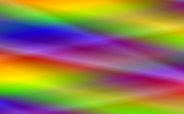
Stacked gradients(多层梯度)
You can even stack gradients with other gradients. As long as the top gradients aren’t entirely opaque, the gradients below will still be visible.
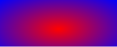
Using radial gradients(使用径向渐变)
Radial gradients are similar to linear gradients, except that they radiate out from a central point. You can dictate where that central point is. You can also make them circular or elliptical.
A basic radial gradient(基本径向梯度)
As with linear gradients, all you need to create a radial gradient are two colors. By default, the center of the gradient is at the 50% 50% mark, and the gradient is elliptical matching the aspect ratio of it’s box:
.simple-radial {
  background: radial-gradient(red, blue);
}
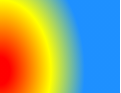
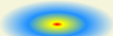
Positioning radial color stops(定位径向颜色止点)
You can position the center of the gradient with keyterms, percentage, or absolute lengths, length and percentage values repeating if only one is present, otherwise in the order of position from the left and position from the top.
.radial-gradient {
  background: radial-gradient(at 0% 30%, red 10px, yellow 30%, #1e90ff 50%);
}
Sizing radial gradients
Unlike linear gradients, you can specify the size of radial gradients. Possible values include closest-corner, closest-side, farthest-corner, and farthest-side, with farthest-corner being the default.
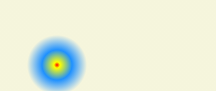
Example: closest-side for ellipses(例子:最近的一面为椭圆)
This example uses the closest-side size value, which means the size is set by the distance from the starting point (the center) to the closest side of the enclosing box.
.radial-ellipse-side {
  background: radial-gradient(ellipse closest-side,
      red, yellow 10%, #1e90ff 50%, beige);
}
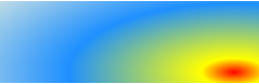
Example: farthest-corner for ellipses(例子:椭圆的最远的角落)
This example is similar to the previous one, except that its size is specified as farthest-corner, which sets the size of the gradient by the distance from the starting point to the farthest corner of the enclosing box from the starting point.
.radial-ellipse-far {
  background: radial-gradient(ellipse farthest-corner at 90% 90%,
      red, yellow 10%, #1e90ff 50%, beige);
}
Example: closest-side for circles(例子:圆的最近的一面)
This example uses closest-side, which makes the circle’s size to be the distance between the starting point (the center) and the closest side. The circle’s radius is the distance between the center of the gradient and the closest edge, which due to the positioning of the 25% from the top and 25% from the bottom, is closest to the bottom, since the height in this case is narrower than the width.
.radial-circle-close {
  background: radial-gradient(circle closest-side at 25% 75%,
      red, yellow 10%, #1e90ff 50%, beige);
}
Stacked radial gradients(堆叠径向梯度)
Just like linear gradients, you can also stack radial gradients. The first specified is on top, the last on the bottom.
.stacked-radial {
  background:
      radial-gradient(circle at 50% 0,
        rgba(255,0,0,.5),
        rgba(255,0,0,0) 70.71%),
      radial-gradient(circle at 6.7% 75%,
        rgba(0,0,255,.5),
        rgba(0,0,255,0) 70.71%),
      radial-gradient(circle at 93.3% 75%,
        rgba(0,255,0,.5),
        rgba(0,255,0,0) 70.71%) beige;
  border-radius: 50%;
}
Using repeating gradients(使用重复的梯度)
The linear-gradient and radial-gradient() properties don’t support automatically repeated color stops. However, the repeating-linear-gradient and repeating-radial-gradient properties are available to offer this functionality.
The size of the gradient line that repeats is the length between the first color stop value and the last color stop length value. If the last color stop has just a color and no color stop length, the value defaults to 0, meaning the linear gradient will not repeat and the radial gradient will only repeat if the radius of the gradient is smaller than the length between the center of the gradient and the farthest corner.
Repeating linear gradients(重复线性渐变)
.repeating-linear {
  background: repeating-linear-gradient(-45deg, red, red 5px, blue 5px, blue 10px);
}
Multiple repeating linear gradients(多个重复的线性梯度)
Similar to regular linear and radial gradients, you can include multiple gradients, one on top of the other. This only makes sense if the gradients are partially transparent allowing subsequent gradients to show through the transparent areas, or if you include different background-sizes, optionally with different background-position property values, for each gradient image. We are using transparency.
In this case the gradient lines are 300px, 230px, and 300px long.
.multi-repeating-linear {
  background:
      repeating-linear-gradient(190deg, rgba(255, 0, 0, 0.5) 40px,
        rgba(255, 153, 0, 0.5) 80px, rgba(255, 255, 0, 0.5) 120px,
        rgba(0, 255, 0, 0.5) 160px, rgba(0, 0, 255, 0.5) 200px,
        rgba(75, 0, 130, 0.5) 240px, rgba(238, 130, 238, 0.5) 280px,
        rgba(255, 0, 0, 0.5) 300px),
      repeating-linear-gradient(-190deg, rgba(255, 0, 0, 0.5) 30px,
        rgba(255, 153, 0, 0.5) 60px, rgba(255, 255, 0, 0.5) 90px,
        rgba(0, 255, 0, 0.5) 120px, rgba(0, 0, 255, 0.5) 150px,
        rgba(75, 0, 130, 0.5) 180px, rgba(238, 130, 238, 0.5) 210px,
        rgba(255, 0, 0, 0.5) 230px),
      repeating-linear-gradient(23deg, red 50px, orange 100px,
        yellow 150px, green 200px, blue 250px,
        indigo 300px, violet 350px, red 370px);
}
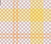
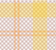
Plaid gradient(格子梯度)
To create plaid we include several overlapping gradients with transparency. In the first background declaration we listed every color stop separately. The second background property declaration using the multiple position color stop syntax:
.plaid-gradient {
  background:
      repeating-linear-gradient(90deg, transparent, transparent 50px,
        rgba(255, 127, 0, 0.25) 50px, rgba(255, 127, 0, 0.25) 56px,
        transparent 56px, transparent 63px,
        rgba(255, 127, 0, 0.25) 63px, rgba(255, 127, 0, 0.25) 69px,
        transparent 69px, transparent 116px,
        rgba(255, 206, 0, 0.25) 116px, rgba(255, 206, 0, 0.25) 166px),
      repeating-linear-gradient(0deg, transparent, transparent 50px,
        rgba(255, 127, 0, 0.25) 50px, rgba(255, 127, 0, 0.25) 56px,
        transparent 56px, transparent 63px,
        rgba(255, 127, 0, 0.25) 63px, rgba(255, 127, 0, 0.25) 69px,
        transparent 69px, transparent 116px,
        rgba(255, 206, 0, 0.25) 116px, rgba(255, 206, 0, 0.25) 166px),
      repeating-linear-gradient(-45deg, transparent, transparent 5px,
        rgba(143, 77, 63, 0.25) 5px, rgba(143, 77, 63, 0.25) 10px),
      repeating-linear-gradient(45deg, transparent, transparent 5px,
        rgba(143, 77, 63, 0.25) 5px, rgba(143, 77, 63, 0.25) 10px);

  background:
      repeating-linear-gradient(90deg, transparent 0 50px,
        rgba(255, 127, 0, 0.25) 50px 56px,
        transparent 56px 63px,
        rgba(255, 127, 0, 0.25) 63px 69px,
        transparent 69px 116px,
        rgba(255, 206, 0, 0.25) 116px 166px),
      repeating-linear-gradient(0deg, transparent 0 50px,
        rgba(255, 127, 0, 0.25) 50px 56px,
        transparent 56px 63px,
        rgba(255, 127, 0, 0.25) 63px 69px,
        transparent 69px 116px,
        rgba(255, 206, 0, 0.25) 116px 166px),
      repeating-linear-gradient(-45deg, transparent 0 5px,
        rgba(143, 77, 63, 0.25) 5px 10px),
      repeating-linear-gradient(45deg, transparent 0 5px,
        rgba(143, 77, 63, 0.25) 5px 10px);
}
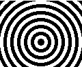
Repeating radial gradients(重复的径向渐变)
This example uses repeating-radial-gradient to create a gradient that radiates repeatedly from a central point. The colors get cycled over and over as the gradient repeats.
.repeating-radial {
  background: repeating-radial-gradient(black, black 5px, white 5px, white 10px);
}
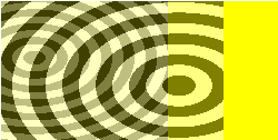
Multiple repeating radial gradients(多次重复的径向梯度)
.multi-target {
  background:
      repeating-radial-gradient(ellipse at 80% 50%,rgba(0,0,0,0.5),
        rgba(0,0,0,0.5) 15px, rgba(255,255,255,0.5) 15px,
        rgba(255,255,255,0.5) 30px) top left no-repeat,
      repeating-radial-gradient(ellipse at 20% 50%,rgba(0,0,0,0.5),
        rgba(0,0,0,0.5) 10px, rgba(255,255,255,0.5) 10px,
        rgba(255,255,255,0.5) 20px) top left no-repeat yellow;
  background-size: 200px 200px, 150px 150px;
}
Plaid gradient(格子梯度)
To create plaid we include several overlapping gradients with transparency. In the first background declaration we listed every color stop separately. The second background property declaration using the multiple position color stop syntax:
<div class="plaid-gradient"></div>
div {
  width: 200px;
  height: 200px;
}
.plaid-gradient {
  background:
      repeating-linear-gradient(90deg, transparent, transparent 50px,
        rgba(255, 127, 0, 0.25) 50px, rgba(255, 127, 0, 0.25) 56px,
        transparent 56px, transparent 63px,
        rgba(255, 127, 0, 0.25) 63px, rgba(255, 127, 0, 0.25) 69px,
        transparent 69px, transparent 116px,
        rgba(255, 206, 0, 0.25) 116px, rgba(255, 206, 0, 0.25) 166px),
      repeating-linear-gradient(0deg, transparent, transparent 50px,
        rgba(255, 127, 0, 0.25) 50px, rgba(255, 127, 0, 0.25) 56px,
        transparent 56px, transparent 63px,
        rgba(255, 127, 0, 0.25) 63px, rgba(255, 127, 0, 0.25) 69px,
        transparent 69px, transparent 116px,
        rgba(255, 206, 0, 0.25) 116px, rgba(255, 206, 0, 0.25) 166px),
      repeating-linear-gradient(-45deg, transparent, transparent 5px,
        rgba(143, 77, 63, 0.25) 5px, rgba(143, 77, 63, 0.25) 10px),
      repeating-linear-gradient(45deg, transparent, transparent 5px,
        rgba(143, 77, 63, 0.25) 5px, rgba(143, 77, 63, 0.25) 10px);

  background:
      repeating-linear-gradient(90deg, transparent 0 50px,
        rgba(255, 127, 0, 0.25) 50px 56px,
        transparent 56px 63px,
        rgba(255, 127, 0, 0.25) 63px 69px,
        transparent 69px 116px,
        rgba(255, 206, 0, 0.25) 116px 166px),
      repeating-linear-gradient(0deg, transparent 0 50px,
        rgba(255, 127, 0, 0.25) 50px 56px,
        transparent 56px 63px,
        rgba(255, 127, 0, 0.25) 63px 69px,
        transparent 69px 116px,
        rgba(255, 206, 0, 0.25) 116px 166px),
      repeating-linear-gradient(-45deg, transparent 0 5px,
        rgba(143, 77, 63, 0.25) 5px 10px),
      repeating-linear-gradient(45deg, transparent 0 5px,
        rgba(143, 77, 63, 0.25) 5px 10px);
}
See also
- Gradient functions: linear-gradient, radial-gradient(),
repeating-linear-gradient, repeating-radial-gradient - Gradient-related CSS data types: ,
- Gradient-related CSS properties: background, background-image
- CSS Gradients Patterns Gallery, by Lea Verou
- CSS3 Gradients Library, by Estelle Weyl
- Gradient CSS Generator
**本文著作权归作者所有
来源地址:https://editor.csdn.net/md/?articleId=108940873
发布者:全栈程序员-站长,转载请注明出处:https://javaforall.net/226757.html原文链接:https://javaforall.net


