
项目场景:
渐变圆角边框
问题描述:
无法给一个圆角的div加上渐变的边框
border-image 存在缺陷不支持圆角
使用完 border-image 之后,border-radius 设置是无效的,达不到圆角的效果
解决方案:
background-image/background-clip
<div class="outBor"> <div class="content"> <span>内容区域</span> </div> </div> html,body{
background-color: rgb(51, 50, 50); } .outBor{
width: 360px; height: 150px; padding: 1px; display: flex; justify-content: center; align-items: center; border: none; background-color: transparent; box-sizing:border-box; /* 这里需要设置两个背景,第一个背景是内容区域的背景,另一个是实现渐变边框的背景 */ background-image: linear-gradient(100deg,rgba(29,39,34,0.8)0.94%,rgba(54,87,79,0.8) 94.7%),linear-gradient(to bottom right, #0fd850, #f9f047); border-radius: 12px; /* 背景裁切的时候,第一个背景需要从内容区域开始裁切,因此设置为content-box; 第二个背景需要作为渐变边框,因此需要从边框处开始裁切 */ background-clip: content-box,padding-box; } .content{
width: 359px; height: 148px; padding:15px; color: #f1f1ee; display: flex; justify-content: center; align-items: center; } 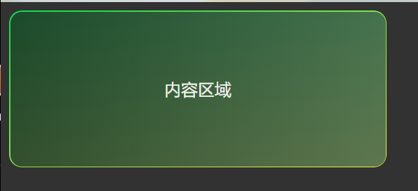

版权声明:本文内容由互联网用户自发贡献,该文观点仅代表作者本人。本站仅提供信息存储空间服务,不拥有所有权,不承担相关法律责任。如发现本站有涉嫌侵权/违法违规的内容, 请联系我们举报,一经查实,本站将立刻删除。
发布者:全栈程序员-站长,转载请注明出处:https://javaforall.net/229054.html原文链接:https://javaforall.net


