自定义 QTreeView自定义QTreeView交替行的背景色可以使用下面样式代码来定义:QTreeView{alternate-background-color:yellow;}123123当鼠标划过item时,如果要提供一个特殊的背景色,可以使用 ::item 辅助控制,例如:QTreeView{show-decoration-selected:1;}
大家好,又见面了,我是你们的朋友全栈君。
自定义 QTreeView
交替行的背景色可以使用下面样式代码来定义:
QTreeView { alternate-background-color : yellow } 当鼠标划过 item 时,如果要提供一个特殊的背景色,可以使用 ::item 辅助控制,例如:
QTreeView { show-decoration-selected : 1 }
QTreeView ::item { border : 1 px solid #d9d9d9 border-top-color : transparent border-bottom-color : transparent }
QTreeView ::item :hover { background : qlineargradient(x1: 0 , y1: 0 , x2: 0 , y2: 1 , stop: 0 #e7effd, stop: 1 #cbdaf1) border : 1 px solid #bfcde4 }
QTreeView ::item :selected { border : 1 px solid #567dbc }
QTreeView ::item :selected :active { background : qlineargradient(x1: 0 , y1: 0 , x2: 0 , y2: 1 , stop: 0 #6 ea1f1, stop: 1 #567 dbc) }
QTreeView ::item :selected :!active { background : qlineargradient(x1: 0 , y1: 0 , x2: 0 , y2: 1 , stop: 0 #6 b9be8, stop: 1 #577 fbf) }
1
2
3
4
5
6
7
8
9
10
11
12
13
14
15
16
17
18
19
20
21
22
23
24
25
26
1
2
3
4
5
6
7
8
9
10
11
12
13
14
15
16
17
18
19
20
21
22
23
24
25
26
QTreeView 的分支可以使用 ::branch 辅助控制。当绘制一个 branch 时,下述的样式颜色实现了一系列状态。
QTreeView ::branch { background : palette(base) }
QTreeView ::branch :has-siblings :!adjoins-item { background : cyan }
QTreeView ::branch :has-siblings :adjoins-item { background : red }
QTreeView ::branch :!has-children :!has-siblings :adjoins-item { background : blue }
QTreeView ::branch :closed :has-children :has-siblings { background : pink }
QTreeView ::branch :has-children :!has-siblings :closed { background : gray }
QTreeView ::branch :open :has-children :has-siblings { background : magenta }
QTreeView ::branch :open :has-children :!has-siblings { background : green }
1
2
3
4
5
6
7
8
9
10
11
12
13
14
15
16
17
18
19
20
21
22
23
24
25
26
27
28
29
30
31
1
2
3
4
5
6
7
8
9
10
11
12
13
14
15
16
17
18
19
20
21
22
23
24
25
26
27
28
29
30
31
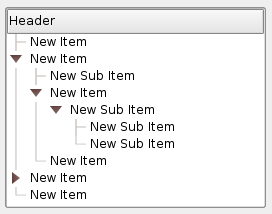
尽管它比较丰富多彩,但可以用下面的图片实现一个更有用的效果:
图片
路径
vline.png
branch-more.png
branch-end.png
branch-closed.png
branch-open.png
QTreeView ::branch :has-siblings :!adjoins-item { border-image : url(vline.png) 0 }
QTreeView ::branch :has-siblings :adjoins-item { border-image : url(branch-more.png) 0 }
QTreeView ::branch :!has-children :!has-siblings :adjoins-item { border-image : url(branch-end.png) 0 }
QTreeView ::branch :has-children :!has-siblings :closed ,
QTreeView ::branch :closed :has-children :has-siblings { border-image : none image : url(branch-closed.png) }
QTreeView ::branch :open :has-children :!has-siblings ,
QTreeView ::branch :open :has-children :has-siblings { border-image : none image : url(branch-open.png) }
1
2
3
4
5
6
7
8
9
10
11
12
13
14
15
16
17
18
19
20
21
22
23
1
2
3
4
5
6
7
8
9
10
11
12
13
14
15
16
17
18
19
20
21
22
23
由此产生的 Tree 视图看起来像这样:
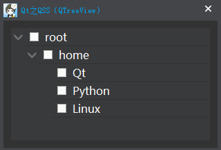
如果我们对 Tree 需要添加指示器,需要用过 ::indicator 辅助控制:
QTreeView { border : 1 px solid rgb(50 , 50 , 50 ) background-color : rgb(57 , 58 , 60 ) font-size : 16 px }
QTreeView ::item { height : 25 px color : white border : none border-bottom : 1 px solid rgb(50 , 50 , 50 ) background-color : transparent }
QTreeView ::item :hover { background-color : rgba(255 , 255 , 255 , 40 ) }
QTreeView ::item :selected { background-color : rgb(0 , 160 , 230 ) }
QTreeView ::branch :open :has-children { image : url(:/Images/arrowBottom) }
QTreeView ::branch :closed :has-children { image : url(:/Images/arrowRight) }
QTreeView ::indicator { width : 20 px height : 20 px }
QTreeView ::indicator :enabled :unchecked { image : url(:/Images/checkBox) }
QTreeView ::indicator :enabled :unchecked :hover { image : url(:/Images/checkBoxHover) }
QTreeView ::indicator :enabled :unchecked :pressed { image : url(:/Images/checkBoxPressed) }
QTreeView ::indicator :enabled :checked { image : url(:/Images/checkBoxChecked) }
QTreeView ::indicator :enabled :checked :hover { image : url(:/Images/checkBoxCheckedHover) }
QTreeView ::indicator :enabled :checked :pressed { image : url(:/Images/checkBoxCheckedPressed) }
QTableView ::indicator :enabled :indeterminate { image : url(:/Images/checkBoxIndeterminate) }
QTreeView ::indicator :enabled :indeterminate :hover { image : url(:/Images/checkBoxIndeterminateHover) }
QTreeView ::indicator :enabled :indeterminate :pressed { image : url(:/Images/checkBoxIndeterminatePressed) }
1
2
3
4
5
6
7
8
9
10
11
12
13
14
15
16
17
18
19
20
21
22
23
24
25
26
27
28
29
30
31
32
33
34
35
36
37
38
39
40
41
42
43
44
45
46
47
48
49
50
51
52
53
54
55
1
2
3
4
5
6
7
8
9
10
11
12
13
14
15
16
17
18
19
20
21
22
23
24
25
26
27
28
29
30
31
32
33
34
35
36
37
38
39
40
41
42
43
44
45
46
47
48
49
50
51
52
53
54
55
由上面分析,如果要整行拓展,可以将 item 和 branch 相同状态(正常、划过、选中)下的背景设置相同。
QTreeView { border : 1 px solid rgb(50 , 50 , 50 ) background-color : rgb(57 , 58 , 60 ) }
QTreeView ::item { height : 25 px color : white border : none background-color : transparent }
QTreeView ::item :hover , QTreeView ::branch :hover { background-color : rgba(255 , 255 , 255 , 40 ) }
QTreeView ::item :selected , QTreeView ::branch :selected { background-color : rgb(0 , 160 , 230 ) }
QTreeView ::branch { background-color : transparent }
QTreeView ::branch :open :has-children { image : url(:/Images/arrowBottom) }
QTreeView ::branch :closed :has-children { image : url(:/Images/arrowRight) }
1
2
3
4
5
6
7
8
9
10
11
12
13
14
15
16
17
18
19
20
21
22
23
24
25
1
2
3
4
5
6
7
8
9
10
11
12
13
14
15
16
17
18
19
20
21
22
23
24
25
O__O”…,看似大功告成,可万万没想到:
当鼠标选中的时候可以整行拓展,可是当鼠标滑过。。。无语中!
没关系,其实 Qt 关于盒模型的介绍说的很清楚,不妨添加如下代码试试:
QTreeView { show-decoration-selected : 1 } 注意: 在之前代码的基础上,只需再添加这一行即可。
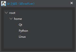
再来看一下效果:
show-decoration-selected 属性控制选中时是选中整项还是仅仅只是项的文本,而辅助控制(子组件) ::branch 和 ::item 用于精细化控制。
版权声明:本文内容由互联网用户自发贡献,该文观点仅代表作者本人。本站仅提供信息存储空间服务,不拥有所有权,不承担相关法律责任。如发现本站有涉嫌侵权/违法违规的内容, 请联系我们举报,一经查实,本站将立刻删除。
发布者:全栈程序员-站长,转载请注明出处:https://javaforall.net/132302.html 原文链接:https://javaforall.net


