
大家好,又见面了,我是你们的朋友全栈君。如果您正在找激活码,请点击查看最新教程,关注关注公众号 “全栈程序员社区” 获取激活教程,可能之前旧版本教程已经失效.最新Idea2022.1教程亲测有效,一键激活。
Jetbrains全系列IDE稳定放心使用
用一些实例来作为QCustomPlot学习的指南,如果用QtCreater 提升一个Widget,就能够通过 ui->customPlot或者其他的名字访问各个Widget;
You can create a new graph in the plot via customPlot->addGraph(). Then you assign the graph some data points, e.g. via customPlot->graph(0)->setData(..), for example in the form of two QVector<double> for x and y (key and value). The reason why QCustomPlot uses the terminology key and value instead of x and y is to allow more flexibility in assigning which axis has what role. So if you define the left axis as “key axis” and the bottom as “value axis”, you can plot a graph that’s standing upright on the left of the plot. By default a QCustomPlot widget has four axes: customPlot->xAxis, yAxis, xAxis2, and yAxis2 of type QCPAxis, corresponding to the bottom, left, top and right axis. Their range defines which portion of the plot is currently visible: customPlot->xAxis->setRange(-1, 1).
通过 customPlot->addGraph()在Plot上创建一个新的graph,然后就可以指派相关数据点到graph上,例如:通过customPlot->graph(0)->setData(..),用QVector<double> 代表 x and y (key and value),QCustomPlot用Key,Value代替x和y,已达到可以让哪一个轴代表什么角色变得更加灵活,因此,如果你定义了左边的轴为Key轴,和底部的轴为value轴,你可以画一个左侧为底的图表;缺省的QCustomPlot Widget有四个轴,customPlot->xAxis, yAxis, xAxis2, and yAxis2 of type QCPAxis;分别与底部,左边,上面,右侧对应;他们的范围定义了这个Plot那一部分是可见的、customPlot->xAxis->setRange(-1, 1)。
To make any kind of changes to the plot appear on screen, call customPlot->replot(). Note that a replot will automatically happen when the widget is resized and when the built-in user interactions are triggered. Such user interactions are for example dragging the axis ranges with the mouse and zooming with the mouse wheel.
为了使图像有任何更改都刷新,调用customPlot->replot()。请注意,当小部件被调整或者当内置的用户交互被触发时,replot将自动发生。例如,这样的用户交互就是用鼠标拖动轴的范围,然后用鼠标滚轮进行缩放。
// generate some data:
QVector<double> x(101), y(101); // initialize with entries 0..100
for (int i=0; i<101; ++i)
{
  x[i] = i/50.0 - 1; // x goes from -1 to 1
  y[i] = x[i]*x[i]; // let's plot a quadratic function
}
// create graph and assign data to it:
customPlot->addGraph();
customPlot->graph(0)->setData(x, y);
// give the axes some labels:
customPlot->xAxis->setLabel("x");
customPlot->yAxis->setLabel("y");
// set axes ranges, so we see all data:
customPlot->xAxis->setRange(-1, 1);
customPlot->yAxis->setRange(0, 1);
customPlot->replot();
输出图像:

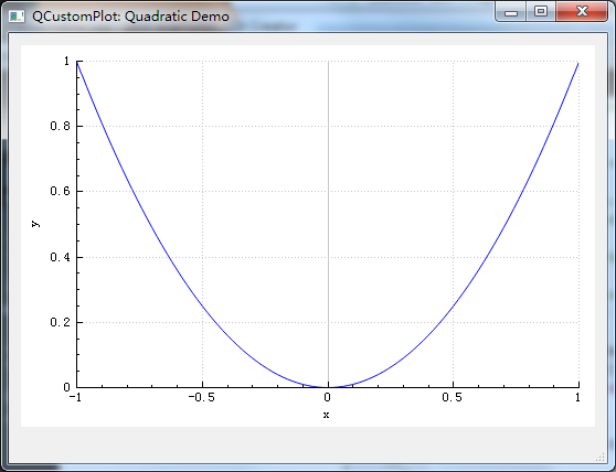
The tick step and labeling is chosen automatically, by the axis ticker that is currently used by the axis. This is an instance of type QCPAxisTicker, and is accessible e.g. via xAxis->ticker(). You can adjust the approximate number of ticks that the ticker tries to create via xAxis->ticker()->setTickCount(6). The default axis ticker is well suited for simple numerical displays, however there are specialized classes e.g. for time spans, calendar dates, categories, pi (or other symbolic units) and logarithmic axes. See the QCPAxisTicker documentation for details.
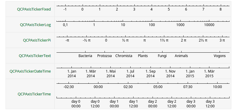
十字叉和标签是由当前使用的轴自动选择的,这是QCPAxisTicker的一种类型的实例,通过xAxis->ticker()访问。可以使用xAxis->ticker()->setTickCount(6)去调整或者创建合适数量的十字叉;缺省的轴十字叉非常适合简单数值的展示,有一些专门的类为特殊的轴提供服务,如时间间隔,日历,类别,圆周,对数等,查阅QCPAxisTicker documentation;
void MainWindow::setupQuadraticDemo(QCustomPlot *customPlot)
{
demoName = "Quadratic Demo";
// generate some data:
QVector<double> x(101), y(101); // initialize with entries 0..100
for (int i=0; i<101; ++i)
{
x[i] = i/50.0 - 1; // x goes from -1 to 1
y[i] = x[i]*x[i]; // let's plot a quadratic function
}
// create graph and assign data to it:
customPlot->addGraph();
customPlot->graph(0)->setData(x, y);
// give the axes some labels:
customPlot->xAxis->setLabel("x");
customPlot->yAxis->setLabel("y");
// set axes ranges, so we see all data:
customPlot->xAxis->setRange(-1, 1);
customPlot->yAxis->setRange(0, 1);
//customPlot->xAxis->ticker();
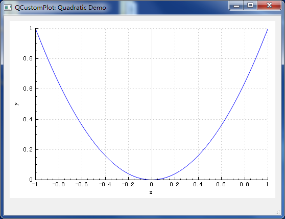
customPlot->xAxis->ticker()->setTickCount(10);//x轴的分成了10份
}
The tick labels (the numbers) of the axes never reach outside the widget border, even when they get wider. This is due to the automatic margin calculation, which is turned on by default. It makes the axis rect shrink if the tick labels and axis labels need more space. If you don’t wish that the margin is determined automatically, disable the behaviour by calling customPlot->axisRect()->setAutoMargins(QCP::msNone). Then you can adjust the margin manually via customPlot->axisRect()->setMargins(..).
轴的标记标签绝不会超过Widget的边界之外,即使他们表宽了。这是因为Margin自动计算保证的,这个是默认打开的,如果标记标签需要更多的空间,会导致轴所在的矩形区域收缩;如果你不希望这个Margin是自动决定的,你可以用customPlot->axisRect()->setAutoMargins(QCP::msNone)使之失效,也可以用customPlot->axisRect()->setMargins(..).调整Margin。
改变图形外观:
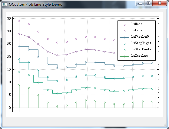
Line style: Call graph->setLineStyle(..). For all possible line styles, see the LineStyle documentation or the line style demo screenshot on the introduction page.线型风格,通过graph->setLineStyle(..)设置;
Line pen: All pens the QPainter-framework provides are available, e.g. solid, dashed, dotted, different widths, colors, transparency, etc. Set the configured pen via graph->setPen(..)线条画笔, graph->setPen(..)配置
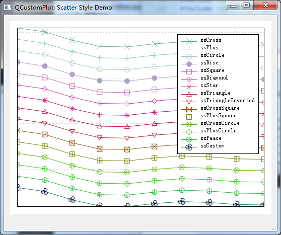
Scatter symbol: Call graph->setScatterStyle(..) to change the look of the scatter point symbols. For all possible scatter styles, see the QCPScatterStyle documentation or the scatter style demo screenshot shown on the introduction page. If you don’t want any scatter symbols to show at the data points, set the graph’s scatter style to QCPScatterStyle::ssNone.设置分散符号,包括符号类型,和大小,详情见QCPScratterStyle, graph->setScatterStyle(..) 去设置;
Fills under graph or between two graphs: All brushes the QPainter-framework provides can be used in graph fills: solid, various patterns, textures, gradients, colors, transparency, etc. Set the configured brush via graph->setBrush(..).填充两个图形之间的画刷,或者图形下面的画刷graph->setBrush(..)
void MainWindow::setupScatterStyleDemo(QCustomPlot *customPlot)
{
  demoName = "Scatter Style Demo";
  customPlot->legend->setVisible(true);
  customPlot->legend->setFont(QFont("Helvetica", 9));
  customPlot->legend->setRowSpacing(-3);
  QVector<QCPScatterStyle::ScatterShape> shapes;
  shapes << QCPScatterStyle::ssCross;
  shapes << QCPScatterStyle::ssPlus;
  shapes << QCPScatterStyle::ssCircle;
  shapes << QCPScatterStyle::ssDisc;
  shapes << QCPScatterStyle::ssSquare;
  shapes << QCPScatterStyle::ssDiamond;
  shapes << QCPScatterStyle::ssStar;
  shapes << QCPScatterStyle::ssTriangle;
  shapes << QCPScatterStyle::ssTriangleInverted;
  shapes << QCPScatterStyle::ssCrossSquare;
  shapes << QCPScatterStyle::ssPlusSquare;
  shapes << QCPScatterStyle::ssCrossCircle;
  shapes << QCPScatterStyle::ssPlusCircle;
  shapes << QCPScatterStyle::ssPeace;
  shapes << QCPScatterStyle::ssCustom;

  QPen pen;
  // add graphs with different scatter styles:
  for (int i=0; i<shapes.size(); ++i)
  {
    customPlot->addGraph();
    pen.setColor(QColor(qSin(i*0.3)*100+100, qSin(i*0.6+0.7)*100+100, qSin(i*0.4+0.6)*100+100));
    // generate data:
    QVector<double> x(10), y(10);
    for (int k=0; k<10; ++k)
    {
      x[k] = k/10.0 * 4*3.14 + 0.01;
      y[k] = 7*qSin(x[k])/x[k] + (shapes.size()-i)*5;
    }
    customPlot->graph()->setData(x, y);
    customPlot->graph()->rescaleAxes(true);
    customPlot->graph()->setPen(pen);
    customPlot->graph()->setName(QCPScatterStyle::staticMetaObject.enumerator(QCPScatterStyle::staticMetaObject.indexOfEnumerator("ScatterShape")).valueToKey(shapes.at(i)));
    customPlot->graph()->setLineStyle(QCPGraph::lsLine);
    // set scatter style:
    if (shapes.at(i) != QCPScatterStyle::ssCustom)
    {
      customPlot->graph()->setScatterStyle(QCPScatterStyle(shapes.at(i), 10));
    }
    else
    {
      QPainterPath customScatterPath;
      for (int i=0; i<3; ++i)
        customScatterPath.cubicTo(qCos(2*M_PI*i/3.0)*9, qSin(2*M_PI*i/3.0)*9, qCos(2*M_PI*(i+0.9)/3.0)*9, qSin(2*M_PI*(i+0.9)/3.0)*9, 0, 0);
      customPlot->graph()->setScatterStyle(QCPScatterStyle(customScatterPath, QPen(Qt::black, 0), QColor(40, 70, 255, 50), 10));
    }
  }
  // set blank axis lines:
  customPlot->rescaleAxes();
  customPlot->xAxis->setTicks(false);
  customPlot->yAxis->setTicks(false);
  customPlot->xAxis->setTickLabels(false);
  customPlot->yAxis->setTickLabels(false);
  // make top right axes clones of bottom left axes:
  customPlot->axisRect()->setupFullAxesBox();
}
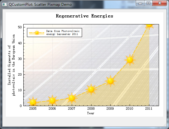
void MainWindow::setupScatterPixmapDemo(QCustomPlot *customPlot)
{
  demoName = "Scatter Pixmap Demo";
  customPlot->axisRect()->setBackground(QPixmap("./solarpanels.jpg"));
  customPlot->addGraph();
  customPlot->graph()->setLineStyle(QCPGraph::lsLine);
  QPen pen;
  pen.setColor(QColor(255, 200, 20, 200));
  pen.setStyle(Qt::DashLine);
  pen.setWidthF(2.5);
  customPlot->graph()->setPen(pen);
  customPlot->graph()->setBrush(QBrush(QColor(255,200,20,70)));
  customPlot->graph()->setScatterStyle(QCPScatterStyle(QPixmap("F:/MyStudy/qcustomplot/examples/plots/sun.png")));
  // set graph name, will show up in legend next to icon:
  customPlot->graph()->setName("Data from Photovoltaic\nenergy barometer 2011");
  // set data:
  QVector<double> year, value;
  year  << 2005 << 2006 << 2007 << 2008  << 2009  << 2010 << 2011;
  value << 2.17 << 3.42 << 4.94 << 10.38 << 15.86 << 29.33 << 52.1;
  customPlot->graph()->setData(year, value);

  // set title of plot:
  customPlot->plotLayout()->insertRow(0);
  customPlot->plotLayout()->addElement(0, 0, new QCPTextElement(customPlot, "Regenerative Energies", QFont("sans", 12, QFont::Bold)));
  // axis configurations:
  customPlot->xAxis->setLabel("Year");
  customPlot->yAxis->setLabel("Installed Gigawatts of\nphotovoltaic in the European Union");
  customPlot->xAxis2->setVisible(true);
  customPlot->yAxis2->setVisible(true);
  customPlot->xAxis2->setTickLabels(false);
  customPlot->yAxis2->setTickLabels(false);
  customPlot->xAxis2->setTicks(false);
  customPlot->yAxis2->setTicks(false);
  customPlot->xAxis2->setSubTicks(false);
  customPlot->yAxis2->setSubTicks(false);
  customPlot->xAxis->setRange(2004.5, 2011.5);
  customPlot->yAxis->setRange(0, 52);
  // setup legend:
  customPlot->legend->setFont(QFont(font().family(), 7));
  customPlot->legend->setIconSize(50, 20);
  customPlot->legend->setVisible(true);
  customPlot->axisRect()->insetLayout()->setInsetAlignment(0, Qt::AlignLeft | Qt::AlignTop);
}
void MainWindow::setupLineStyleDemo(QCustomPlot *customPlot)
{
  demoName = "Line Style Demo";
  customPlot->legend->setVisible(true);
  customPlot->legend->setFont(QFont("Helvetica", 9));
  QPen pen;
  QStringList lineNames;
  lineNames << "lsNone" << "lsLine" << "lsStepLeft" << "lsStepRight" << "lsStepCenter" << "lsImpulse";
  // add graphs with different line styles:
  for (int i=QCPGraph::lsNone; i<=QCPGraph::lsImpulse; ++i)
  {
    customPlot->addGraph();
    pen.setColor(QColor(qSin(i*1+1.2)*80+80, qSin(i*0.3+0)*80+80, qSin(i*0.3+1.5)*80+80));
    customPlot->graph()->setPen(pen);
    customPlot->graph()->setName(lineNames.at(i-QCPGraph::lsNone));
    customPlot->graph()->setLineStyle((QCPGraph::LineStyle)i);
    customPlot->graph()->setScatterStyle(QCPScatterStyle(QCPScatterStyle::ssCircle, 5));
    // generate data:
    QVector<double> x(15), y(15);
    for (int j=0; j<15; ++j)
    {
      x[j] = j/15.0 * 5*3.14 + 0.01;
      y[j] = 7*qSin(x[j])/x[j] - (i-QCPGraph::lsNone)*5 + (QCPGraph::lsImpulse)*5 + 2;
    }
    customPlot->graph()->setData(x, y);
    customPlot->graph()->rescaleAxes(true);
  }
  // zoom out a bit:
  customPlot->yAxis->scaleRange(1.1, customPlot->yAxis->range().center());
  customPlot->xAxis->scaleRange(1.1, customPlot->xAxis->range().center());
  // set blank axis lines:
  customPlot->xAxis->setTicks(false);
  customPlot->yAxis->setTicks(true);
  customPlot->xAxis->setTickLabels(false);
  customPlot->yAxis->setTickLabels(true);
  // make top right axes clones of bottom left axes:
  customPlot->axisRect()->setupFullAxesBox();
}
void MainWindow::setupSimpleDemo(QCustomPlot *customPlot)
{
  demoName = "Simple Demo";

  // add two new graphs and set their look:
  customPlot->addGraph();
  customPlot->graph(0)->setPen(QPen(Qt::blue)); // line color blue for first graph
  customPlot->graph(0)->setBrush(QBrush(QColor(0, 0, 255, 20))); // first graph will be filled with translucent blue
  customPlot->addGraph();
  customPlot->graph(1)->setPen(QPen(Qt::red)); // line color red for second graph
  // generate some points of data (y0 for first, y1 for second graph):
  QVector<double> x(251), y0(251), y1(251);
  for (int i=0; i<251; ++i)
  {
    x[i] = i;
    y0[i] = qExp(-i/150.0)*qCos(i/10.0); // exponentially decaying cosine
    y1[i] = qExp(-i/150.0);              // exponential envelope
  }
  // configure right and top axis to show ticks but no labels:
  // (see QCPAxisRect::setupFullAxesBox for a quicker method to do this)
  customPlot->xAxis2->setVisible(true);
  customPlot->xAxis2->setTickLabels(false);
  customPlot->yAxis2->setVisible(true);
  customPlot->yAxis2->setTickLabels(false);
  // make left and bottom axes always transfer their ranges to right and top axes:
  connect(customPlot->xAxis, SIGNAL(rangeChanged(QCPRange)), customPlot->xAxis2, SLOT(setRange(QCPRange)));
  connect(customPlot->yAxis, SIGNAL(rangeChanged(QCPRange)), customPlot->yAxis2, SLOT(setRange(QCPRange)));
  // pass data points to graphs:
  customPlot->graph(0)->setData(x, y0);
  customPlot->graph(1)->setData(x, y1);
  // let the ranges scale themselves so graph 0 fits perfectly in the visible area:
  customPlot->graph(0)->rescaleAxes();
  // same thing for graph 1, but only enlarge ranges (in case graph 1 is smaller than graph 0):
  customPlot->graph(1)->rescaleAxes(true);
  // Note: we could have also just called customPlot->rescaleAxes(); instead
  // Allow user to drag axis ranges with mouse, zoom with mouse wheel and select graphs by clicking:
  customPlot->setInteractions(QCP::iRangeDrag | QCP::iRangeZoom | QCP::iSelectPlottables);
}
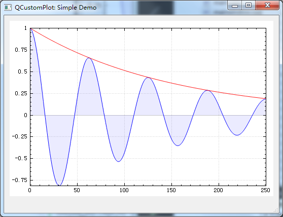
从图像可以看出画刷填充是与0这一条直线之间被填充,如果想与其他的线之间填充调用customPlot->graph(0)->setChannelFillGraph(customPlot->graph(1));
void MainWindow::setupTextureBrushDemo(QCustomPlot *customPlot)
{
  demoName = "Texture Brush Demo";
  // add two graphs with a textured fill:
  customPlot->addGraph();
  QPen redDotPen;
  redDotPen.setStyle(Qt::DotLine);
  redDotPen.setColor(QColor(170, 100, 100, 180));
  redDotPen.setWidthF(2);
  customPlot->graph(0)->setPen(redDotPen);
  customPlot->graph(0)->setBrush(QBrush(QPixmap("F:/MyStudy/qcustomplot/examples/plots/balboa.jpg"))); // fill with texture of specified image

  customPlot->addGraph();
  customPlot->graph(1)->setPen(QPen(Qt::red));

  // activate channel fill for graph 0 towards graph 1:
  customPlot->graph(0)->setChannelFillGraph(customPlot->graph(1));

  // generate data:
  QVector<double> x(250);
  QVector<double> y0(250), y1(250);
  for (int i=0; i<250; ++i)
  {
    // just playing with numbers, not much to learn here
    x[i] = 3*i/250.0;
    y0[i] = 1+qExp(-x[i]*x[i]*0.8)*(x[i]*x[i]+x[i]);
    y1[i] = 1-qExp(-x[i]*x[i]*0.4)*(x[i]*x[i])*0.1;
  }

  // pass data points to graphs:
  customPlot->graph(0)->setData(x, y0);
  customPlot->graph(1)->setData(x, y1);
  // activate top and right axes, which are invisible by default:
  customPlot->xAxis2->setVisible(true);
  customPlot->yAxis2->setVisible(true);
  // make tick labels invisible on top and right axis:
  customPlot->xAxis2->setTickLabels(false);
  customPlot->yAxis2->setTickLabels(false);
  // set ranges:
  customPlot->xAxis->setRange(0, 2.5);
  customPlot->yAxis->setRange(0.9, 1.6);
  // assign top/right axes same properties as bottom/left:
  customPlot->axisRect()->setupFullAxesBox();
}
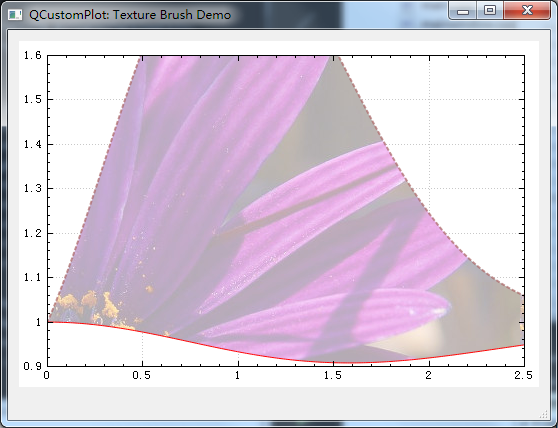
To remove the channel fill, just pass 0 as other graph, and the fill will reach all the way to the zero-value-line as before. To remove the fill completely, call graph->setBrush(Qt::NoBrush).要移除填充,只需要改变channel,用0作为另外一个graph,就还原为之前的缺省状态,如果要全部移除,调用graph->setBrush(Qt::NoBrush).
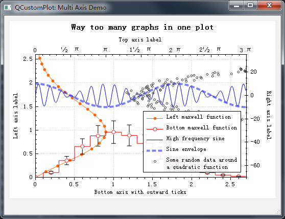
多个轴线,多个图形,设置标识,customPlot->legend->setVisible(true)让标识显示customPlot->graph(0)->setName(“Left maxwell function”)设置标识名称;
void MainWindow::setupMultiAxisDemo(QCustomPlot *customPlot)
{
  customPlot->setInteractions(QCP::iRangeDrag | QCP::iRangeZoom);
  demoName = "Multi Axis Demo";

  customPlot->setLocale(QLocale(QLocale::English, QLocale::UnitedKingdom)); // period as decimal separator and comma as thousand separator
  customPlot->legend->setVisible(true);
  QFont legendFont = font();  // start out with MainWindow's font..
  legendFont.setPointSize(9); // and make a bit smaller for legend
  customPlot->legend->setFont(legendFont);
  customPlot->legend->setBrush(QBrush(QColor(255,255,255,230)));
  // by default, the legend is in the inset layout of the main axis rect. So this is how we access it to change legend placement:
  customPlot->axisRect()->insetLayout()->setInsetAlignment(0, Qt::AlignBottom|Qt::AlignRight);

  // setup for graph 0: key axis left, value axis bottom
  // will contain left maxwell-like function
  customPlot->addGraph(customPlot->yAxis, customPlot->xAxis);
  customPlot->graph(0)->setPen(QPen(QColor(255, 100, 0)));
  customPlot->graph(0)->setBrush(QBrush(QPixmap("./balboa.jpg"))); // fill with texture of specified image
  customPlot->graph(0)->setLineStyle(QCPGraph::lsLine);
  customPlot->graph(0)->setScatterStyle(QCPScatterStyle(QCPScatterStyle::ssDisc, 5));
  customPlot->graph(0)->setName("Left maxwell function");

  // setup for graph 1: key axis bottom, value axis left (those are the default axes)
  // will contain bottom maxwell-like function with error bars
  customPlot->addGraph();
  customPlot->graph(1)->setPen(QPen(Qt::red));
  customPlot->graph(1)->setBrush(QBrush(QPixmap("./balboa.jpg"))); // same fill as we used for graph 0
  customPlot->graph(1)->setLineStyle(QCPGraph::lsStepCenter);
  customPlot->graph(1)->setScatterStyle(QCPScatterStyle(QCPScatterStyle::ssCircle, Qt::red, Qt::white, 7));
  customPlot->graph(1)->setName("Bottom maxwell function");
  QCPErrorBars *errorBars = new QCPErrorBars(customPlot->xAxis, customPlot->yAxis);
  errorBars->removeFromLegend();
  errorBars->setDataPlottable(customPlot->graph(1));

  // setup for graph 2: key axis top, value axis right
  // will contain high frequency sine with low frequency beating:
  customPlot->addGraph(customPlot->xAxis2, customPlot->yAxis2);
  customPlot->graph(2)->setPen(QPen(Qt::blue));
  customPlot->graph(2)->setName("High frequency sine");

  // setup for graph 3: same axes as graph 2
  // will contain low frequency beating envelope of graph 2
  customPlot->addGraph(customPlot->xAxis2, customPlot->yAxis2);
  QPen blueDotPen;
  blueDotPen.setColor(QColor(30, 40, 255, 150));
  blueDotPen.setStyle(Qt::DotLine);
  blueDotPen.setWidthF(4);
  customPlot->graph(3)->setPen(blueDotPen);
  customPlot->graph(3)->setName("Sine envelope");

  // setup for graph 4: key axis right, value axis top
  // will contain parabolically distributed data points with some random perturbance
  customPlot->addGraph(customPlot->yAxis2, customPlot->xAxis2);
  customPlot->graph(4)->setPen(QColor(50, 50, 50, 255));
  customPlot->graph(4)->setLineStyle(QCPGraph::lsNone);
  customPlot->graph(4)->setScatterStyle(QCPScatterStyle(QCPScatterStyle::ssCircle, 4));
  customPlot->graph(4)->setName("Some random data around\na quadratic function");

  // generate data, just playing with numbers, not much to learn here:
  QVector<double> x0(25), y0(25);
  QVector<double> x1(15), y1(15), y1err(15);
  QVector<double> x2(250), y2(250);
  QVector<double> x3(250), y3(250);
  QVector<double> x4(250), y4(250);
  for (int i=0; i<25; ++i) // data for graph 0
  {
    x0[i] = 3*i/25.0;
    y0[i] = qExp(-x0[i]*x0[i]*0.8)*(x0[i]*x0[i]+x0[i]);
  }
  for (int i=0; i<15; ++i) // data for graph 1
  {
    x1[i] = 3*i/15.0;;
    y1[i] = qExp(-x1[i]*x1[i])*(x1[i]*x1[i])*2.6;
    y1err[i] = y1[i]*0.25;
  }
  for (int i=0; i<250; ++i) // data for graphs 2, 3 and 4
  {
    x2[i] = i/250.0*3*M_PI;
    x3[i] = x2[i];
    x4[i] = i/250.0*100-50;
    y2[i] = qSin(x2[i]*12)*qCos(x2[i])*10;
    y3[i] = qCos(x3[i])*10;
    y4[i] = 0.01*x4[i]*x4[i] + 1.5*(rand()/(double)RAND_MAX-0.5) + 1.5*M_PI;
  }

  // pass data points to graphs:
  customPlot->graph(0)->setData(x0, y0);
  customPlot->graph(1)->setData(x1, y1);
  errorBars->setData(y1err);
  customPlot->graph(2)->setData(x2, y2);
  customPlot->graph(3)->setData(x3, y3);
  customPlot->graph(4)->setData(x4, y4);
  // activate top and right axes, which are invisible by default:
  customPlot->xAxis2->setVisible(true);
  customPlot->yAxis2->setVisible(true);
  // set ranges appropriate to show data:
  customPlot->xAxis->setRange(0, 2.7);
  customPlot->yAxis->setRange(0, 2.6);
  customPlot->xAxis2->setRange(0, 3.0*M_PI);
  customPlot->yAxis2->setRange(-70, 35);
  // set pi ticks on top axis:
  customPlot->xAxis2->setTicker(QSharedPointer<QCPAxisTickerPi>(new QCPAxisTickerPi));
  // add title layout element:
  customPlot->plotLayout()->insertRow(0);
  customPlot->plotLayout()->addElement(0, 0, new QCPTextElement(customPlot, "Way too many graphs in one plot", QFont("sans", 12, QFont::Bold)));
  // set labels:
  customPlot->xAxis->setLabel("Bottom axis with outward ticks");
  customPlot->yAxis->setLabel("Left axis label");
  customPlot->xAxis2->setLabel("Top axis label");
  customPlot->yAxis2->setLabel("Right axis label");
  // make ticks on bottom axis go outward:
  customPlot->xAxis->setTickLength(0, 5);
  customPlot->xAxis->setSubTickLength(0, 3);
  // make ticks on right axis go inward and outward:
  customPlot->yAxis2->setTickLength(3, 3);
  customPlot->yAxis2->setSubTickLength(1, 1);
}
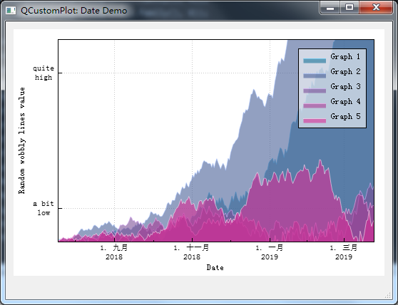
日期轴:
void MainWindow::setupDateDemo(QCustomPlot *customPlot)
{
  demoName = "Date Demo";
  // set locale to english, so we get english month names:
  customPlot->setLocale(QLocale(QLocale::Chinese, QLocale::China));
  // seconds of current time, we'll use it as starting point in time for data:
  double now = QDateTime::currentDateTime().toTime_t();
  srand(8); // set the random seed, so we always get the same random data
  // create multiple graphs:
  for (int gi=0; gi<5; ++gi)
  {
    customPlot->addGraph();
    QColor color(20+200/4.0*gi,70*(1.6-gi/4.0), 150, 150);
    customPlot->graph()->setLineStyle(QCPGraph::lsLine);
    customPlot->graph()->setPen(QPen(color.lighter(200)));
    customPlot->graph()->setBrush(QBrush(color));
    // generate random walk data:
    QVector<QCPGraphData> timeData(250);
    for (int i=0; i<250; ++i)
    {
      timeData[i].key = now + 24*3600*i;
      if (i == 0)
        timeData[i].value = (i/50.0+1)*(rand()/(double)RAND_MAX-0.5);
      else
        timeData[i].value = qFabs(timeData[i-1].value)*(1+0.02/4.0*(4-gi)) + (i/50.0+1)*(rand()/(double)RAND_MAX-0.5);
    }
    customPlot->graph()->data()->set(timeData);
  }
  // configure bottom axis to show date instead of number:
  QSharedPointer<QCPAxisTickerDateTime> dateTicker(new QCPAxisTickerDateTime);
  dateTicker->setDateTimeFormat("d. MMMM\nyyyy");
  customPlot->xAxis->setTicker(dateTicker);
  // configure left axis text labels:
  QSharedPointer<QCPAxisTickerText> textTicker(new QCPAxisTickerText);
  textTicker->addTick(10, "a bit\nlow");
  textTicker->addTick(50, "quite\nhigh");
  customPlot->yAxis->setTicker(textTicker);
  // set a more compact font size for bottom and left axis tick labels:
  customPlot->xAxis->setTickLabelFont(QFont(QFont().family(), 8));
  customPlot->yAxis->setTickLabelFont(QFont(QFont().family(), 8));
  // set axis labels:
  customPlot->xAxis->setLabel("Date");
  customPlot->yAxis->setLabel("Random wobbly lines value");
  // make top and right axes visible but without ticks and labels:
  customPlot->xAxis2->setVisible(true);
  customPlot->yAxis2->setVisible(true);
  customPlot->xAxis2->setTicks(false);
  customPlot->yAxis2->setTicks(false);
  customPlot->xAxis2->setTickLabels(false);
  customPlot->yAxis2->setTickLabels(false);
  // set axis ranges to show all data:
  customPlot->xAxis->setRange(now, now+24*3600*249);
  customPlot->yAxis->setRange(0, 60);
  // show legend with slightly transparent background brush:
  customPlot->legend->setVisible(true);
  customPlot->legend->setBrush(QColor(255, 255, 255, 150));
}
发布者:全栈程序员-站长,转载请注明出处:https://javaforall.net/181306.html原文链接:https://javaforall.net